Will J. Lokken
-
Posts
25 -
Joined
-
Last visited
Everything posted by Will J. Lokken
-
Math based film emulation. Alexa to 5219 color science
Will J. Lokken replied to Will J. Lokken's topic in Post Production
Hi Brian, My website is no longer active. It was a post with pictures and an accompanying text on some of the technical notes and conclusions I made. I've put the pictures up on flickr instead for those interested so you can see the two formats compared with this color science. https://www.flickr.com/photos/185251785@N02/albums/72157711562201957 Regarding the process - yes I shot film and alexa "side by side" (technically one at a time to get a more similar framing and to use the same lens) in a variety of lighting scenarios (much more than you see in these few images here, but these are some of them) I also shot color charts and more boring stuff to measure color and contrast curve response.- 14 replies
-
- 2
-

-

-
- color science
- film emulation
- (and 2 more)
-
Math based film emulation. Alexa to 5219 color science
Will J. Lokken replied to Will J. Lokken's topic in Post Production
Thanks Bruce. I do agree with you, film print is a very interesting target as well for color science and 2383 is my next project when I get around to it ! I understand your thoughts about the importance of such tools. I guess it's all a matter of taste in the end. I personally like the different way colours are inter-positioned relative to each other in film which is completely different to how they are in Alexa, and how highlights bloom for example -- all the details in the way film renders an image which can't be mimicked with tools available in programs such as Resolve. I see much potential in my own work for using color science as a tool, not just for one stock but for any complex look creation Dirk, the RFG process sounds interesting. Do you have any technical info or examples of the results of the process you can share? Pete, my color science is not currently existing in a shareable format -- it would be a bit of a project to teach how to use the tools I've created in the current state, but hopefully one day I will have a way to make it accessible -
Hi there, Over the last few years I've developed a system to match cameras with color science, specifically matching digital footage to film. I recently finished a quite heavy project attempting to emulate 5219 with the Alexa, and I'd like to share it with you and hear what you think. I wrote a few words about my findings and thoughts from the process for those interested in the topic, as well as put some side-by-side images comparing film and Alexa after the color science has been applied. Here's a link to the post: ARRI Log C | Kodak 5219 I'm also interested in hearing your opinions on, and knowledge of, the use of similar color science within the industry in general. Are some of you using similar techniques already? I read that they used Steve Yedlin's display prep on Last Jedi to match digital shots, but haven't been able to find much info elsewhere on the application of such tools. Would you find creating film-like looks for digital capture a desirable trait or prefer clean Log C as a starting point for grading?
- 14 replies
-
- 2
-
-
- color science
- film emulation
- (and 2 more)
-
Thanks for your feedback Robin, I hadn't considered the LWZ, but it looks like a nice lens for S16 too! But damn, I love the 11mm-14mm range too much to let that go
-
I've recently purchased my first S16 camera (Aaton XTR Prod) and I'm looking to make an investment in a zoom lens I can use for allround purposes and no-budget projects that I can still use on productions where we have the budget to rent e.g. Ultra16s, Super Speeds, S4s/SK4s - Hoping someone in here can give me some advice on the topic. I'm interested in a zoom that has the following properties: PL Mount Close focus of 0.75m or closer Has at least 12-30mm range Preferably ~T2.8 or faster Covers S16 fully For these requirements I've narrowed my options down to either: Angenieux HR 11.5-138 T2.3 Angenieux HR 7-81 T2.4 Cooke 10.4-52mm T2.8 (CVK) Cooke 10.8-60 T3* (CVK) Cooke 10-30 T1.6 (CVP) Cooke 9.5-53 T1.6 (CVT) Cooke 10.6-52 T1.65 (CVT) I didn't include the Canon Zooms as I don't feel like they give me the look I am going for. I also didn't include Zeiss Vario Sonnars in the list because their close focus is too far. But they may be workable with a diopter. I'm afraid of losing sharpness however. Any thoughts? Any other lenses that I might have missed in my research are much appreciated. Do you have any advice on these lenses. And which do you prefer?
-
Beadboard - names and confusion
Will J. Lokken replied to Will J. Lokken's topic in Lighting for Film & Video
Oh no, that's even worse :) -
Beadboard - names and confusion
Will J. Lokken replied to Will J. Lokken's topic in Lighting for Film & Video
Thanks guys, So from what I can see, Bead board = Styrofoam Board = Expanded Poly Depron = Extruded Polystyrene Does that look correct? Foam Core.. is still a bit unclear I have some pictures, do you know which is which? Here -
Hi guys, I'm a big fan of using bead board as a bounce material, but sometimes it can be difficult when the gaffer in a new country doesn't know what a bead board is. Sometimes, the material I end up with is a different, harsher material, which renders light less soft. So, I was hoping someone in here could help me clear up my confusion between the many names, Is there anywhere I can read and get good information about the difference between the following? -styrofoam -polystyrene -- expanded polystyrene -- extruded polystyrene -poly (I'm guessing it is short for polystyrene) -beadboard -foam core Any help would be much appreciated, Thanks,
-
Spectral Power Distribution for Sources
Will J. Lokken replied to Will J. Lokken's topic in Lighting for Film & Video
Phil & Yann, Thanks both of you -- this is very helpful! I'm surprised about the SPD for the Joker HMI. I wonder if it's the same for ARRIs HMIs. - Looks much like the Osram HMI above in your post Phil -
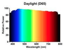
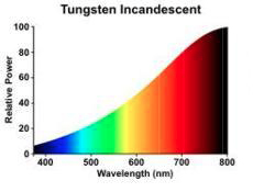
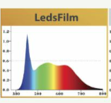
Lately I've heard more and more people talk about the qualities of new LED lights, that are supposedly as color correct as a kino-flo. I guess the SPD we are going for is to be a close as possible to daylight or tungstens; A somewhat even distribution of all colors; But how close to this do the newer LEDs come -- and are there any particular brands of LEDs that are better than others? It's hard to find much information online about the SPD, only the CRI is available, and not even for all. I came across this in the ASC magazine. CRI 95+, but the SPD looks like something I wouldn't want to use as a key light. Do any of you know what the SPDs of a kino-flo and a HMI is? Thanks,
-
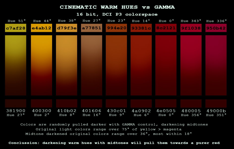
Phil, I'm afraid I don't have the psd file anymore, but I can tell you what I did. I chose an array of warm hues from greenish yellow to magenta'ish red, as you see the numbers above. Then I measured the color hue in degrees. I then darkened the color in a gradient with levels using the midtone marker, I expect it would be the same as using the gamma wheel in a colorgrading software -- And used the color picker to measure the resulting color. When I exported I tried different image containers, jpeg, png etc. And this one came out looking the most like what I had worked on in photoshop. I don't remember which export settings. But when I took it back in the hue had changed 19° Dennis, those are some good points. I've never dug down that deep into the science behind it. I guess I tend to focus on the more practical side. It's an interesting read
-
That's a good point. I guess the best we can do is to learn the limitations and faults of the software we use and find the best option to work with. Thanks for the DPX recommendation! I will run some tests. On the 20° shift -- It is very unusual. I've only had it happen once. Well actually it was 19°. This image. The color in the low left corner came out as a hue 27° when I did the photoshop test. After exporting and reimporting it read a hue 8°
-
Phil, you mention that image containers don't care much about what you put in them, do you then know how come colors shift when exporting? I've had as much as 20° hue shifts, luminance shifts as well as saturation shifts when exporting to JPEG, PNG etc. from photoshop. It feels like some gamut remapping is going on, but I can't say. ProRes422(HQ) usually deliver very satisfactory and precise colors. Dennis, I suppose it would be a good idea to aim for a P3 gamut before reencoding to XYZ. Working with the full XYZ colorspace and exploiting the wider gamut would be counter productive if projectors cannot project those colors. Wouldn't you agree?
-
Supervising colorspaces in different parts of the chain. As I understand it, Digital Cinema Projections are in P3 colorspace, and TV/DVD/Web is rec.709 colorspace. Then, as for the workflow. Images are captured in colorspace X (depending on the camera/stock) In the DI, images are converted to another colorspace, lets just say ACES In the master the images are then converted into either P3 or Rec.709 depending on the format. My questions are, 1. How do we know which colorspace we are exporting to? E.g. What colorspace does H.264, ProRes422 (HQ) or ProRes4444 have? Can you recommend any places to read up on this? 2. And how do we ensure to keep colors within the intended colorspace, as to not lose out of gamut colors when exporting? 3. I often use a Kodak2383 emulsion LUT when grading which clips out of gamut colors and remaps them to the closest color of same luminance. I suppose the gamut / colorspace is calculating what can be printed to Kodak2383 film. Do you know of any way that I can see / test how wide this colorspace is compared to P3 and rec.709? 4. I work with dailies & grades in photoshop as references for the colorists. Can you recommend a website where to read about color-management in photoshop as to stay within gamut, and 5. Would you recommend any specific image format. DPX, TIFF or PNG etc. for colorspace and accurate color rendition? Thanks guys, Will
-
I've noticed that adding contrast, and darkening warm hues tend to pull colors towards red. I love dark red hues, but I've been wonder what caused this. I had my doubts whether it was a visual illusion, so I put it to a test in Photoshop. Lo and behold. According to photoshop's color science, hues do pull towards a reddish hue when darkening. This test is by no means scientific. And image compression as well as web compression will certainly make the results even less scientific. But visually the results are pretty close. What are your theories? Limited color space with automatic gamut remapping?
-
What options do we have that have a good enough SPD (and CRI?) to qualify for high quality cinema work for d65 lighting? I know the HMI is the golden standard. As well as 85+ CRI fluorescents. - What other options are great? Do PAR lights have a good SPD? I heard that a tungsten with a CTB with a mired value that matches d65 should have some negative effects other than losing a lot of light. Is this true? Thanks guys, Will
-
Lighting and look breakdowns
Will J. Lokken replied to Will J. Lokken's topic in Lighting for Film & Video
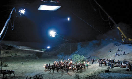
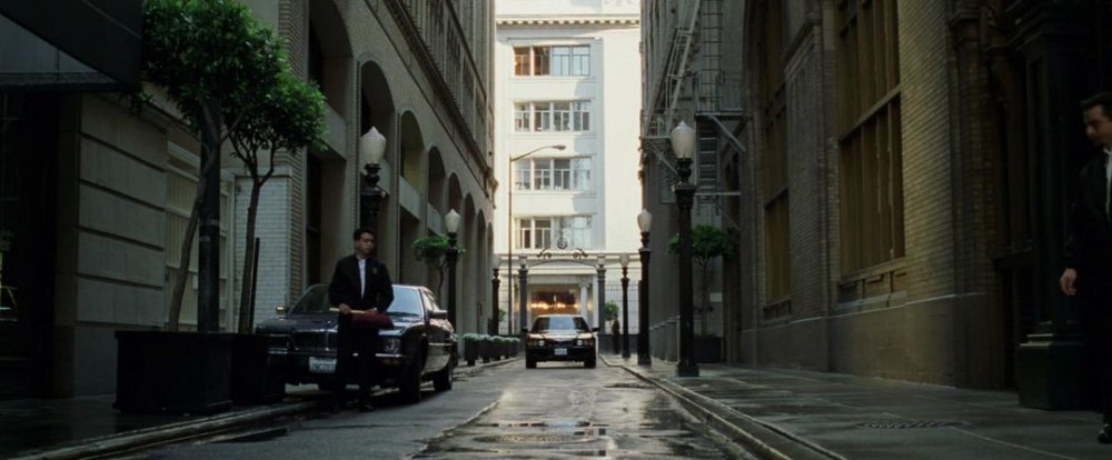
For this picture it looks like they may have used some of the same lighting as in the post i mentioned. Here are some bts shots from the scene: Here they used 40'x40' truss frames fitted with 24 DMX-controlled 6K space lights and skinned with Gelfab Full Blue Silent Grid Cloth to "provide some "moonlight" ambience", according to the ASC magazine. I'm guessing the general field illumination was done in the same way. You see some of this light hitting the front of the house as well. + You can clearly make out the 'vignetting' from the light. Other than that it looks like they have a backlight that hits the top of the house and also the actors. Here is another bts shot: Here the "moon box" is further supported by two 12K HMI Pars, and ArriMax on a 125' Condor and two 15-light Beebe Night Lights. My guess for your reference, they used the "moon box" and 2 smaller lights to give backlit shape. One on the house and one on the actors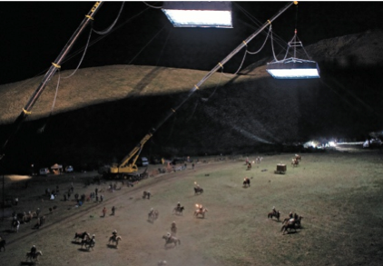
-
Lighting and look breakdowns
Will J. Lokken replied to Will J. Lokken's topic in Lighting for Film & Video
Hard to say with so many images -- But there's definitely a lot of backlit haze/fog in all of them, creating the separation by having a light background and dark silhouettes, more or less in all of them. I read somewhere that they used giant cranes for some night scenes in Django -- massive structures to cast illumination over greater areas, I'm guessing to simulate moonlight. I think it was ASC magazine, but it was another night scene. -- I can find it if you're interested It may be easier to go in detail with one scene in particular. I don't see the screen from Django with a house that you mentioned. There's definitely a saturated blue color to the shadow region, but it's not affecting the skin. Maybe it's a key in post. Perhaps the background is lit with cooler lights. It kind of looks like it's something achieved in the DI though. I agree with you, those are some pretty gorgeous night scenes. It looks like I may have to watch AVP! :) -
Lighting and look breakdowns
Will J. Lokken replied to Will J. Lokken's topic in Lighting for Film & Video
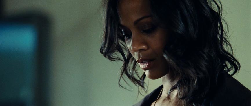
You are right. It may be more constructive for a debate like this to include both wide and CU. This scene, however, only has a CU for this particular setup. A CU on her and a CU of what she is looking at. It may be helpful to see her from more angles though --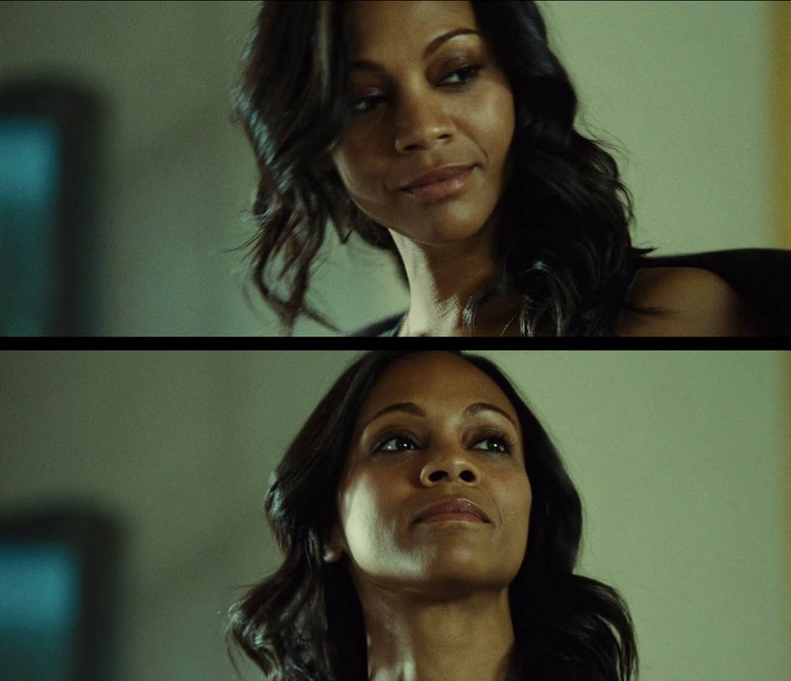
-
Lighting and look breakdowns
Will J. Lokken replied to Will J. Lokken's topic in Lighting for Film & Video
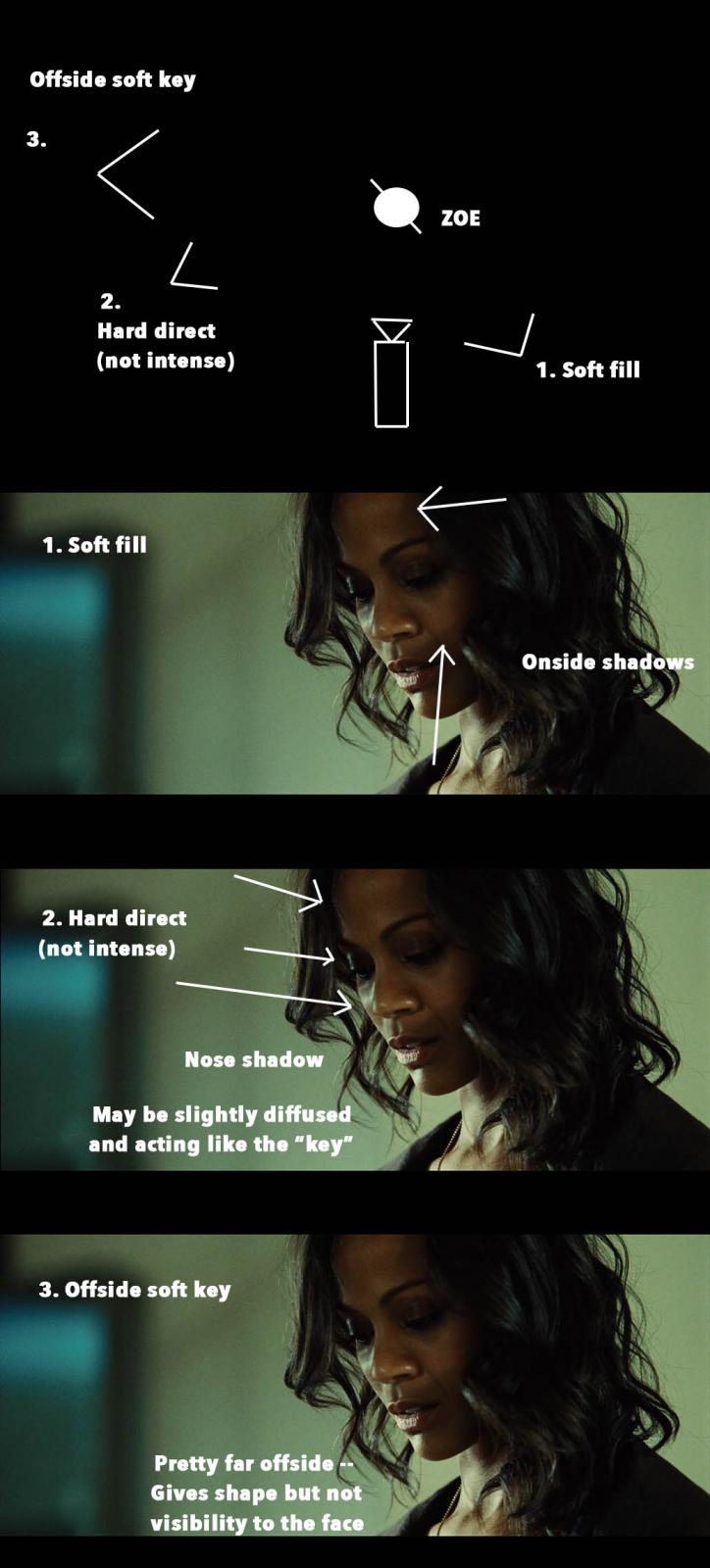
My guess would be that they used three light sources. No guess as to which. Placed this way; For post-processing, there is definitely a good deal of contrast. My guess is they warmed up the shadows, redish, and cooled the highlights, greenish. - if I grade the opposite I get this more clean normal look; What do you think?
-
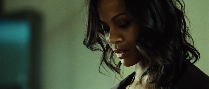
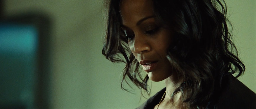
Hey guys, I'm looking to start an ongoing debate about creating looks, with main focus on lighting. - Light sources, grip, exposure, color, texture, direction, post-processing. The whole deal. Ideally one could just go shoot tests with different sets and lighting setups every day. But since that would require a great deal of money and time I figured this to be the next best thing. - If you’re interested please join in! Let me start out with this image,
-
Natural Lighting & Color Temperature
Will J. Lokken replied to Will J. Lokken's topic in Lighting for Film & Video
Thanks for your answer David. I guess the use of digital color-correction is the best bet like you say. The F-65 claims to be good for shooting in mixed white balance situations. At least I saw an ad/article about it somewhere with examples -- Don't know where to find it again. - Would you say different mediums respond differently to mixed white balance than others? Film-stock vs. alexa vs. red -
Hi guys, I was wondering if anyone has any tricks to reduce the difference in color temperature when shooting with natural light on a clear day. On sunny days I often like to shoot in the shade rather than direct sunlight, and often the "key" will be the blue sky, unless the sun bounces off a building etc. I always desaturate the blues/cyans a lot in post, but sometimes it's still not the desired look. I found shooting at 6500wb helps a little. Do you know of any other techniques to reduce the 'blueness' of the light in camera/on set? I like how both the areas in sunlight and shade look fairly neutral in these shots from The Game. Clearly the blues are desaturated by the look of the sky in the first picture.

-
Digital cinema projection vs. frame rate
Will J. Lokken replied to Will J. Lokken's topic in General Discussion
I agree the clean saturated look looks less filmic but what I am referring to is something different - The 25 fps DVD i have of A Million Ways to Die in the West looks right. So it must have been the way it was projected in cinema. It may just be that someone screwed up something with 3D / 2D settings, or that they use a higher refresh rate than 48 hz. - I guess the only way to be sure is to contact the Cinema. I will give word if the cinema can answer my question. -
Topic: Smoother HFR / frame interpolation / soap opera look. I just came back form watching Dracula Untold in a spanish cinema (specifically the Yelmo Cineplex Icaria movie theatre in Barcelona). The movie has pretty great visuals, but something felt wrong. It didn't have the cinematic feel I'm used to and love. After a few seconds I was sure the movie was played in 30fps or more. But after checking out imdb to find out that the film was shot on Kodak I am not so sure any more. The first time I came across this in cinema (other than of course The Hobbit) was watching A Million Ways to Die in the West (shot on Sony F55) in a Danish Cinema (Cinemaxx Copenhagen). The way this movie was projected definitely looked like 30fps or more, and felt cheap -- 20 minutes after A Million Ways to Die in the West had ended, we watched 22 Jump Street (shot on Alexa XT) -- and this movie had none of the high frame rate / frame interpolation feel. Same cinema. 22 Jump Street felt like a real movie. I can't seem to find out at what frame rate either Dracula Untold or A Million Ways to Die in the West was shot nor at which it was intended to be projected in Cinema -- But my real worry is this, Are some digital cinemas beginning to use frame interpolation to smooth out motion jitter etc. like popular consumer TVs? Note: The DVD version of A Million Ways to Die in the West feels right. I'm pretty sure there is some frame rate related gimmick going on. Any ideas or thoughts?