


Elliot DeBonee
-
Posts
2 -
Joined
-
Last visited
Posts posted by Elliot DeBonee
-
-
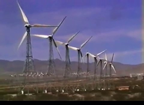
Here is an image from a Limp Bizkit documentary, it seems the colors are smoothed out or something. I cant seem to figure out how they got it to look so good. I have Color Finesse in adobe after effects cs5. Im pretty sure the footage was shot on Hi8 or something but it still looks amazing.
How do I color correct to look like this
in Post Production
Posted
Everything in the image seems to have a soft appearance to it, especially around the edges of the wind blades. I read somewhere that pro colorists use some sort of color chart or something and get color fixed perfectly. I could never figure out exactly how to color correct properly. I do study footage from documentaries like this to attempt to help myself color correct better but it never seems to work. I mean how do they know what saturation levels certain things are and stuff? Would calibrating my monitor with something like Spyder 3 color calibrator help because it could also be my monitor, Im sure the pros use much better color correction stuff than I have at home.