


Sandra Merkatz
-
Posts
110 -
Joined
-
Last visited
Posts posted by Sandra Merkatz
-
-
It's a near-miss attempt at butterfly lighting, so called because of the shape of the shadow that should be under the nose.
Ah, I read about that, it´s also called "Paramount lighting".
It misses partly because of her retroussé nose, but the chin shadow is the giveaway.What do you mean exactly? How would the shadow look when the lighting wouldn´t be butterfly lighting, but a "normal" one? What does the shadow tell you here?
(I´m not asking because I doubt what you say, but because I want to learn and understand it so I can see it myself in other pictures)
A hard key barely above her eyeline, it needed to be higher, and very little fill at all, possibly only a reflector- look at the catchlights in the eyes.You mean, all the bright light only comes from ONE keylight?
It doesn't help that the highlights are blown on the video.I also think it´s too bright, more darker areas would be nice!
Greetings,
Sandra
-
I love matte paintings! There was sitting a person and drawed a picture, and the camera is filming this "picture". So it´s still kind of real to me, because the camera films something that is actual there, while with CGI you film nothing and add everything later digitally.
Greetings,
Sandra
-
Hello!
There was a discussion about two different Blu-rays of Sergio Leones "The Good, the Bad and the Ugly", because one version (US-Blu-ray) looks "more realistic", with blu skies and more natural colors, the other version (UK Remastered Blu-ray) has a yellowness in the picture, with a green sky etc.
Some people say, that Eastmancolor was chosen to have that yellow color, and that the BD with the "normal" colors shows the movie in a wrong way.
Here two comparisons.
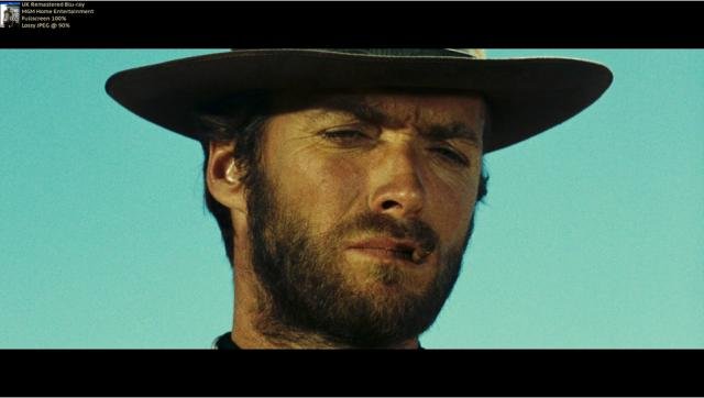
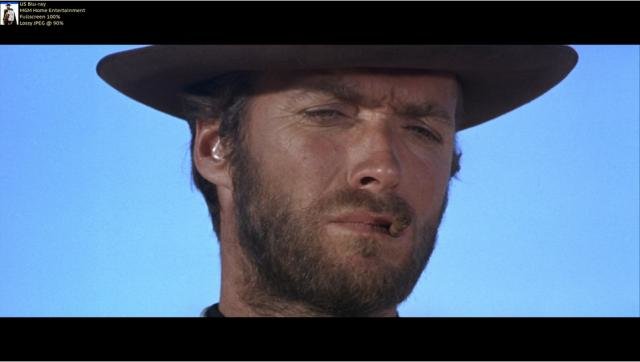
Is it true that Eastmancolor has that yellow color, and movies that used that stock have to look like that?
Greetings,
Sandra
-
It´s quite funny: many people (not here, I mean generally!) think that this new Ben Hur is a remake of the 1959 movie. But the 1959 version was a remake of a remake, because there was the 1925 version, and the 1907 version.
I think the 1925 version is in general better, because it fits more to the movie. Charlton "from my cold dead hands" Heston is much too old to be Ben Hur, who is about 16 in the beginning of the story in the book. On the other hand, Haya Harareet is more convincing as his girlfriend then the blonde Mary Pickford in the 1925 version.
Greetings,
Sandra
-
To be fair, the Harryhausen thing does look like a bit of slightly clunky stop-motion, which is just as fake as the CGI.
Of course the Harryhausen-Medusa has it´s flaws, but it looks better, because it´s "real". And her way of moving can also be frightening. I would rather say, the Harryhausen-Medusa looks less fake, not just as fake as the CGI. But today you could make much better creatures with puppets. I saw the bonus material of "Star Wars: The Force Awakens" recently, where they show how they build some of the creatures. It´s amazing how real a mechanical creature-face looks, all the little movements of the "muscles" in the face. They could do great stuff now, if they wanted to (and had the money).
Greetings,
Sandra
-
Franz Schubert: Streichquartett D810 "Der Tod und das Mädchen" (String-quartet D810 "Death and the Maiden")

There are so many versions of this very famous quartet, but this is the only one that I love, for different reasons.
The most important thing is, that the Quatuor Terpsychordes are playing HIP (historic informed performance), with old instruments and gut strings! Those strings sound so much better and fuller then those steel strings players use today. They sound metallic and thin. But the sound here is sooo beautiful, especially the second subject in the 1st movement! Schubert wrote this piece for gut strings and with a lower tuning then the standard 440Hz they use today, no matter what music they play, and this quartet plays it like back then, so we hear the sound Schubert wanted.
But there is another reason this record is great: they play the correct notes. There are different full scores of that piece out there, and most of them have MANY, MANY mistakes. Especially in older recordings you can hear that the players used a defective score. Suddenly a pulsating portamento in the cello from measure 61 on becomes a soft legato! Triplets become Eighth Notes! But not here.
I listened to that record with an Urtext Edition, that also contains a critical commentary. This way I find new beautiful details in this piece.
Greetings,
Sandra
-
Using CGI isn't unusual these days, that's not to say they they won't build and use effects just the same as in "Ben Hur" and "Indiana Jones and the last Crusade" The chariot race in the recent "Ben Hur" remake just looked like a video game compared to the 1959 version. There is a greater range of tools available today and they get used in combination, not just blue/green screen CGI, depending on the demands of the production.
You'll find production stills from Mary Poppins (1964), which uses a sodium screen to combine live action with animation. .
Physically has a production value of its own in a world with CGI..
I think it´s also a problem for the actors. It´s a difference if an actor actually sees a landscape, or if he sees a blue screen in a studio, with the director saying "Pretend this wall to be a beautiful landscape".
Or another thing: creatures in movies back then and today.
In 1981, Ray Harryhausen made a great Medusa in "Clash of the Titans", that is still scary today.

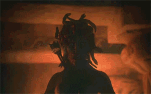
And in the 2010 remake they did this:

Seriously??
When I see that I say "Quick, give me a controller, I want to fight against that thing ... oh wait, this is not a game, it´s supposed to be a movie, that thing is supposed to look real and actually there".
Those Harryhausen creatures look so great, because they ARE real, real puppets. Let alone of the glossy look of that remake ...
Or in Cronenbergs "The Fly" from the 80s: they worked on actual puppets so the actors have something to act with. They can SEE what the fly looks like at the end, they could react to it, they could look at it. And what had the actors to do in "The Mummy" from 1999? Looking at NOTHING, because the mummy was digitally put into the movie later. Staring into the air, pretending there is a horrible looking creature in front of you. Filmmaking today, ladies and gentlemen.
Greetings,
Sandra
-
Making a movie in 1959 (Ben Hur) and 1989 (Indiana Jones and the last Crusade):

And today: (Star Wars and Jungle Book):

Greetings,
Sandra
-
 1
1
-
-
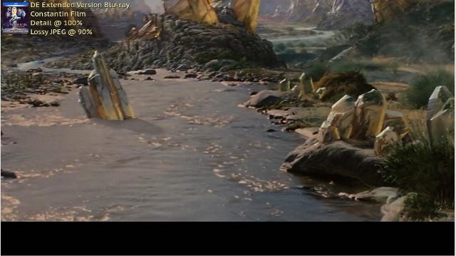
Wait, there is an EXTENDED version of Die unendliche Geschichte?
I must research this! That film is one of my favorites - on my very short list of things I might like to remake as a Director. However, given the shortcomings of the time period, I understand the changes made in the film over what the book describes.
There are two versions of „The Neverending Story“. The original German version and a shorter US-version.
The German version is 96:43 Minutes long, the US version 90:01 Minutes. (Source: schnittberichte.com. This is a page where they compare different movie versions frame by frame to see where they cut, and what they cut, also with many pictures to see the missing scenes)
This first German Blu-ray contained only the shorter US-version.
In 2013 there was a new BD-release, this time with the longer German version. (I guess “Extended” is not quite correct, it´s just the uncut movie.

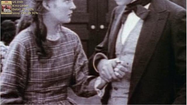
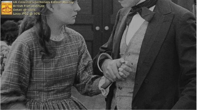
Here you can see the original version on the left side, the US version on the right. Just some examples.


That last translation is not very good. In the original it says "Don´t be mad, I´ll return it soon", in the English version it says "Don´t worry, I´ll return your book".
For example, when the Gmork is chasing Atreju in the swamp, and Falcor saves him in the last second, this shot of the Gmork is missing in the US version:

But it´s hard to decide: either you get a better picture, but a cut movie, or you get an uncut original version, but with a horrible picture.
They call this “Digitally remastered”, but it´s rather "Digitally destroyed".
Greetings,
Sandra
-
Nancy Sinatra - Son of a preacher man
For me, this is one of those cover-versions that are better than the original. Although I don´t hate the Dusty Springfield version, I´m not a fan of her voice, I don´t really like the way she digests syllables at the end of words or single letters like “S” or “N” or “M”. Also, the arrangement with the electronic organ(?) is a little bit too “cheesy” for me.
But the Sinatra-version is great! The original was in E-Major, the Sinatra version was transposed down a major third to C-Major, the feeling of the song is more relaxed in my opinion, and the arrangement with the brass sounds better, not so “soft”.And of course her interpretation! She sings it more self-confident and more interesting, emphazising different lyrics in a different way, with a little bit more erotic then the original; I also like the way she sings words like “mine” or “time”: it sounds a little bit like “time-a” or “mine-a”. (A little bit like Eartha Kitt used to pronounce some endings of words) And I think the American accent adds more to the song too.
(I wonder how they managed to make that photo on the video. Seems like a very strong key- and fill-light, because there is no nose shadow at all)
What songs, what music are you listening too?
Greetings,
Sandra
-
Some types of compression smear can have a similar effect, though not identical. And in any case, they should be using low enough compression to avoid that issue!
Absolutely! That´s why I don´t like it when they put all the bonus material together with the movie on one disc. There are positive examples too, like the Indiana Jones-box on DVD. There are 4 DVDs: on every disc is one movie, and JUST the movie, nothing else. On the 4th disc is all the bonus material, documentaries, making ofs etc. That´s the way it should be in my opinion.
Greetings,
Sandra
-
Maybe your just reading too much into it to be honest .. just enjoy the film :)
But aren´t there different ways of enjoying a movie? When you know more about a certain aspect of filmmaking (like sounddesign, lenses and focal lenght, aspect ratio, lighting, etc.) then you probably will have more fun and appreciate the images more.
An example: acting.
Recently I saw a very good acting masterclass from Michael Caine from 1987. In it, he tells his students about small things like blinking. When you speak and you don´t blink you appear stronger, when you blink more often, you appear weaker. And he demonstrates the difference. That´s really a small thing, a little detail, but since I know this, I notice when actors blink more or less, I notice their appearance. Sometimes when a character doesn´t blink it´s more interesting to watch him or her now. Even Siskel and Ebert, who reviewed that masterclass of M. Caine, said, that after watching it they will never see a movie with the same eyes again.
You can compare that with classical music too. There are many small aspects you can turn your attention to. When you learn about a small thing, for example instrumentation or music theory, then you will hear a musical piece with other ears, because of your new knowledge. Another example: when the strings play con sordino, with a muffler. When you know what that is, and when you read the score (maybe along with a record), you will pay more attention to the beautiful sound of muted strings, and you will appreciate the creativity of the composer more then before and have more fun listening to the music. You can study a score for an opera for decades and still find new details that let you expercience a record in a new way.
Or paintings. There are good TV shows where they show you a famous painting for 20 minutes and explain nearly every detail, they draw your attention to the way the painter uses light, color, perspective, depth of field etc., and other details, and you have more fun with it. Of course you don´t need to know all that stuff to like a picture, but the more you know the more you can enjoy it.
What I´m trying to say is that there are so many details, and when you know some of them, you see the richness of a piece of art (film or music or paintings or whatever) and you have more fun with it.
Greetings,
Sandra
-
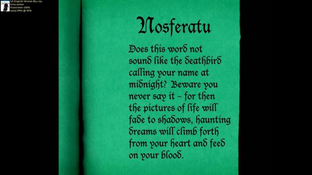
Another great vampire-movie, this time much older: "Nosferatu - Eine Symphonie des Grauens" ("Nosferatu - A Symphony of Terror") from 1921, by Friedrich Wilhelm Murnau. (And a vampire-movie that doesn´t have such a cheesy, predictable "hero-rescues-girl" happy end like so many vampire movies, for example the ones from the HAMMER-studios, which I like very much apart from that)

It´s a shame that this movie wasn´t available on DVD for a very long time in Germany, and so I´ve got a British import-version with a very interesting audio commentary. But of course it´s a DVD and the picture quality is not the best, and it contains an English version of the movie, but because I´m always interested in watching a movie in the original language (in this case German), I wanted a German version.
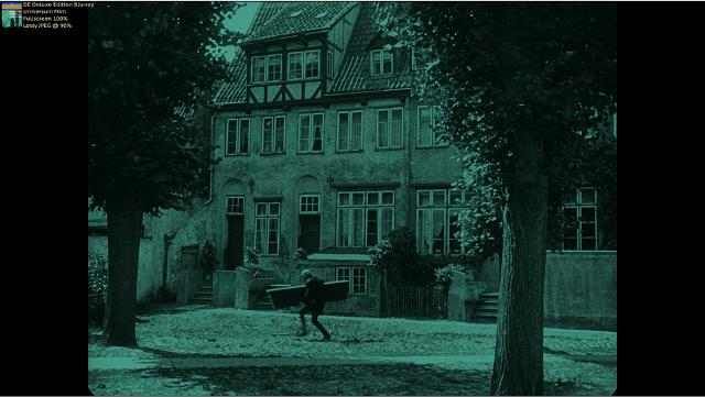
There are different versions of that movie, but the best - compared to the other ones - is the above-pictured German Deluxe Edition.
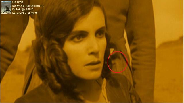
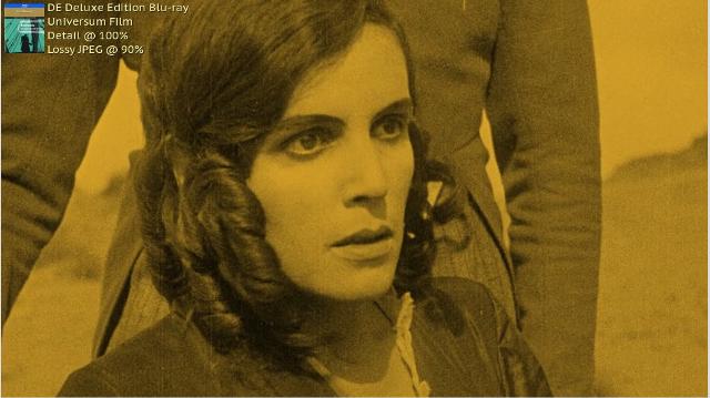
Here some comparisons between the UK-DVD and the German Deluxe Edition BD.


I guess they did on the DVD some kind of DNR or another filter for removing dirt. They also removed a curl of her hair. On the BD it´s there and the picture looks sharper and better, the color not over-saturated.
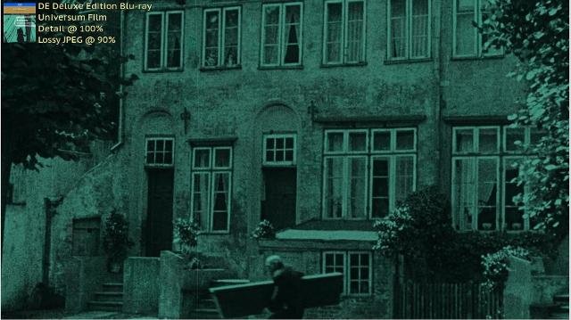
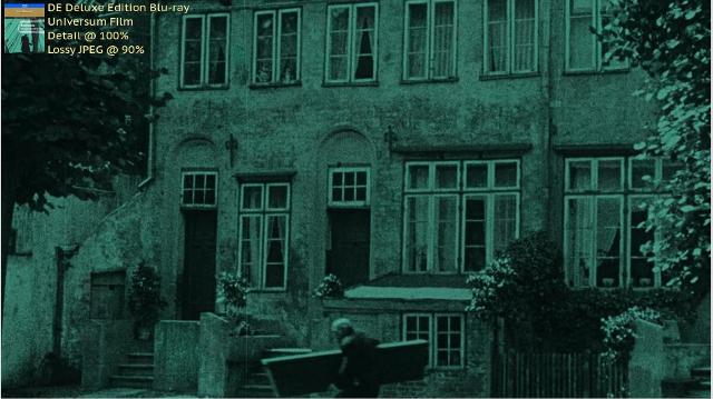
Another example how sharp that movie looks; you can see many details like the leaves on the trees, the windows, the bricks, the fence, the curtains.
There are also two American-BDs of that movie. One contains the movie in English, with English intertitles that look like this.
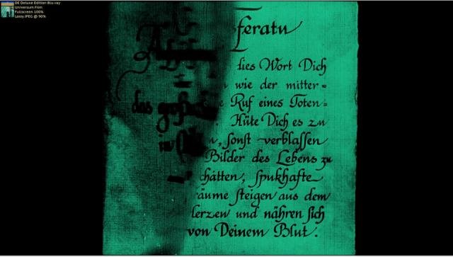
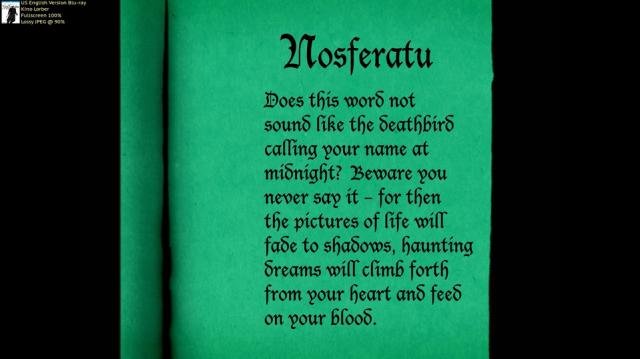
I think they didn´t a very good job here, because altough the typeface looks "old", the picture looks too clean in comparison to the actual movie. Also, the translation here doesn´t really fit to the more lyrical German text, but that´s just my opinion.
The problem is, that they zoomed into the picture which results in loss of picture-information on every side, like in this shot:

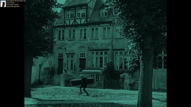
There is also another US-BD which contains the German version of the movie, but still with a zoomed picture.
Greetings,
Sandra
-
I just ordered it!
I'm a big fan of blu-rays. I don't even know why DVD's exist anymore.
That´s great, I wish you a nice time with your BD :)
Please let me know how you like it!! (And if the subtitles in the Romanian-spoken parts can be disabled off on the US-BD). I don´t know if you have one of the older versions, but if not: the documentaries are also very interesting, how they create effects like they did in the early 1900s, and used only stage effects like back then.
Two little examples: in one scene, when Harker travels in the train, there is a shot of his open diary at the bottom of the screen, while the train is rolling from left to right above it, and it throws a shadow on the pages of the book.

They did this effect actually on-screen; they build a GIANT diary, and let a miniature train roll in the distance, and adjusted the light on the train in a certain way, so the train throws it´s shadow on the book.
Or when the driver of the carriage reaches out for Harker, his arm seems to become longer and longer. That was no CGI-effect, they just put the driver on a moveable seat that moves towards Harker - by filming it the right way it looks as if the arm is becoming longer, in reality the whole driver was moving. Simple stage tricks done on camera - but effective results!
Did you order the right BD, and not this one?

I love BDs too. I guess the DVDs are for people who don´t have a flatscreen, or they are not interested in HD or to buy a new TV and a new Blu-ray player. I can understand that, but I don´t like DVDs anymore, because they are limited in their possibilities.
Greetings,
Sandra
-
if the light was right next to the camera lens.. i.e. lighting it "straight on".. it would look "flatter".. look at the side of a building at sunset.. it brings out all the bumps in surface of a wall.. look at it at midday and it will look flatter you wont see the imperfections..
Yes it's the angle of the light relative to the camera. If you light a face 3/4 frontal and position the camera to favor the same direction as the light so that the light and the camera are more or less in the same position to the face, then the face will be flatly lit... but if you move the camera to the opposite side of the face than the light then the light will be at a more reflective angle to the surface of the skin and you'll see shadows from any lines or bumps in the skin, emphasizing them, plus you get a certain sheen on the skin.
Thank you Robin and David for that explanation, I think I´ve got it now! You are talking about the shadows that comes from the bumps etc., and you don´t have that shadows when the light is straight on the face or an object. I was puzzled by the word "texture", because you see, for example, the pores on the skin too, if you get a close up shot and straight on-light.
My question is, in which light did you mean, that the texture comes out more? When you do Rembrandt-light with the darker side towards the camera, or the brighter side?
It's often less about the "meaning" of the light, just depends -- a face usually has to have some light on it unless you want it to go black, and it wouldn't be possible to always have some sort of meaning for that light. I mean, what if you are filming two people outside in the sun, facing each other... does that fact that one person might be more back or front lit by the sun compared to the other always suggest that one person's light has a different meaning than the other person? Sometimes it does but sometimes you don't have much control as to which direction the sun is coming from.You are right! What worries me is that I overlook something, when I don´t look closely at every lighting setup. I read that sometimes there is lighting that comes from things like the sun, lamps etc., but sometimes the light is unrealistic on purpose, to "tell" the audience something. I just want to find out what the filmmaker wanted, instead of watching a movie and saying "Nice movie, let´s watch another one now". A film crew puts so much effort in lighting a scene, and then I watch that without noticing what the have done?
It´s the same thing with music, by the way. I love classical music, and I keep learning musictheory and read scores to see (and hear!) what the composer did. This way you find so much beautiful things that you would never have heard if you just hear the music. I compare that to swimming in a beautiful lake: it´s beautiful to swim on the surface, but I also want to dive in to see what "secrets" there are, to see what´s there.
Greetings,
Sandra
-
Of course I don´t know about that movies you speaking of, I have not comparison before/after DNR, so I can´t say anything about this. But I think most companies who use it are doing it to make the movie look more "modern", more like one of those CGI-movies.
They think "People of today don´t want to see grain, they want to see a picture just like in a modern movie, so we use filters to get that look". Or they fear that the audience will complain about the dirty picture, because they think grain is dirt that has to be removed.
Using DNR on "The Mummy" was absolutely not necessary, because there was very little visible grain anyway.
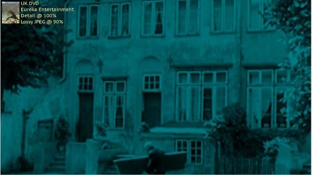
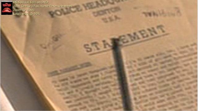
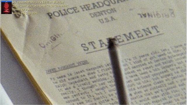
There is another example where they messed it up. The German BD-version of "The Neverending Story". Look at this:

On the first picture you have the grain, and all the details, like the waves on the water. On the German version, they used so much DNR that the grain is removed, but also the details; the water now looks like some kind of jelly, the whole picture looks glossy. Maybe the film looks more "modern" this way, and not like an "old movie" from the 80s, but the filter destroys everything here.
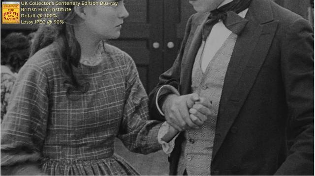
But there are also good examples of very old movies like "The Birth of a Nation" from 1915, that looks fantastic on BD! (I don´t like that movie, it´s just an example!)
First you have the DVD version, then the Blu-ray. They left the grain in the picture, and you get sharp edges, details like the patterns on the clothes or the hair.
Greetings,
Sandra
-
Well I mean, it's a tad unfair to compare a DVD with a 4k Blu Ray.
I didn´t compare it, I just wanted to demonstrate why companies shouldn´t destroy BDs with filters etc. :)
Greetings,
Sandra
-
I suppose it depends on how crucial the viewing experience is to the consumer. I know guys who own LaserDisc players just to watch Robocop 2, My Neighbor Totoro, and the first Pokemon movie for "optimal experience".
You are right. I´m shocked how many people don´t care about the picture quality, as long as they see anything, for example in reviews. I think that the picture is as important as everything else, because the set designers cared for details in the set, the costume designers cared for the costumes, the make up artist did that on the masks etc., and if you don´t see that things because the compression makes the image blurry, or some filters destroy the picture, then it´s a shame for me.
I want to see the set, I want to see the details they put in it, and not a blurry, undefinable mess. I want to be able to see what kind of clothes a character wears, and the little stitcheries or patterns on it, not just the color of the clothes. In the documentary for Bram Stokers Dracula the costume designer said, that she thought about what patterns she would put on the differend dresses. One dress has snakes on it, another one leaves. But if you are not able to see that? A Blu-ray is able to show that, but then there are companies who decide to put filters on the picture that destroy those details again or make them look horrible.
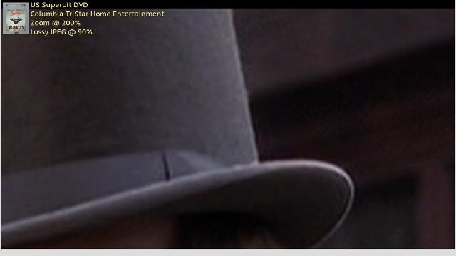
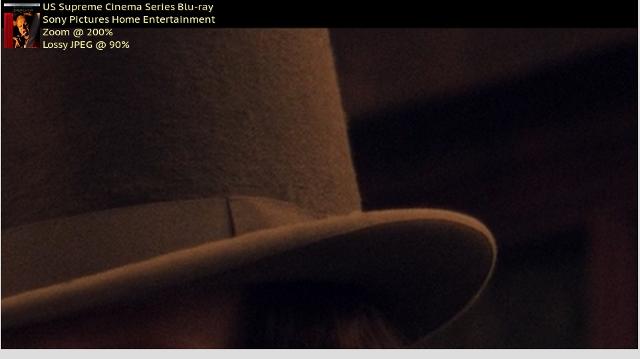
An example of "Dracula":
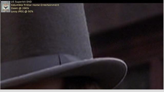
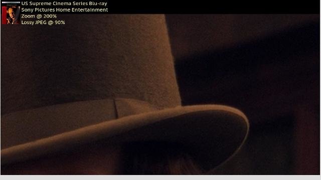
On the DVD you just see color and form of the hat. On the 4K Blu-ray you see all the details, the texture of the cloth, even the fluff on it. So you can see what the character wears, and what the director wanted him to wear.
Greetings,
Sandra
-
Well, this is just one example of a bad BD, of course there are many more who are worse. I will show some of them in the future. But even if they "only" use DNR it´s a bad BD for me, because grain contains picture-information too.
Greetings,
Sandra
-
I don´t have a HD-DVD Player, and the movie is not so important that I would buy one only for this. HD-DVDs lost against the Blu-ray about 10 years ago.
Greetings,
Sandra
-
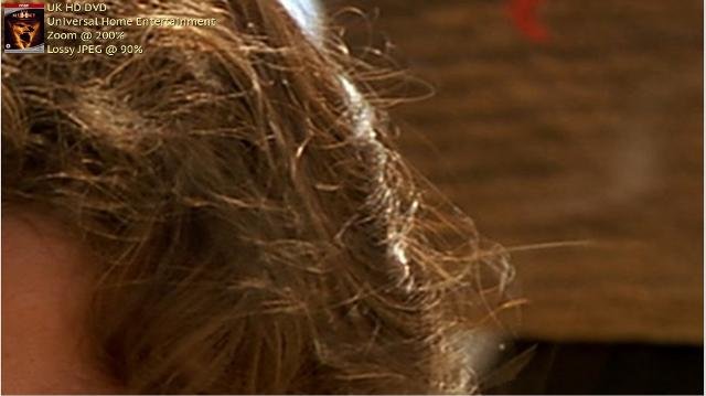
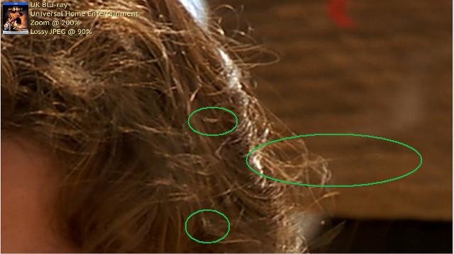
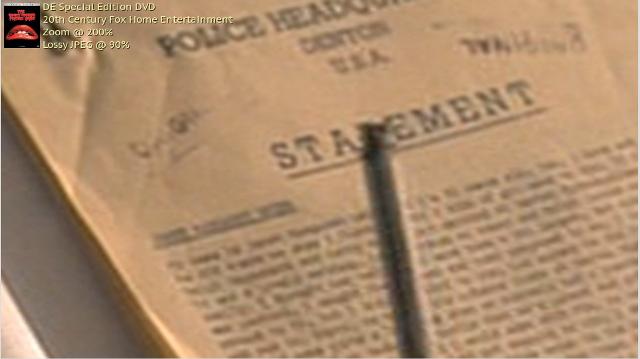
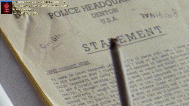
In this thread I want to show Blu-rays that are not good, especially when it comes to the picture quality!
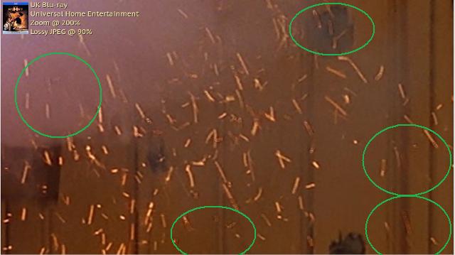
The first one is "The Mummy" from 1999.
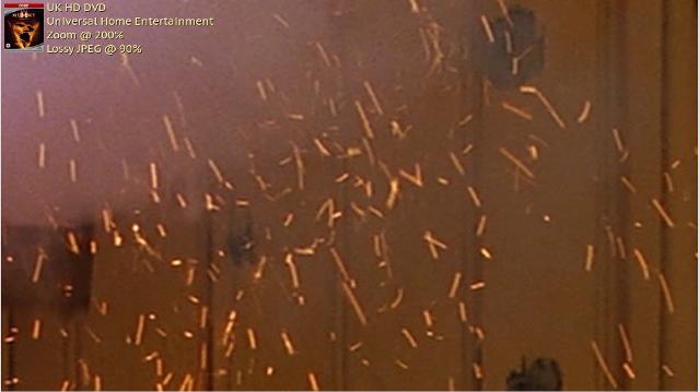
I wanted to buy that movie on BD, because it reminds me of Indiana Jones, but then I saw what they did: instead of leaving the already small amount of grain, they decided to use DNR (or another filter like that), which doesn´t only make the picture soft and like wax, but also robs some information!
There was a HD DVD, that is the reference here; they didn´t use that filter.
Let me show you this:
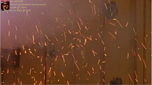
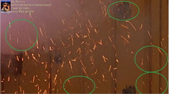
Here you can see that the DNR removes many of those sparks. To make it easier to compare the pictures I marked some of the worst removements of the filter, where sparks are almost or completeley missing.
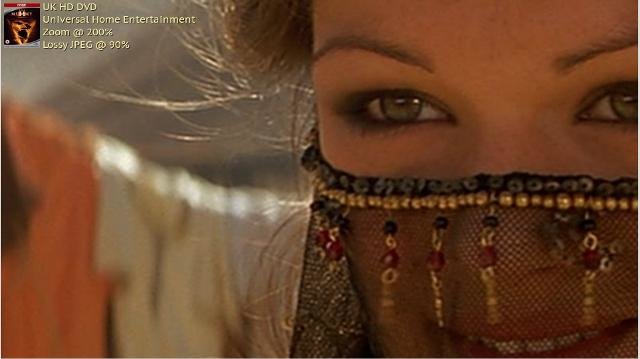
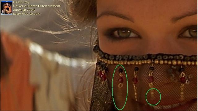
And here the filter removes some of that tiny pearls (or whatever this is), and also most of the little freckles on her forehead and the nose, that makes the face beautiful. Now it looks too soft, too smooth.
Of course one can say "That are tiny things missing, you can still have fun with the movie, who cares about some hairs or sparks missing?", but for me it´s important that you leave the picture as it is, and not try to make it look "modern" and softer. I´d really like to have that film, also because of the audio commentaries, but I won´t buy it that way :(
Greetings,
Sandra
-
Thanks for that review! Is the new 4K version a new transfer (I assume) and if so, is it available in a 1080P blu-ray or only in UHD?
I´m sorry, I didn´t saw your respond! I think it´s a new transfer, it was scanned in 4K, but pressed on a 1080p Blu-ray, so it´s not a "real" 4K picture, but you still get a sensational picture full of details. It´s not on a UHD-disc as far as I know.
Greetings,
Sandra
-
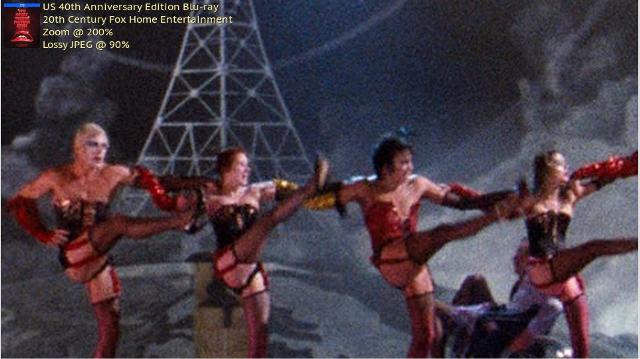
Another Blu-ray: "The Rocky Horror Picture Show".

I can recommend it, because they didn´t use DNR etc. on this, you see the grain, and many details, and the colors especially of the costumes are beautiful and bright, not as dark and muddy as on the old DVD.
On the DVD you can´t ready anything, and you have ugly double edges from the compression. On the BD, the picture looks clear, no double edges, grain, and better colors. And you can read the text better. ("My Name is Janet Margaret Weiss, I´m 23 years old ...")

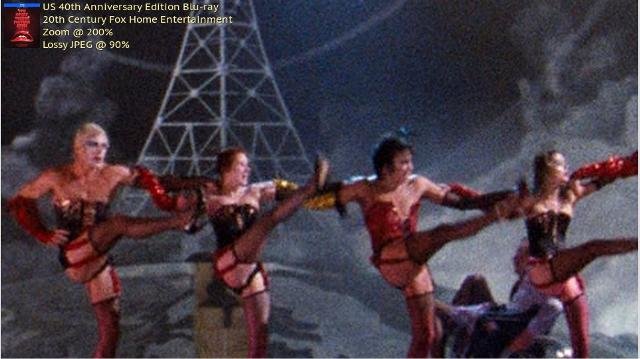
This is a zoom of a wide shot. Again you see much more details, better colors and grain, not a soft DNR-mess.

Here you also have much more details, and beautiful, shiny colors instead of the muddy picture on the DVD.
On the BD, there is a lot of bonus material (most of it I don´t really need, like the shadow cast), but some of them are good, like the Trivia Track, the Vintage Callback Track or the Outtakes. Again it´s a shame they put all the specials on one disc, but the picture still looks good. I would recommend that BD to anyone who likes the movie.
Greetings,
Sandra
-
It's just a convention to have the key light coming from the direction that the actor is looking, so if they are looking towards the left side of the frame, the light comes from the left side, so if you are shooting a 3/4 angle, that puts the camera on the shadow side. Having the light come from that direction also tends to create a nice catch light of the key reflecting in the eye, plus provides more mood by having the camera see more of the shadow side of the face, such as in this shot:
The only downside to having the light come at a "raking" angle to the face like this is that while you get more mood, you also bring out the texture in the skin more, which can either be good or bad. "Alien" is a textbook movie of lighting for texture, as these shots demonstrate:
I don´t get that: why would that kind of lighting bring out the texture more? (You mean the Rembrandt-lighting?) If you would light the object with much light, so that the whole image would be bright, you would see the texture too, or not? For example the shot of the alien or the hand: when you light that much brighter you would still see the texture of the skin, the pores, I think. (I´m not criticizing you or doubt what you say, I just want to learn more about this!)
You said it´s also a convention to do that Rembrandt-lighting, I would agree with it, but can there be also some kind of meaning behind it, or would directors do that only because it looks good? What can that lighting imply? A dramatic situation? A romantic situation? A "dark side" of the character?
Greetings,
Sandra


What happened to look of movies
in General Discussion
Posted
That´s a good explanation, thank you :)
There are other examples, like both Ghostbusters-movies from the 80s. They ghosts look good even today, because they were "real", real puppets, or peolple who played them. That´s why they look organic. Like the library ghost from Ghostbusters (1984):
Doesn´t that look great even today? When the light hits the creature it looks real, because it´s REAL light hitting a REAL puppet! There were people who build that thing and tried to create the best effect. They used light, wind etc. to make that.
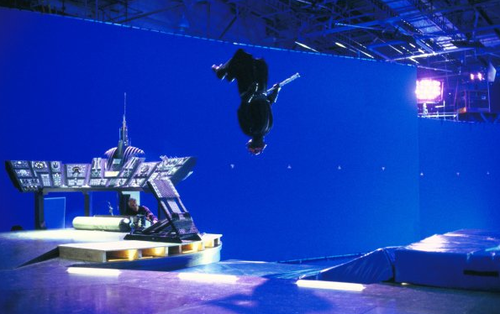
And today you´ve got this:
Looks like a video game to me. I can clearly see that this thing is not "real",
For me, "Film" means that you film something that is in front of the camera, not filming a greet wall and put in everything later digitally. That´s what Coppola did with "Dracula": he used only(!) practical effects. Everything you see is actually there. If you see green smoke wandering around in the room, it´s real smoke, green light and some people with fans "directing" the smoke. It´s much more effort, you have to try and practise a lot of things, but the result looks better. I like it when filmmakers are creative to achieve a certain effect.
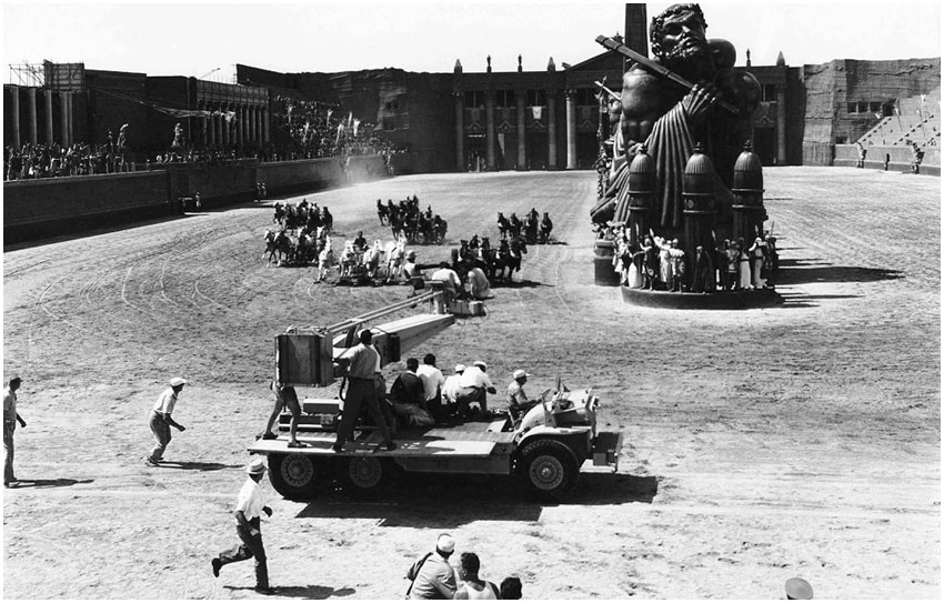
They also did this for the 1925 Ben Hur. In the wide shots most of the arena was fake, with miniature audience moving up and down. It´s a simple trick, but in the final movie you think "Wow, they shot this in a real arena!". Not like those digital arenas like in Ridley Scotts "Gladiator" etc.
Greetings,
Sandra