Search the Community
Showing results for tags 'grade'.
Found 5 results
-
Hi all -- So, I follow Ryan Booth on Instagram, and the guy has a knack for creating really beautiful looks with his Fuji X100T + VSCO (iPhone) combination. It's one of my favorite results from a mobile workflow I've come across, and it's so consistent. Obviously a very teal + orange grade, but I'm wondering how he keeps it almost natural looking without taking it to a complicated desktop setup. I think it could be really helpful to break down for quick grades in the future. Thanks! Jon
-
Is it even possible to achieve a decent result when color grading non RAW footage. Is it a common thing to do to color grade non RAW footage? How much of what I see at the cinema is shot RAW?
-
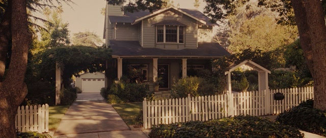
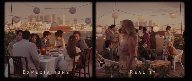
 Hi I am in prep to shoot a budget feature that is set in the 80's and present day. I am wanting to give the 80's a distinctive look, something more nostalgic and tending towards the warmer colours. I found 2 references (refer to attached files) from 500 Days of Summer that I really like and I think something similar could work for my film. Can anyone give me some input on the look that was achieved here? Do you think there were filters used or was it just post grade, or was it possible a lighting thing, or a combination? I know one can't tell for certain unless you were on set but I am hoping someone out there has come across something similar and has a point of view. From what I can see is the blacks are sitting more in the magenta range and the mids and highlights are sitting more towards the orange yellow. Is there a filter that can achieve something similar? I have done a few tests with Antique Suede, Chocolate, Coral, Gold and Tobacco filters. I did the tests at the rental house which did not give me a true reflection of what I will get because the locations, art and wardrobe in the film are quite specific and tend towards the browns, creams and oranges not gun metal grey and white like you find in most rentals. There is unfortunately no budget for me to do a proper test shoot so I am a little stuck. We shooting on Alexa with Zeiss Ultra Primes, I will have 10 days for grade. Thank you, Jacques
-
 Hey guys, soon making a corporate and require VFX. This is the first time I have needed a VFX team. What is the process? Collect footage > VFX > Colour grade? Or collect footage > Colour grade > VFX? Thanks in advance!