


Jarin Blaschke
-
Posts
328 -
Joined
-
Last visited
Posts posted by Jarin Blaschke
-
-
14 hours ago, Tyler Fukuda said:
One more question @Jarin Blaschke
I attended your Q&A last night at the Kodak house and you mentioned about camera movement wanting to take on a more "classic" approach. Were there any films Rob and yourself watched that demonstrate this type of approach?
Clearly all the moves are very calculated and precise -- I imagine this had a lot to deal with the cranes/remote heads you were using.
Rob cites “The Innocents” shot by Freddie Francis. For me though, I generally don’t follow other films as far as camera movement. References are better for texture or “vibe”
-
On 1/31/2025 at 8:20 PM, M Joel W said:
Looked great.
How much of the atmospherics (the fog in the graveyard scene, the snowfall) was done in comp and how much in camera?
Why did the mesopic filter reduce apparent saturation? Wouldn't band pass filters increase the apparent saturation of the image?
For the candle-lit scenes, how much supplemental lighting was there in addition to the candles?
Thanks.
Most atmospherics are on set, including all falling snow. Rob HATES CG snow. The only CG atmosphere I can think of is removing budding spring leaves in the cemetery. In doing that, they also strengthened the background fog to hide the distant trees that were filling out in March/April. There is also some fixing and extension of snow dressing where effects people couldn't reach like windowsills on the second and third floor, high boulders, etc.
The filter indeed gives a saturated cyan image but that is then desaturated in the grade. The intention of the filter is simply to darken red and orange and set up an orthochromatic tonal response for the final near-monochrome image.
Candlelight was only supplemented by more candles off-camera, as well as mirrors to double the existing candlelight toward chosen directions. There is no electric supplementation. However, in the interiror monastery, I needed more oomph to light the featured ceiling fresco. So I added some flame bars with mirrors to light the ceiling adequately.
-
 1
1
-
 1
1
-
 1
1
-
-
On 1/6/2025 at 8:11 PM, Petr Kvapil said:
Were all the exterior night scenes shot at night? I read somewhere that some were filmed in the daytime, but I couldn't find anything about it anywhere else, so I guess that's nonsense?
Yes. At night. I would experiment with day for night in a location that has almost guaranteed clear sunshine (like the Mojave), but in my opinion overcast light makes terrible day for night.
-
3
-
-
Hard moon: two 18ks at two different depths in the highest lifts possible (80 ft height? 120 ft?) -2
Top Skylight: LED sausage shape balloon between camera and subject. It just squeezed in between the branches above. -3.5 to -3.7 if memory serves
Fill light: 2.5ks mounded into Molton-covered 20x20 ultrabounce. Behind camera far enough to hide foreground/background falloff. -4 on average, brighter for closer shots.
-
5
-
-
On 12/31/2024 at 1:39 PM, Stephen Perera said:
By the way this film is a masterclass for how to shoot low light with film…..
@Jarin Blaschke could you talk us through how you created this scene in particular….my favourite set up of the whole film! Wow
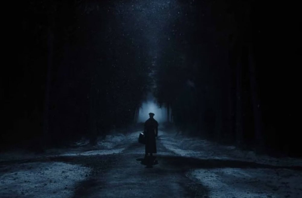
Well thank you. The ‘moonlight’ work in the film, including the frame you reference, may not be truly “low light” in 2024 terms. It was shot at T2.8 at ISO 200 (after our “Mesopic” filter factor) and with a 1/2 stop push. The hard back/top light is set at -2 incident, the soft top light is -3.7 incident and the front fill is -4 to -4.3 incident. This under exposure level still lights the set at 12 foot candles, which is bright to the eye when you’re shooting at night. Lighting ratios set for low exposure also look very flat to the eye, so testing is definitely necessary!
-
4
-
3
-
-
I prefer film because to my eye it simply looks better for most things.
As a bonus, it keeps me very sharp on set in regards to my metering and exposure.
As another bonus, it focuses the set a great deal. When I do shoot digitally, the set seems more scatterbrained.
As a third bonus I find I am more confident when I am not relying on the monitor to light.
On 7/22/2024 at 2:17 PM, Jon O'Brien said:G'day Jarin. What do you think of film vs digital acquisition for cinema release narrative feature movies? Do you prefer working with film because of the work flow, or do you more prefer the look in the
-
6
-
1
-
-
We didn’t reference Coppolas Dracula although we are both very familiar with it from childhood and perhaps there is some level of unavoidable “subconscious vibe osmosis” between the films.
But visually, my techniques differ greatly from Bauhaus and our shot structure is rather separate as well.
We shot 4-perf. Otherwise your 1.66 gets smaller.
-
3
-
1
-
-
Yes, there will be prints.
The only perfect match where the audience will see exactly what we graded is DolbyVision .
Nonetheless, Rob is very happy with the print tests so far. There’s a degree of “cozy” loss of sharpness he likes.
-
2
-
-
Early on (around 2017), Rob was clear that it needed to feel of the period it takes place in, 1838, rather than the original film, 1922. So from the get-go we were after giving the film its own identity based on the character’s outlook and culture. So, it’s in color and following the lead of 19th century romanticism.
Since we were then starting fresh anyway, 1.66 “felt” right for reasons that are hard to articulate. To me, this aspect ratio is the most neutral and invisible to the audience, while still capable of grand romantic vistas when needed. It’s also more suited to an ensemble piece which this most certainly is.
We are still great lovers of 1.33 and intend to return to the format with the right film, just like we’re not done with black and white. Above a certain price point, 1.33 may also be a struggle with the studio, but if you look at recent releases, I’m optimistic that that may be changing.
-
6
-
-
Ideally, for the most realistic results you’d have the source 50 or more meters away by using flat mirrors the size of the set windows, but convex is a shortcut with the aforementioned drawbacks.
We calculated that 70 meters’ distance would match the relative size of the sun or the moon.
With a convex mirror, we have moonlit scenes in Nosferatu that are actually much harder than real moonlight. The convex mirror took away too much light to be used for sunny interiors where I want +4 exposure for sun patches. Convex was fine for studio “exteriors” where sun only needs to be +1
-
3
-
-
Obviously I can’t answer a number of questions due to confidentiality, but what would you like to know?
J
-
1
-
-
“Over”exposure and “over”development have similar effects and different effects. Both add density overall but in different ways. Increased exposure affects everything evenly and decreases grain while increased development affects things proportionally and increases grain. The “Babylon” recipe uses both ingredients, and I would posit with intention: I would guess the look was the primary factor, above practical needs - otherwise he would have used 5219 for everything and called it a day.
-
1
-
-
That is a good formula for a harsh high contrast image with especially hot highlights, which is reflected in the look of the film.
There are creative reasons for pushing or pulling film, outside of exposure needs.
-
My tests say Summilux is the closest, although the Primos have more pleasing bokeh in my opinion (Sasaki blames Summilux’s aspheric elements for this). At least on celluloid, performance is very similar : primo is more even performance, while summilux has extra performance in the very center.
Cooke S4s have chromatic aberration, splitting green/magenta at high contrast edges. Master Primes have flat highlights and less “dimensionality” on film, but could be an asset for digital formats - I haven’t done a digital comparison. I like Leitz Rs a lot, but they are visibly softer in contrast than Primos and I consider them a different look.
J
-
2
-
-
As far away from the window as possible, which shrinks the source (for sharpness/hardness)and brings the beams closer to parallel.
-
We actually had convex mirrors made for “The Northman.” I put an 18k into it to emulate sunlight or moonlight in the studio or outside at night, so I can’t speak about bouncing the real sun. It would be much more forgiving when tracking the sun, and it would put out a pattern more wide and desirable compared to the standard 4-foot flat mirror. However there is substantial light loss with the convex.
For we light snobs, the convex mirror was a very useful tool because it shrinks the source to a proper point, and the “sun” or “moon” starts looking like the real thing. Crisp, believable shadows. To shrink an 18k to the relative size of the sun, we calculated that we’d have to place it over 250 feet away. The convex mirror allowed us to place the lamp 15 feet away from the mirror, and the mirror 30-40 feet from set. You just had to be sneaky about hiding the diverging angle of the rays.
Our mirrors were 1.2 meters wide and 150 or 300mm deep depending on what we needed to do. Light loss was about 3.5 stops with the 300, - you’ve been warned.
-Jarin
Frank: Large silks defeat the mirror of course, and unless your silk is only 4’ wide, you’re only using a fraction of it. Unless you mean multiple mirrors?
-
5
-
2
-
-
1 hour ago, Phil Rhodes said:
I find most people are willing to accept at some level that HDR is a pretty good idea. Some DPs aren't particularly aware of the Vision grade, though; I've spoken to plenty of high end people who finished the conventional version and then let the colourist do the HDR. Approaches seem to differ.
Well, I meant DolbyVision theatrical, which tops out at about 100 nits, but blacks are complete- a spooky effect in the theater when you dolly into a black doorway.
For home HDR, I capped highlights at about 130 nits. More than that affronts my eyes. Unless you are watching the film outside in broad daylight in Arizona.
j
-
This is mostly accurate. Our Primos were adapted for us, the main differences are a round aperture rather than the spiky Primo aperture, some added barrel distortion, and subtle “cat’s eye” bokeh. The field also seemed to be deeper than a typical Primo. I basically asked Dan for 70% primo, 30% Cooke Panchro series 2. Who knows what he did and how he did it.
We also graded a DolbyVision version, which is THE way to see the movie.
-
2
-
3
-
-
2 hours ago, John Rizzo said:
Not sure if anyone heard about this yet,
Columbia Collage in Chicago which is one on the top schools for Motion Picture Film Courses is phasing out film and going totally digital, not only that but word from the camera cage is hat all of the film camera s are to be junked.
here is a excellent podcast from last week in response to this:
Ok, well, the last time I shot digitally was 2017 so there are a broad spectrum of experiences. I'm shooting a commercial on 35mm in a couple weeks, of all things...
There is an unprecedented rise in 65mm production as well. Maybe it's just getting more stratified and we could lose a film technician pool to feed the upper end, but for now there is a different film situation than 5 years ago.
Jarin
-
1
-
1
-
-
It sounds like a test is really necessary!
I will venture to say that it will be more sensitive to red than a tungsten stock, as an educated guess, perhaps similar to 5219's sensitivity to red...
J
-
On 1/18/2021 at 2:32 AM, Manu Delpech said:
Film will be just fine. Killers of The Flower Moon is starting next month for a seven month shoot, David O.Russell's next one is shooting right now (probably on film). Paul Thomas Anderson shot his latest film a few months ago on 35mm as always. Patty Jenkins only shoots on film and she's got three huge films lined up: Rogue Squadron, Wonder Woman 3 and Cleopatra. I'm guessing/hoping that Indy 5 (directed by James Mangold) will be film too. No Time To Die is releasing (probably pushed back to Fall 2021), A Quiet Place Part 2 as well (film), Shyamalan's Old (he actually paid the extra himself to go back to film on this one), Death On The Nile, Last Night in Soho, Mission Impossible 7, The French Dispatch, West Side Story and so on.
There are also obviously other films shooting that we don't know of, then all the directors currently shooting on film are going to continue to shoot on film.
*cough* "The Northman *cough, cough...* : )
-
3
-
-
6 hours ago, Stephen Perera said:
Hey Jarin, we look forward to when you can give us details, anecdotes, stories of it all.....and how you found working with the Panavision Panaflex Millennium XL2 (so IMDB says) and 35mm film of course as we know......what light metre you were using.....what EI you rated the stocks ta......everything
Thanks. Without divulging much of the film or its aesthetic techniques, I’ll probably post my findings within the next week regarding the portfolio of Kodak film stocks, how I rated them, etc, within the next week or so.
jarin
-
4
-
1
-
-
We wrap principal photography tomorrow!
For a 87 day shoot, only two days were lost due to false positives in our testing regimen, otherwise no covid hiccups.
I was tested three times per week.
Rob has a very long post production process ahead!
J
-
1
-
1
-
-
Yeah, right nowI'm doing exterior moonlit nights now with only 1 1/2 stops difference between the "moonlight" and the ambient "starlight." I also get costumes and sets to make nothing lighter in tone than the average skintone of the actors. Otherwise, you can't set your fill to anything consistent. You really have to compress tones for night work!
J

Nosferatu - Robert Eggers - Jarin Blaschke DP
in On Screen / Reviews & Observations
Posted
I decide the processing and the working ISO first. When that is done, it stops becoming a variable. The working ISO is now 250, period. Then I test how dark or light I want key and fill for all the different kinds of scenes at this locked Iso.