Jarin Blaschke
-
Posts
328 -
Joined
-
Last visited


Recent Profile Visitors


-
 I decide the processing and the working ISO first. When that is done, it stops becoming a variable. The working ISO is now 250, period. Then I test how dark or light I want key and fill for all the different kinds of scenes at this locked Iso.
 -
Rob cites “The Innocents” shot by Freddie Francis. For me though, I generally don’t follow other films as far as camera movement. References are better for texture or “vibe”
-
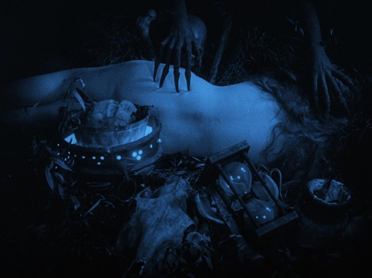
Thanks. Most atmospherics are on set, including all falling snow. Rob HATES CG snow. The only CG atmosphere I can think of is removing budding spring leaves in the cemetery. In doing that, they also strengthened the background fog to hide the distant trees that were filling out in March/April. There is also some fixing and extension of snow dressing where effects people couldn't reach like windowsills on the second and third floor, high boulders, etc. The filter indeed gives a saturated cyan image but that is then desaturated in the grade. The intention of the filter is simply to darken red and orange and set up an orthochromatic tonal response for the final near-monochrome image. Candlelight was only supplemented by more candles off-camera, as well as mirrors to double the existing candlelight toward chosen directions. There is no electric supplementation. However, in the interiror monastery, I needed more oomph to light the featured ceiling fresco. So I added some flame bars with mirrors to light the ceiling adequately.
-
Dear Jarin,
So much has already been said about your talent — your cinematographic vision is often compared to painting, and it’s hard to disagree.
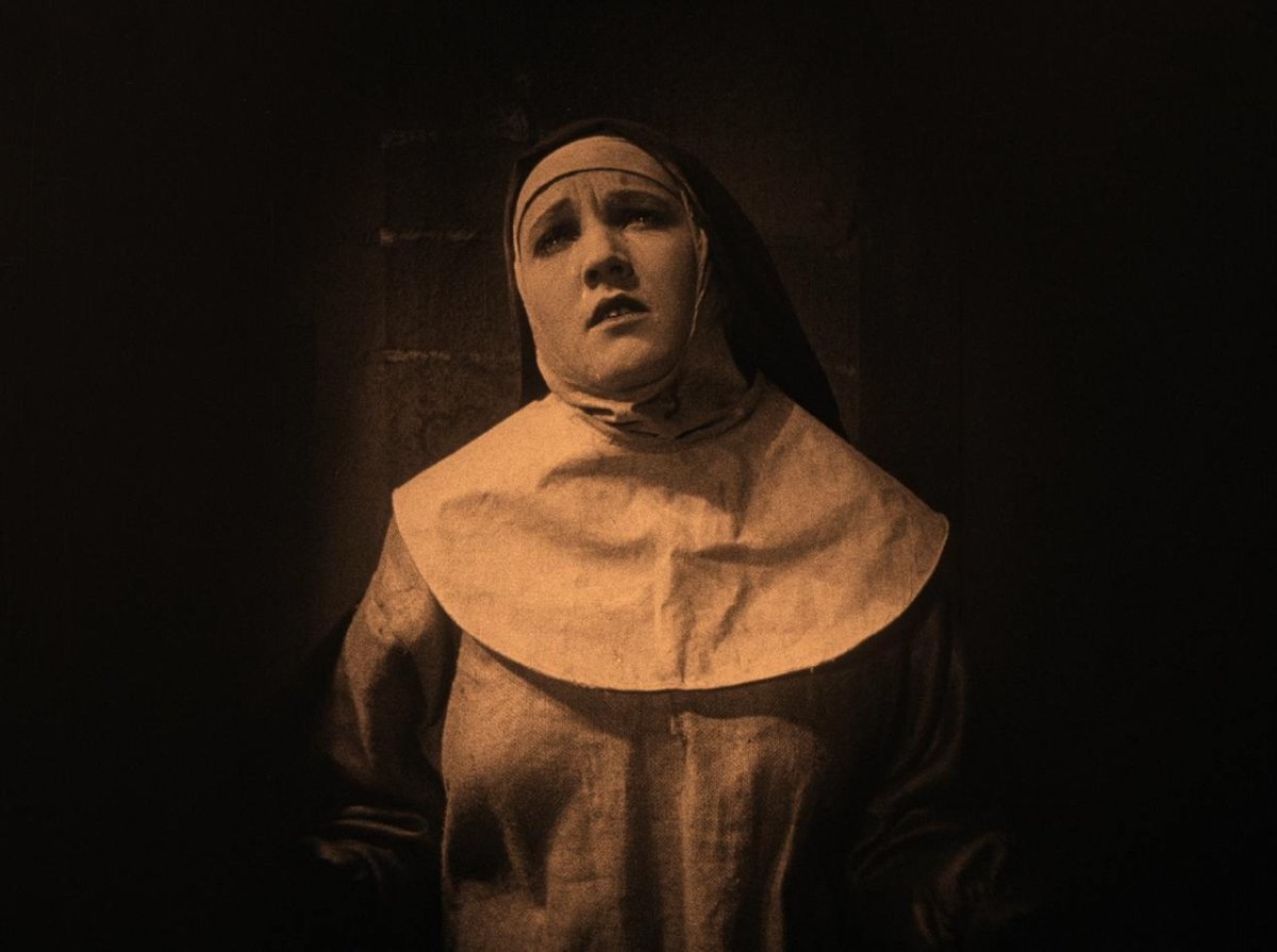
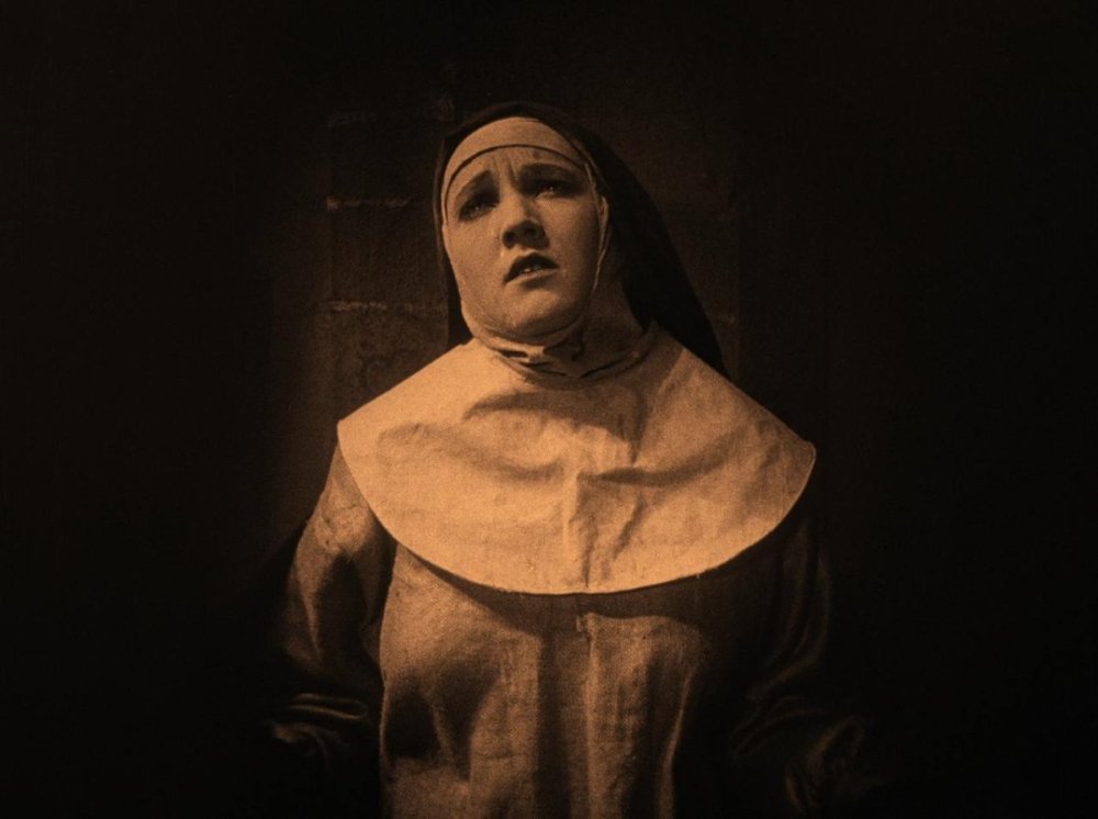
Recently, I watched the 1922 Swedish film Häxan, and I couldn’t help but think it might be something you’d appreciate. That got me wondering — would you be willing to share a short list of films that have influenced your visual style? I’d love to know what has shaped your artistic approach.
Вest,
Vera

-
Yes. At night. I would experiment with day for night in a location that has almost guaranteed clear sunshine (like the Mojave), but in my opinion overcast light makes terrible day for night.
-
Hard moon: two 18ks at two different depths in the highest lifts possible (80 ft height? 120 ft?) -2 Top Skylight: LED sausage shape balloon between camera and subject. It just squeezed in between the branches above. -3.5 to -3.7 if memory serves Fill light: 2.5ks mounded into Molton-covered 20x20 ultrabounce. Behind camera far enough to hide foreground/background falloff. -4 on average, brighter for closer shots.
-
Well thank you. The ‘moonlight’ work in the film, including the frame you reference, may not be truly “low light” in 2024 terms. It was shot at T2.8 at ISO 200 (after our “Mesopic” filter factor) and with a 1/2 stop push. The hard back/top light is set at -2 incident, the soft top light is -3.7 incident and the front fill is -4 to -4.3 incident. This under exposure level still lights the set at 12 foot candles, which is bright to the eye when you’re shooting at night. Lighting ratios set for low exposure also look very flat to the eye, so testing is definitely necessary!
-
I prefer film because to my eye it simply looks better for most things. As a bonus, it keeps me very sharp on set in regards to my metering and exposure. As another bonus, it focuses the set a great deal. When I do shoot digitally, the set seems more scatterbrained. As a third bonus I find I am more confident when I am not relying on the monitor to light.
-
We didn’t reference Coppolas Dracula although we are both very familiar with it from childhood and perhaps there is some level of unavoidable “subconscious vibe osmosis” between the films. But visually, my techniques differ greatly from Bauhaus and our shot structure is rather separate as well. We shot 4-perf. Otherwise your 1.66 gets smaller.
-
Yes, there will be prints. The only perfect match where the audience will see exactly what we graded is DolbyVision . Nonetheless, Rob is very happy with the print tests so far. There’s a degree of “cozy” loss of sharpness he likes.
-
Early on (around 2017), Rob was clear that it needed to feel of the period it takes place in, 1838, rather than the original film, 1922. So from the get-go we were after giving the film its own identity based on the character’s outlook and culture. So, it’s in color and following the lead of 19th century romanticism. Since we were then starting fresh anyway, 1.66 “felt” right for reasons that are hard to articulate. To me, this aspect ratio is the most neutral and invisible to the audience, while still capable of grand romantic vistas when needed. It’s also more suited to an ensemble piece which this most certainly is. We are still great lovers of 1.33 and intend to return to the format with the right film, just like we’re not done with black and white. Above a certain price point, 1.33 may also be a struggle with the studio, but if you look at recent releases, I’m optimistic that that may be changing.
-
Using Convex Mirrors for Sunlight bounce
Jarin Blaschke replied to Trent Watts's topic in Lighting for Film & Video
Ideally, for the most realistic results you’d have the source 50 or more meters away by using flat mirrors the size of the set windows, but convex is a shortcut with the aforementioned drawbacks. We calculated that 70 meters’ distance would match the relative size of the sun or the moon. With a convex mirror, we have moonlit scenes in Nosferatu that are actually much harder than real moonlight. The convex mirror took away too much light to be used for sunny interiors where I want +4 exposure for sun patches. Convex was fine for studio “exteriors” where sun only needs to be +1 -
Obviously I can’t answer a number of questions due to confidentiality, but what would you like to know? J
-
BABYLON - Push-processing 35mm stock
Jarin Blaschke replied to Guillem Zamora's topic in Film Stocks & Processing
“Over”exposure and “over”development have similar effects and different effects. Both add density overall but in different ways. Increased exposure affects everything evenly and decreases grain while increased development affects things proportionally and increases grain. The “Babylon” recipe uses both ingredients, and I would posit with intention: I would guess the look was the primary factor, above practical needs - otherwise he would have used 5219 for everything and called it a day. -
BABYLON - Push-processing 35mm stock
Jarin Blaschke replied to Guillem Zamora's topic in Film Stocks & Processing
That is a good formula for a harsh high contrast image with especially hot highlights, which is reflected in the look of the film. There are creative reasons for pushing or pulling film, outside of exposure needs.