


Anzer Sizov
-
Posts
29 -
Joined
-
Last visited
Posts posted by Anzer Sizov
-
-
On 9/6/2023 at 8:21 AM, Abdul Rahman Jamous said:
Good day to you brother and hope that you are doing fine.
I also used to struggle with the concept of lighting, but reading this book was an eye opener
https://archive.org/details/mastersoflightco0000scha_b9t3
Well,,,, yes in this forum there are a lot of legends who would happily answer your questions, but perhaps you should attend as many shootings as possible and feel free to know the standards of lighting in your country or region and then try at the beginning stealing those lighting technique and then bit by bit you come up with your own style of lighting. Or may be you can go to rental houses and examine their equipment and get yourself familiar with lighting till it becomes 2nd nature, or perhaps when it comes to the technical aspect of the job you may rely on a gaffer you trust.
Beside being a DOP I also recommend you to accept getting hired as an operator, being an operator would help you grasp the technical aspect of the craft.Hello Abdul,
Thank you for your detailed response and all the thoughts and suggestions you've kindly shared. It's obviously good to learn the best practices from the more experienced craftsmen. To be able to apply them adequately, to combine, to reinvent etc. But ultimately it's about one's own way of thinking and interpreting. That what makes us all different, hopefully. As filmmakers and as human beings alike. Thank you for the book, too!
A.
-
On 9/4/2023 at 7:33 PM, David Mullen ASC said:
You'd probably have to work with photometric data of lamps based on foot-candles. Inverse square law comes into play; unfortunately one aspect of lighting through windows is that the natural slow fall-off of natural light is replaced by the faster fall-off from artificial lighting outside the window, which cannot be as far away are the sky and sun. But obviously the bigger and farther you can get, the slower you can make the fall-off rate.
I'm afraid that practically what tends to happen is that you get the largest lights you can afford and can rig, even if they are not enough. Yes, experience sometimes tells you when something will be overkill.
Hello David,
Thank you for taking the time to respond. I've always felt rather reluctant to dive way too deep into the technicality of the lighting process. Even though I understand that it's a part of the craft and do understand quite a bit, my focus always shifts onto the story itself, the atmosphere, where to put the viewer (i.e. where to put the camera) etc. So, your advice seems simple, straight-forward and reassuring and I guess I'll follow along. Thank you.
A.
-
Hello friends,
It might have become second nature to many of you, but I'm puzzled.
How do I calculate which lights exactly I should be using in a certain space, aiming for a certain exposure?
I mean, is this at all common practice to calculate this way?
For instance, we enter a room during the recce.
Let's say I measure the light by the window, in the middle of the room and also in the darkest corner.
And also outside, where the background is, obviously.
And I like the way it falls off the further you get from the window.
I just need to triple the quantity to have proper exposure inside along with some background, too.
How do I proceed, so that ultimately I would end up having enough light but also saving some money?
I've been in situations when I brought in big lights and eventually, it was way over the top.
When I really needed them the next time, I could not afford them.
I feel that the distance is important and the inverse square law might also step into play.
But how does it all come together?
Any piece of advice would be much appreciated.
A.
-
Hello, Chase!
Thank you for such a detailed response.
"Legacy" is such a beautiful word in this context.
I will try using the ARRI LOOK CREATOR Tool.
Do you know if there are any old LUT libraries available to download?
Thank you again for your time! I appreciate that.
A.
-
Friends,
I'm looking for B/W LUTs to load onto an old Arri Alexa Plus.
If anybody could share a few ~.aml files I would be grateful.
I understand that I might be raising some eyebrows.
Still, I would much appreciate any help.
The shoot itself will be, obviously, color for B/W.
Interior (Concert Hall of a small town).
All Tungsten light (Arri).
Thanks.
-
On 3/10/2022 at 6:05 AM, Daniel D. Teoli Jr. said:
I saw a trailer of a war movie from 2008. Think it was called Defiance. Very blue scenes in the woods. But you saw no whites of the eyes. Don't know how it was in the movie, but that was how the trailer was. And it worked fine, even though very blue.
Hi Daniel,
I've just watched the trailer. I see what you mean. According to IMDB (https://www.imdb.com/title/tt1034303/technical?ref_=ttfc_sa_5) it was Kodak 500T. It really works fine. I guess it is all about the coherence between the meaning/atmosphere/feel you want to convey and the colors/tones/hues you end up applying. An innocent pair of slightly off-colored eyes and so much to think of.
-
On 3/10/2022 at 12:46 PM, Mark Kenfield said:
This happens with basically any image that recieved the TEAL/ORANGE grading treatment. It's a result of the colour gamut being condensed down, which leads to more uniform blocks of colour - skintones lose their rudiness and complexity and become a more uniform "warm" tone, and blues all bleed together and spread out - this almost always leads to the whites of people's eyes taking on a cooler blue tone.
Hi Mark,
Again, it took a while to respond. My apologies. Thank you for your thought, much appreciated. You've made me think that grading may easily be done in a sort of 'lazy' manner, when a certain preset is applied. For instance, the "trusty" one that usually makes most of the material look both acceptable in terms of QC and "beautiful" according to the TV-people, who commission the production.
-
On 3/2/2022 at 4:42 AM, Daniel D. Teoli Jr. said:
It is just desaturated and darker. A couple of clicks and you are done.
I was thinking about the contact lens. Thinking you could use yellow contact lenses to counteract the blue. Never wearing them, I'm not sure, but I believe contact lenses don't cover the white of the eyes. They are just in the center. If so, that won't work. Next time try tinted eyeglasses. But run some tests.
Here is the deal with post work...
If you are paying someone to do it, you are stuck with what they give you. You can pay more $$ and sit next to them for a pow-wow on the grading. But it usually cost more. At least that is how it is with timed film scans. You pay extra.
When you do your own post work you can try different things. You can do 10 different grades in 10 minutes. (More or less) But some grading takes hours for just one frame.
I'm very good at post work...with still photos. Even so, this took me 2-1/2 hours in Lightroom along with some single image HDR.
Sunlit Slipper 1973 D.D.Teoli Jr.
But I don't care who does that post work. I don't think you can fix those blue eyes unless you...
1) Go warm.
2) Or paint the eyes.
3) Or you have magic movie software.
Daniel,
Thank you for your thoughts on post-work. I guess, one might end-up highly depending on the colorist (especially the one who's been working closely with that platform or this TV-channel). The guy might be following certain patterns that will tick the necessary boxes with the client - which may not be what a cinematographer has in mind. Understanding the importance and versatile possibilities of post-work, I still try to do as much as possible on-set. Looking in those fremen eyes again, I guess I should try harder. Thank you! I'm sorry it took me this long to reply to your posts.
-
On 3/1/2022 at 4:27 PM, Daniel D. Teoli Jr. said:
That is all correct. On a rainy day you don't expect warm tones. But it would take that amount of warming to kinda fix the eyes.
What should be done, if they like the cold look, is to just target the yes. But if much of the film has blue eyes and they don't make super-duper movie software that will just fix the eyes easily...it is not practical to do.
.jpg)
Above is the image as-is with just the eyes desaturated and slightly whitened. The eyes are very blue. 100% desaturation was not enough. I needed 200%. In other worlds, the maximum desaturation adjustment in Lightroom 5 still didn't fix it. I had to target another spot of the eyes and do it all again.
.jpg)
This is the image as-is with no adjustments.
.jpg)
This is the image darker and desaturated a couple of notches. Nothing done to the eyes. It is just another way to make the eyes less obvious.
But none of these grade's matter. It is what you can do with the movie software that matters not what can be done in Lightroom. Even if you got a film broken down into TIFF files, and you did it in Lightroom, it is very hard keeping things consistent from frame-to-frame hand-painting the eyes.
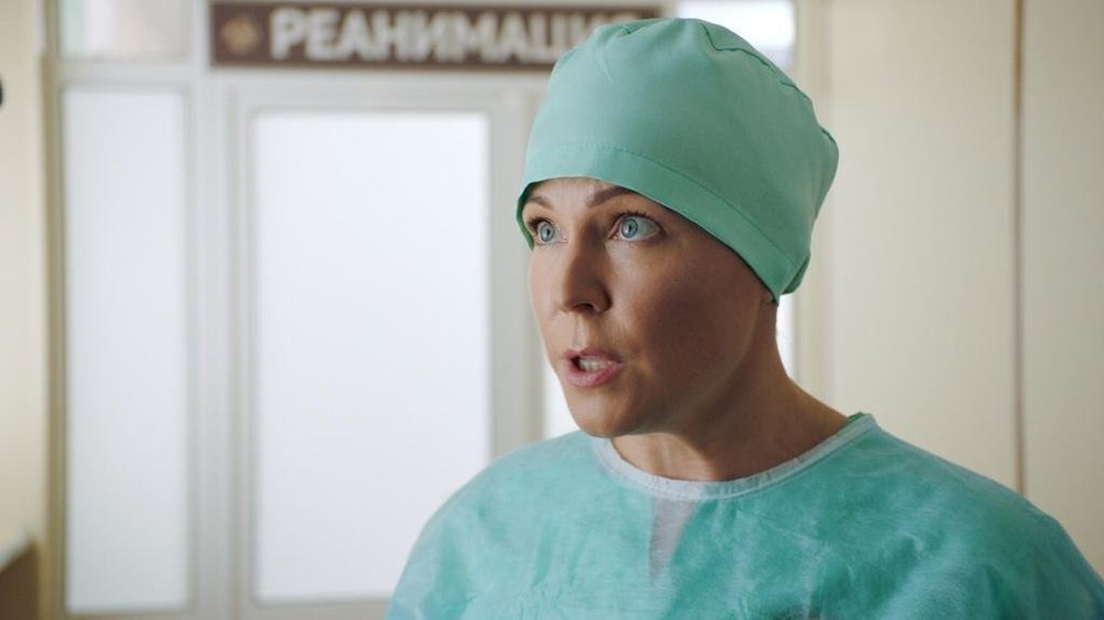
Hello Daniel,
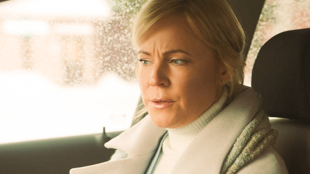
Thank you for such a tremendous effort. I'd go with Phil - the final grade seems to be the most appropriate for that particular scene. The guy warns her that her business (a hospital she runs) might be in serious danger because someone powerful wants that land. I've seen the first cut and noticed a very interesting mechanism. If the story is properly structured, performances are solid and the whole thing is generally engaging and believable - you get involved, you root for somebody and do not notice "the kitchen". Only when the story is weak in its core you notice the shortcomings. The grade might be perfect per-se but I guess it will never save the writing.
-
On 3/1/2022 at 2:08 PM, Phil Rhodes said:
The problem with this stuff is that there are a thousand "reasonable" grades for any one image, which is why I've always objected slightly to the deification of colourists. So long as you can keep it consistent from shot to shot and everyone likes it, there are no rules. In that context, the shot with the cyan eyes doesn't look that wrong to me. It's cold in tone, but not to the point where I'd expect it to fail a quality control check.
I think Daniel's grades do have a certain golden tone that's slightly at odds with the rain on the window, but again, it's not wrong, particularly. Maybe this is a scene just after a rain storm when the sun comes out, when the characters have realised everything's going to be OK after all. Maybe it isn't. It depends.
One of the things you have to take into account is that light coming from different directions may be different colours. Assuming the actor is wearing a neutral grey coat, you can sample the collar either to the right or left of her face and get a different answer as to what's really correct.
If you like the version with the cyan eyes, go with it. It's art. You can do what you like.
Hello Phil,
Thank you for your thoughts. I've never expected that this minor issue would provoke such a profound thinking. Appreciate that! I like the way you dig deeper into the drama and art itself, where there are no rights or wrongs, and I much appreciate the idea of consistency which defines a choice. I'll keep it in my bag. Sorry it took me quite a while to reply.
-
18 hours ago, Daniel D. Teoli Jr. said:
That is a tough grade you got.
Basically, your image is too blue, at least on my monitor. That is the trouble with grades. They look different on every device you view them on. They are not like a print. Even then, the print depends on the lighting.
These grades may look terrible on your monitor, but they look OK on mine.


The color grading was done to the max adjustment for warming it in Lightroom 5. Also, some tests with desaturation a notch and some additional tint control in some. The only thing what did pretty good was max warming and hand retouching the whites.
I don't remember which image was which, so don't ask. Just playing around with options. The image with the whitest eyes were retouched. The rest of the images did not have the eyes retouched.
If you want to keep your images blue with white eyes, I think you are going to have a hard time unless they have some crazy AI software for it.
Do they have cine' retouching software that can just target the white of the eyes or does it have to be done frame by frame?
I'm thinking your lightning / color balance was bad...but I'm no expert on lighting. Maybe she does have blue eyes?
Good luck figuring it out!
Hello Daniel,
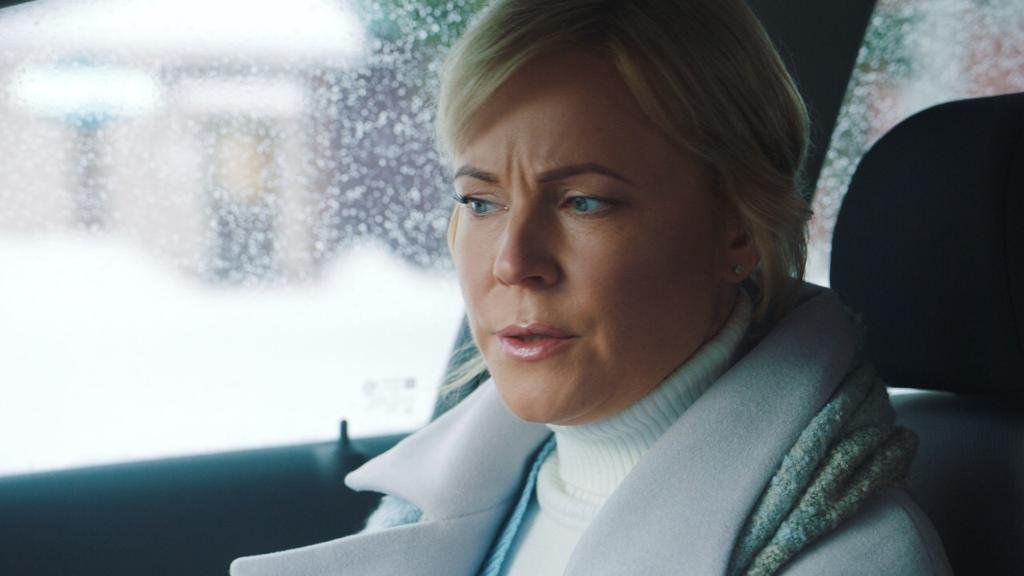
Thank you for the work you've decided to put into those images. Much appreciated! It's so true - everything looks different on any display. Your grades on my display, for instance, have a warm, slightly pink tint, creating a different mood. However, the whites are perfect - so it feels natural. The director likes the blueish-green tint created by the glass of the windows of the car, though. So I'll try to work on saturation, while keeping the original tint. I don't remember if the actress were wearing contact lenses. Could those be the reason?.. I remember we used additional LED-light coming in through the windshield. I think now, looking at your grades, I should have paid closer attention to that light source. Anyway, thank you again for sharing your thoughts!
A.
-
On 2/18/2022 at 9:48 AM, David Mullen ASC said:
You’d have to ask your colorist. The first shot seems fine but the second might have too much saturation in the cyans which is exaggerating it in the eyes.
David,
Thank you! I'm going to see the guy today. Hopefully it is saturation. I've come across an article which describes a dozen
deseases resulting in this eye condition.
-
1 hour ago, David Mullen ASC said:
Fremen actors?
David,
I wish I could boast of having worked with those folks. These actors are common Russian people with a little too much make-up on which I miserably failed to negotiate down. Is the answer really this obvious?..
-
Friends,
I have just received several pieces of graded footage.
The whites of the eye went visibly blue.
What could be the reasons behind that?
Every opinion would be of high value for me.
Thanks!
A.

-
Hi Stephen,
Thank you for a valuable comment.
The chance to use those LED panels is getting even thinner now, I guess..
Anyway, I am looking forward to running a little test.
Hopefully, those LED panels are going to surprise all of us.
A.
-
Phil,
I think all these are working solutions.
However, for this one I'll stick to the floodlights. They seem so simple to handle.
I've found some green ones and some blue ones. Quite inexpensive, too.
The only thing that I can't see before I do it - how many of them I might need to properly cover a certain area.
Hopefully, with RED sensors I won't have to use tonnes of these.
I guess it's a good idea to just get a couple of those lights first and see how they work.
If it doesn't work for some reason I'll keep the lights as practicals/back-lights, anyway.
Thank you for your help. Much appreciated.
A.
-
Green lights designed for architectural special effects... I love it.
It seems to be another good option that would never occur to me. I'll see into that.
I'll pay attention to whether these lights flicker or not when we run a little test.
Thank you, Phil!
A very valuable piece of information.
A.
-
Hi, everybody.
A production I am working with has a coupe of dozens of outdoor light panels (all identical).
They pretty much look like this one:
Those are 6500K LED light panels with light output of 8500 lm.
Obviously, they are easy to operate, powerful, robust, cheap and even weatherproof.
So, the producer asks me if we could also light our green screen with those and this question has puzzled me.
Has anyone ever tried anything like that? Does it make any sense at all? With green/blue filter? Flicker issues?
Any thoughts or experiences shared would be highly appreciated.
The camera I'm going to use is Red Monstro.
Thank you.
Anz
-
2 hours ago, Phil Rhodes said:
That sounds like the right approach.
Bear in mind that quite a lot of things that you wouldn't think will flicker actually do; there's more flicker in modern LED lights than there was with fluorescent, for instance.
90 isn't that fast; if you were talking about 900 you'd have more concerns. Some HMIs do okay at lowish rates, but may start to cause problems at really high frame rates.
Test everything.
P
Hello, Phil! Thank you for your notes on flicker and high frame rates. I hope I'll be able to run a few tests.
-
39 minutes ago, Bruce Greene said:
Why not shoot 100fps?
Bruce, 90 fps seems to be the maximum available in this mode, i.e. Open Gate ARRIRAW on Arri Alexa SXT... Going to double check, though!
-
Dear friends, what should I expect when shooting slow-motion with rather unusual fps for a standard 25 fps project? Say, 90 fps?
My strategy is to try to avoid any 50/60 Hz related equipment and then accurately slow down the footage in post to maintain the correct shutter speed of 180 degrees.
Does it make any sense?
Any advice would be much appreciated!
-
I have confused Americans with Pete Tong references, but yes I think most places would understand 86 because of staggering American cultural hegemony.
One thing that non-Brits don't seem to get is "split the difference" which is not film terminology but has confused French, Japanese and Americans in my recent experience, and it's not a language problem.
For reference, it's a directive to use something halfway between two recently-discussed options and often comes up when positioning people - "Take a step to your right, no, too much, split the difference."
This is wonderful. I can now think of an adequte phrase that exists in Russian but being a non-native speaker I could never come up with something so graceful. "Split the difference". Love that. Thank you.
-
*Knock off" a light will usually result in it being switched off (assuming you don't mean stealing the light, which is another meaning of that term) and "bring down" could result in it being derigged. or lowered. If you want to to lower the light levels you usually have to say how you want to lower the light level eg ND, scrim, fade down, dim.
Terms like "lose the Kino" or "kill the redhead" are not that unusual. Organizations or different sectors can have differing terms e.g. the BBC calls chroma key, C.S.O. (Colour Separation Overlay)
I haven't heard a one word for the sun and clouds. it's usually "the sun's in and out" or "it can't make up its mind".
I heard "Joan Collins" being used in the late 1990s.
Brian, That is exactly what I wanted. Thank you. Could you think of any words related to dolly-work. For instance, what do you call type of shot when the object in in the center of a circle and you're on dolly circling around? Is it an ark-shot?..
Sometimes English-speaking directors use words such as "punch in". Are there any others of the same kind?
-
Thank you everyone.
I realise I might have not made myself clear.
Phil, I'm with you on that.
David, thank you for your post.
Things I'd like to know are the words like "open up, stop down, lock down" etc.
Do you "knock off" the light if it's too much of it or do you "bring down"?
Another good example:
What do you call a situation when the Sun constantly pops out of the clouds and then hides so that it's impossible to predict if you're going to have a take.
We have one word for such situation.

Peach-colored walls in jumbo-light
in General Discussion
Posted · Edited by Anzer Sizov
Dear friends,
I am about to shoot in a hospital, where all the walls are painted in a sort of warm peachy color. I'll have to use jumbo lights there and have not yet figured out how do get around it. Should I try making the light cooler by sticking some CTB onto the windows? Do I pump in as much light as I could so that all the walls go darker?.. Any thoughts and suggestions would be much appreciated.