Anzer Sizov
-
Posts
29 -
Joined
-
Last visited
Recent Profile Visitors
3,909 profile views

-
Dear friends, I am about to shoot in a hospital, where all the walls are painted in a sort of warm peachy color. I'll have to use jumbo lights there and have not yet figured out how do get around it. Should I try making the light cooler by sticking some CTB onto the windows? Do I pump in as much light as I could so that all the walls go darker?.. Any thoughts and suggestions would be much appreciated.
-
Hello Abdul, Thank you for your detailed response and all the thoughts and suggestions you've kindly shared. It's obviously good to learn the best practices from the more experienced craftsmen. To be able to apply them adequately, to combine, to reinvent etc. But ultimately it's about one's own way of thinking and interpreting. That what makes us all different, hopefully. As filmmakers and as human beings alike. Thank you for the book, too! A.
-
Hello David, Thank you for taking the time to respond. I've always felt rather reluctant to dive way too deep into the technicality of the lighting process. Even though I understand that it's a part of the craft and do understand quite a bit, my focus always shifts onto the story itself, the atmosphere, where to put the viewer (i.e. where to put the camera) etc. So, your advice seems simple, straight-forward and reassuring and I guess I'll follow along. Thank you. A.
-
Hello friends, It might have become second nature to many of you, but I'm puzzled. How do I calculate which lights exactly I should be using in a certain space, aiming for a certain exposure? I mean, is this at all common practice to calculate this way? For instance, we enter a room during the recce. Let's say I measure the light by the window, in the middle of the room and also in the darkest corner. And also outside, where the background is, obviously. And I like the way it falls off the further you get from the window. I just need to triple the quantity to have proper exposure inside along with some background, too. How do I proceed, so that ultimately I would end up having enough light but also saving some money? I've been in situations when I brought in big lights and eventually, it was way over the top. When I really needed them the next time, I could not afford them. I feel that the distance is important and the inverse square law might also step into play. But how does it all come together? Any piece of advice would be much appreciated. A.
-
Looking for B/W LUTs to load onto an old Arri Alexa Plus camera
Anzer Sizov replied to Anzer Sizov's topic in Post Production
Hello, Chase! Thank you for such a detailed response. "Legacy" is such a beautiful word in this context. I will try using the ARRI LOOK CREATOR Tool. Do you know if there are any old LUT libraries available to download? Thank you again for your time! I appreciate that. A. -
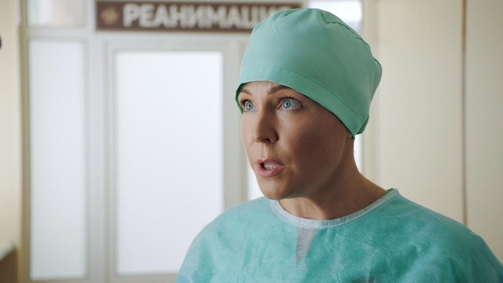
Friends, I'm looking for B/W LUTs to load onto an old Arri Alexa Plus. If anybody could share a few ~.aml files I would be grateful. I understand that I might be raising some eyebrows. Still, I would much appreciate any help. The shoot itself will be, obviously, color for B/W. Interior (Concert Hall of a small town). All Tungsten light (Arri). Thanks.
-
Whites of the eye go blue after color-correction
Anzer Sizov replied to Anzer Sizov's topic in Post Production
Hi Daniel, I've just watched the trailer. I see what you mean. According to IMDB (https://www.imdb.com/title/tt1034303/technical?ref_=ttfc_sa_5) it was Kodak 500T. It really works fine. I guess it is all about the coherence between the meaning/atmosphere/feel you want to convey and the colors/tones/hues you end up applying. An innocent pair of slightly off-colored eyes and so much to think of. -
Whites of the eye go blue after color-correction
Anzer Sizov replied to Anzer Sizov's topic in Post Production
Hi Mark, Again, it took a while to respond. My apologies. Thank you for your thought, much appreciated. You've made me think that grading may easily be done in a sort of 'lazy' manner, when a certain preset is applied. For instance, the "trusty" one that usually makes most of the material look both acceptable in terms of QC and "beautiful" according to the TV-people, who commission the production. -
Whites of the eye go blue after color-correction
Anzer Sizov replied to Anzer Sizov's topic in Post Production
Daniel, Thank you for your thoughts on post-work. I guess, one might end-up highly depending on the colorist (especially the one who's been working closely with that platform or this TV-channel). The guy might be following certain patterns that will tick the necessary boxes with the client - which may not be what a cinematographer has in mind. Understanding the importance and versatile possibilities of post-work, I still try to do as much as possible on-set. Looking in those fremen eyes again, I guess I should try harder. Thank you! I'm sorry it took me this long to reply to your posts. -
Whites of the eye go blue after color-correction
Anzer Sizov replied to Anzer Sizov's topic in Post Production
Hello Daniel, Thank you for such a tremendous effort. I'd go with Phil - the final grade seems to be the most appropriate for that particular scene. The guy warns her that her business (a hospital she runs) might be in serious danger because someone powerful wants that land. I've seen the first cut and noticed a very interesting mechanism. If the story is properly structured, performances are solid and the whole thing is generally engaging and believable - you get involved, you root for somebody and do not notice "the kitchen". Only when the story is weak in its core you notice the shortcomings. The grade might be perfect per-se but I guess it will never save the writing. -
Whites of the eye go blue after color-correction
Anzer Sizov replied to Anzer Sizov's topic in Post Production
Hello Phil, Thank you for your thoughts. I've never expected that this minor issue would provoke such a profound thinking. Appreciate that! I like the way you dig deeper into the drama and art itself, where there are no rights or wrongs, and I much appreciate the idea of consistency which defines a choice. I'll keep it in my bag. Sorry it took me quite a while to reply. -
Whites of the eye go blue after color-correction
Anzer Sizov replied to Anzer Sizov's topic in Post Production
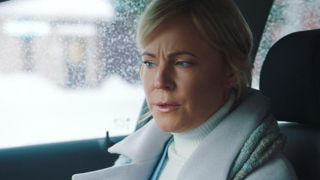
Hello Daniel, Thank you for the work you've decided to put into those images. Much appreciated! It's so true - everything looks different on any display. Your grades on my display, for instance, have a warm, slightly pink tint, creating a different mood. However, the whites are perfect - so it feels natural. The director likes the blueish-green tint created by the glass of the windows of the car, though. So I'll try to work on saturation, while keeping the original tint. I don't remember if the actress were wearing contact lenses. Could those be the reason?.. I remember we used additional LED-light coming in through the windshield. I think now, looking at your grades, I should have paid closer attention to that light source. Anyway, thank you again for sharing your thoughts! A. -
Whites of the eye go blue after color-correction
Anzer Sizov replied to Anzer Sizov's topic in Post Production
David, Thank you! I'm going to see the guy today. Hopefully it is saturation. I've come across an article which describes a dozen deseases resulting in this eye condition. -
Whites of the eye go blue after color-correction
Anzer Sizov replied to Anzer Sizov's topic in Post Production
David, I wish I could boast of having worked with those folks. These actors are common Russian people with a little too much make-up on which I miserably failed to negotiate down. Is the answer really this obvious?.. -
Friends, I have just received several pieces of graded footage. The whites of the eye went visibly blue. What could be the reasons behind that? Every opinion would be of high value for me. Thanks! A.