


Jall Cowasji
-
Posts
6 -
Joined
-
Last visited
Posts posted by Jall Cowasji
-
-
First off, thanks so much for weighing in on this David. Your generosity on this online community is astounding.Vertigo used fog filters for those scenes so a ProMist would work or other misty filters like GlimmerGlass.
I was coincidentally just looking into Glimmer Glass today. Do you notice a marked difference in the results from promists vs. glimmer glass?
-
Thanks Akos this is great!
-
If you don't have money for filters, using stockings over the front or the back of the lens can help:
Thanks so much Akos! This is a great resource! I do have access to a few filters through NYU (though no opportunity to test prior to checkout!), since I'm a student there. They mostly have a range of black and white promist, along with ultra cons and glimmer glass. Any thoughts on these vs. stockings, or pairing multiple filters together?
-
Hi all. Excited to ask my very first question on this forum!
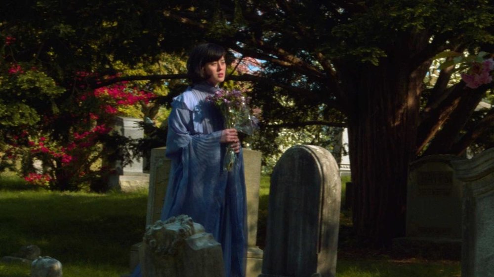
For an upcoming short, I'm trying to achieve a pastel, somewhat low-contrast color palette in a bright daytime exterior, very much like the attached reference image from Vertigo. Being a micro budget project, I don't have the opportunity to pre test a bunch of filters or lenses. Any recommendations on filtration for this reduced contrast, slightly blooming look?
For the project, I'm using the Ikonoskop A-Cam DII. I own this camera, and the colors from its Super16 Kodak CCD sensor feel inherently pure and dare I say film-like. I'm pairing it with oldish glass, the Cooke 9-50 Varokinetal (T2.5). I've rented this lens before and it is not only affordable but renders a very creamy three dimensional image. I've attached a sample I shot with this configuration, no filters. Just need to turn that into something less contrasty, more talcumy, more "vintage" for lack of a better word.Thank you!
Jall


How To: Low-Con Pastel Colors in Bright Day Exteriors?
in Lighting for Film & Video
Posted
Great point Mark! Rather than going too heavy on that soft, bloomy quality, I’m really looking to lower contrast. Another element of the Vertigo screen grab that I love is the subdued nature of the colors, and I feel like I see a tint of brown in all the colors. I’m really after that. Some of the tests I’ve seen with stockings do render a similar color palette, but are often too heavy on the glowy effect.