Jay, you make good points, from a position of humility (humility being the true definition of open-mindedness.)
I had early faith that Graeme Nattress and Ted Schilowitz knew what they were getting into. And with Jim's passion and resources, not to mention his anti-corporate approach to things, it seemed the odds of them pulling off something revolutionary really were pretty good. So this story is as much a study on what can happen when your resources are vastly expanded (from the technician side of things), and when you're managed by someone who's business passion is based on respect and openness (with the employees, especially).
I was pessimistic about the "look" initially. Everything "published" looked flat, and after many hours of trying to color-correct it, I was never happy with the results. Specifically, the contrast. And it was frustrating to realize that questions could be met with antagonism, but I just chalked it up to enthusiasm.
I struggled to achieve the look I wanted, without sacrificing the exposure latitude, and couldn't do it. (I started my career as a custom-color printer, so this was disappointing to me.)
So while you've just been disappointed, my view of the "hero" tif (in the above mentioned thread), has made me feel relieved. Strong contrast, good skin tone, apparently no herculean effort to get it to this "normal" state, and still lots of detail available in the shadows. (These jpgs, without color management, are terrible, but that's going to be my fault.
Personally, my approach to this camera, has nothing to do with 35mm.
It has to do with delivery of goods. If we're going to compare Red's qualities to 35mm, where do we make the comparison? To 35mm that's just been exposed? Red wins. (That's a joke, but I'm making a point, here.) To 35mm that's just been processed? Well, at least we have an image we can look at. Or do we compare it to 35mm that's gone through its final grade? And if we compare Red to something that's been graded, then we're really comparing Red to a very mature 35mm workflow! Comparing a fledlgling workflow to an established one, makes for a pretty precarious "comparison." At least if you want to make absolute statements.
And while the 35mm comparison is a necessary one for where 35mm is already in use, the comparison tends to ignore those aspects where 35mm is completely deficient. The economic angle, alone, to this camera is crazy. Even from the digital/video side. Not only does it cost less than your typical HD deck, it provides all the advantages of a digital workflow with over-the-counter equipment. If someone buys this camera to simply shoot local-level commercials, they still come out ahead :P.
I believe a lot of the "look" of this camera is going to depend on the different processes people adopt, and even discover, for it.
And with 750 Reds in reservation for the LA region alone, there's going to be a lot of collaboration. That will certainly help illuminate some of the shadows surrounding Red's workflow! So don't give up hope on seeing further improvements ;)
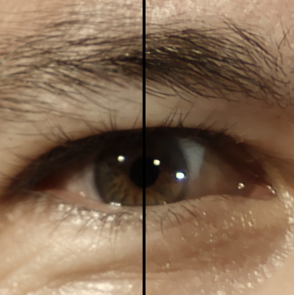
As to the smudgy look, here's a cropped post from the "eyes" tif (from the same thread above). I don't think they had applied any sharpening to the footage, but would you have objections to what I've done here in Photoshop (no color correction, just going after detail)? It's pretty heavily compressed now, due to the 100k limit, but the comparison seems to show a slight improvement in eyelash detail, without overemphasizing skin pores. Or what were you referring to specifically?
(Um, that's not a leading question to spark a fight. I'm curious. And I am willing to be taught a thing or two :))
Yes, make-up would be a good investment :) There's nothing forgiving about digital highlights. Yet :)
Glen