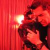
Arc Posted September 15, 2006 Share Posted September 15, 2006 (edited) Hello I would like you guys to take a look at trailer of my graduation/thesis film shot in 35mm called ?Kichiro?, which means lucky son in Japanese. I don?t have a reel but I would like to have some feedback on the trailer. I shot it using an ARRI BL2 camera which does the job but it?s not in a mint condition. The camera is heavy and bulky but I did a lot of handheld work. I used Kodak Vision2 500T for interior scenes and Kodak Vision2 50D for exterior scenes. In the interior scenes I created all the lighting set up and played around with gels on the lights to have a mix lighting condition. For the exterior scenes I didn?t use HMI or any kind of lights, sometimes I used a reflector but nothing else so I had to adjust exposure constantly due to changes in the sun and weather. Here is the link to download the trailer: http://www.kichiro.adinfinitumfilms.com/trailers.html thanks Edited September 15, 2006 by Salvattore Eterno Link to comment Share on other sites More sharing options...
Morgan Peline Posted September 15, 2006 Share Posted September 15, 2006 Lots of blood! Can't really say about the cinematography though as the trailer is quite short. Do youy have anything longer you could show? Link to comment Share on other sites More sharing options...
Mark Williams Posted September 15, 2006 Share Posted September 15, 2006 Lots of blood! Can't really say about the cinematography though as the trailer is quite short. Do youy have anything longer you could show? The soundtrack was great Its not bad But I think it needs a little more Info about the film instead of generalising so much perhaps reveal some of the story? I also thought the lighting was not apropriate for this kind of film and the camera was not always at the right height To me sometimes it looked like news footage.. I think a little more work is neccesary but it does show promise! Link to comment Share on other sites More sharing options...
Terrence L Daniels Posted September 16, 2006 Share Posted September 16, 2006 don't know if it's me, but i'm getting 4.4kb for a download speed and i have broadband???? Link to comment Share on other sites More sharing options...
Albert Smith Posted September 16, 2006 Share Posted September 16, 2006 first suggestion, make a quicktime version. Link to comment Share on other sites More sharing options...
Arc Posted September 17, 2006 Author Share Posted September 17, 2006 YEAH I will try to get something longer. All comments and criticisms are welcome, encouraged and needed. Otherwise you never learn. Thanks boys. Link to comment Share on other sites More sharing options...
Gunleik Groven Posted September 23, 2006 Share Posted September 23, 2006 YEAH I will try to get something longer. All comments and criticisms are welcome, encouraged and needed. Otherwise you never learn. Thanks boys. Too much text, bad font and little info. Hard to say too much about the images from a med-rez Windows File... Start off with some stunning images, and let the formal (and not so interesting, but maybe important) info come as breaks inbetween important pictoral sequences. I would maybe not have chosen that cut for the slap on the woman as the angle and her (non-)reaction sort of contradicts what we are supposed to feel/see - or maybe I'm wrong. Looks violent! -;) Just my 2c Gunleik Link to comment Share on other sites More sharing options...
Guest Robert G Andrews Posted September 23, 2006 Share Posted September 23, 2006 Kichiro Is it possible these days to graduate with a "thesis" such as ?Kichiro?? Do you think this was visually interesting? Why so many credits? Was the story of interest? Had you thought about the strength of the story? Personally I'd spend a lot more time on the writing side. Link to comment Share on other sites More sharing options...
Premium Member Bill Totolo Posted September 23, 2006 Premium Member Share Posted September 23, 2006 I'm just curious if you tested the gels you chose on those flesh tones before the shoot. There are so many shades of every color. I'm not sure the one's you chose complimented the actor's faces. Even it's not meant to compliment, theres something about the way someone like Christopher Doyle can use gels and still find some kind of balance while enhancing the story. What were you going for or trying to accomplish? Did you acheive it in your opinion? Thanks. Link to comment Share on other sites More sharing options...
Arc Posted September 25, 2006 Author Share Posted September 25, 2006 Too much text, bad font and little info. Hard to say too much about the images from a med-rez Windows File... Start off with some stunning images, and let the formal (and not so interesting, but maybe important) info come as breaks inbetween important pictoral sequences. I would maybe not have chosen that cut for the slap on the woman as the angle and her (non-)reaction sort of contradicts what we are supposed to feel/see - or maybe I'm wrong. Looks violent! -;) Just my 2c Gunleik Yeah, I did not make the trailer version. I was the cinemtagrapher for this movie and the Director sat with the editor and created the trailer on his own. I would like to put the whole movie in a quicktime version online so you can see the whole thing. thanks for checking my work Kichiro Is it possible these days to graduate with a "thesis" such as ?Kichiro?? Do you think this was visually interesting? Why so many credits? Was the story of interest? Had you thought about the strength of the story? Personally I'd spend a lot more time on the writing side. As I mentioned before I was the DP for this movie. I had NOTHING to do with the story. You are right the story is the single most important thing in a movie but that part was completely out of my hands. About the credits I guess the director wanted to put as much info about names and people as possible in the trailer. I guess it was not the best idea. I had no saying about the trailer because the director created the trailer together with the editor. I wanted to get some feedback about the cinematography even though the trailer is short. Thanks for reviewing my work I'm just curious if you tested the gels you chose on those flesh tones before the shoot. There are so many shades of every color. I'm not sure the one's you chose complimented the actor's faces. Even it's not meant to compliment, theres something about the way someone like Christopher Doyle can use gels and still find some kind of balance while enhancing the story. What were you going for or trying to accomplish? Did you acheive it in your opinion? Thanks. Yes indeed so many shades because that particular scene is suppossed to be a house party so i tried to recreate a 'disco club' look. I must tell you I played with a lot of gels and i didnt want to get one color in particular. I wanted people to look green, red, blue, orange. That was my purpose so I wanted to have that mixture of shades or every color. In my opinion I dont think I achieved what i wanted because as you know, when it comes to art, you can always do it in a different way. I am ok with the result and I know I need to learn so much more. Unfortunately I could not be present for the screening of the finla 35mm print in teh lab in thailand. My director, editor and producer told me that it looks good, specially the party scene. I had no input on the story at all as I mentioned before that was the directors work. thanks for reviewing my work. Link to comment Share on other sites More sharing options...


Recommended Posts
Create an account or sign in to comment
You need to be a member in order to leave a comment
Create an account
Sign up for a new account in our community. It's easy!
Register a new accountSign in
Already have an account? Sign in here.
Sign In Now