


blake williams
-
Posts
24 -
Joined
-
Last visited
Everything posted by blake williams
-
On imdb, under the personal quotes of Peter Hyams he supposedly expresses his dislike for zoom lenses. Does anybody know if this is correct and what the source was? Imdb has misquoted him before.
-
Is this a lighting or post thing?
blake williams replied to Graeme McMahon's topic in Lighting for Film & Video
Thanks for the wise words Jared. You really struck a blow for good vibrations with that comment. -
Is this a lighting or post thing?
blake williams replied to Graeme McMahon's topic in Lighting for Film & Video
"Crimson tide" comes to my mind, although they certainly were meant to look sweaty for some scenes. Mr. Mullen, your dedication to answering questions and helping is truely admirable. I didn't pick better words because pointing out that the DP doesn't do the make-up and that there is collaboration between departments seemed redundant. Also, It was obviously not the point of the post. I cannot see how the real point of the post could be misunderstood without it being a conscious effort. If you feel passionate about correctness in every aspect before giving a reply then I understand and thats fine. -
Is this a lighting or post thing?
blake williams replied to Graeme McMahon's topic in Lighting for Film & Video
Thanks for the reply. I do understand that it is the make-up department that apply the make-up. I do understand that film is a collaborative artform. My interest is only in the effect itself and not how the creative choice is made. So the effect would not be employed solely as an unmotivated stylistic choice, not for the purpose of creating a sweaty look? .. -
Is this a lighting or post thing?
blake williams replied to Graeme McMahon's topic in Lighting for Film & Video
..yes..The correctly formulated question: Will some DPs order the make-up department to apply oil to the actors faces in every shot to achieve this certain look? If so are there any examples? -
Is this a lighting or post thing?
blake williams replied to Graeme McMahon's topic in Lighting for Film & Video
Will some DPs apply oil to the actors faces in every shot to achieve this certain look? If so are there any examples? -
Breakdown of Ridley Scott's 80's Films' Lighting
blake williams replied to Francisco Martins's topic in General Discussion
that is exactly right. A Ridley Scott film looks like a Ridley Scott film, so i believe the cinematographers were directed very specifically by him. Jan de Bont is the only one left to ask about that, all the others have passed away (incl Adrian Biddle if we include 1942/Thelma and Louise) -
Breakdown of Ridley Scott's 80's Films' Lighting
blake williams replied to Francisco Martins's topic in General Discussion
Great initiative. In my opinion, these are 4 of the most beautiful films ever shot (I would also put 1492: conquest of paradise on that list). I am also dying to know more about how it was accomplished. I know the audio commentaries for these pictures by heart, unfortunately Scott dont go into much technical detail about the images. also I would love to know more about the grading for the films (not Blade runner:the final cut which looked terrible). I don't know who would have this knowledge to share with us though. -
Blade Runner: The Final Cut
blake williams replied to David Mullen ASC's topic in On Screen / Reviews & Observations
well I dont watch films through photoshop. on a well calibrated tv set the shadows are black, and the shift in color looks terrible. For the people talking about how it was projected in the cinema, I just dont know, but for the dvd/blu-ray, it sucked. Its just not the same film. Have a look if theres any doubt in your mind. its all right here: http://www.dvdbeaver.com/film/DVDReviews24/bladerunner.htm -
Blade Runner: The Final Cut
blake williams replied to David Mullen ASC's topic in On Screen / Reviews & Observations
well I dont -
Film Flashing, what is it and how do you do it?
blake williams replied to blain murphey's topic in Film Stocks & Processing
Any examples of colored flashing other than Young Winston? Did Tony Scott ever do any yellow toned colored flashing on any of his films? -
Does anybody know what filters Peter Hyams used on 2010? Looks like double fogs to me.
-
Blade Runner: The Final Cut
blake williams replied to David Mullen ASC's topic in On Screen / Reviews & Observations
Hi Mr Mullen. I thought I would get an email notification if you responded, but looks like I havent set that option up correctly cos I just discovered your reply. Ive often wondered to what extend a "look" was a result of a paticular type of video transfer. Ive never seen Blade runner in the cinema. I grew up looping an old vhs copy of the film back in the dark middleages of pan and scan. still remember what a revelation it was when it was transmitted in wide screen on danish TV. since then I looped my laserdisc, then dvd and now the blu-ray. The difference im talking about is noticable in these comparisons: http://www.dvdbeaver.com/film/DVDReviews24/bladerunner.htm Look especially at the shot of Holden/Morgan Paull. The top version is so beautiful I feel like I could replace my wedding photo with it. However, I think the blu-ray shots looks quite different. Im very fond of dark color and details in the shadows, but in this new tweak the shadows are crushed into solid blacks, also I think the shift in color is quite staggering. Also check out the difference in this shot of Rutger Hauers eyes. http://kintespace.com/rasx45.html Maybe that top look was a happy accident for me and my scale taste due to a inferior transfer, but I sure know what I like best. It was a similar problem I had when "the Last boyscout" went from dvd to Blu-ray. I never watch my Blu-ray. Do you not prefer one of these looks over the other? Thanks for your response -
Blade Runner: The Final Cut
blake williams replied to David Mullen ASC's topic in On Screen / Reviews & Observations
Hello mr Mullen. First I just wanna say how amazing your contribution to this forum is. Your enthusiasm in answering complex as well as simple questions is very admirable. Great stuff for those of us stuck in a small european country with a horrible film industry and not much clever film teaching going on. I was just wondering, what did you think of the alteration Ridley Scott did in the grading for the final cut? -
A Good Year
blake williams replied to Ignacio Aguilar AEC's topic in On Screen / Reviews & Observations
Never mind the movie, it was as terrible as I expected it to be, but I guess its important for directors to try new things. But I also didnt care for the cinematography. I do not agree that this was what Ridley/Tony/Mulcahy/Hyams did 30 years ago. The general problem I have with "new" cinematography is that there is too much contrast and the colors are too bright. The best example of the difference between then and now is the tweak thad Ridley did on "Blade runner the final cut". It used to be one of the most beautiful movies ever filmed, but in the final cut the shadows are jet black and the highlights burn out. Also it was toned more towards that trendy cyan. Terrible. That overall bright yellow of "a good year" was a visual nightmare for me. He did the same on "Body of lies".....And where is the anamorphic bokeh!! Never mind, thats my personal obsession. -
youre absolutely not the only one that prefer Sekulas cinematography in Tarantinos films. Both Dogs and Pulp fiction were visual masterpieces, whereas the "high-budget????" look of Inglorius basterds was an exercise in tedious imagery. But different strokes for different folks I guess
-
Blade Runner
blake williams replied to Carlos M. Icaza's topic in On Screen / Reviews & Observations
I wonder why scott messed with the contrast and the colors in "the final cut". looks terrible. I enjoyed the added scenes, but I always watch the directors cut because it looks substantially better. -
ultrascope=techniscope
blake williams replied to blake williams's topic in Lenses & Lens Accessories
so ultrascope was basically a purely rear anamorphic adapter based format?.. it should be named poor mans anamorphic :-) -
ultrascope=techniscope
blake williams replied to blake williams's topic in Lenses & Lens Accessories
well an anamorphic rear adapter is a no go for me then.. you can take anything but my anamorphic bokeh :-) I own two anamorphic front adapters. the problem im having is that I would like to shoot with 300-500mm and they stop functioning at about 200mm. does rear adapters also exist in 1.5x and 1.75x squeeze? does a rear adapther have to be manifactured specifically for the lens youre using? -
ultrascope=techniscope
blake williams replied to blake williams's topic in Lenses & Lens Accessories
thanks for the pics bruce. your lomo attachment also looks very rectangular but I guess its just covers a 4perf frame in the center of the glass and not necessarily all the way out to the horisontal edges. so your rear anamorphic attachment has its own focus right? can you tell me please how a spherical lens with a rear anamorphic attachment differs from a spherical lens with a front anamorphic attachment and finally how the two differs from a real anamorphic lens?...if you have the time that is :-) -
ultrascope=techniscope
blake williams replied to blake williams's topic in Lenses & Lens Accessories
hi Bruce, I know about the stretching to 4perf in post. what got me puzzled about ultrascope was this pic of the rear element of an ultrascope lens. is this opening supposed to cover a full 4perf frame with a 2x anamorphic image? looked a little too rectangular to me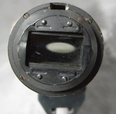
-
ultrascope=techniscope
blake williams replied to blake williams's topic in Lenses & Lens Accessories
Hi chris, thnx for the reply doesnt 2perf use some rear anamorphic elements? is it really just a cropped spherical -
ultrascope=techniscope
blake williams replied to blake williams's topic in Lenses & Lens Accessories
yes.. but does anybody know if Ultrascope is a 2perf anamorphic format like Techniscope?? I can see why the name thing might be important...call me blake williams -
Hi. Does anybody know if Ultrascope is a 2perf anamorphic format like Techniscope?? Thanks