David Mullen ASC
-
Posts
22,292 -
Joined
-
Last visited


About David Mullen ASC

- Birthday June 26
Recent Profile Visitors


-

Why is underexposed film so milky?
David Mullen ASC replied to silvan schnelli's topic in Film Stocks & Processing
The density of the blacks in the print is based on the printer lights used. You could process completely unexposed negative film, more or less blank after development, and then print it at various printer lights and find that the blacks get stronger as the printer lights go higher. So light and expose so that you can print it at higher printer light values if you want denser blacks in a print. -
If you're talking about overhead can lights, the ones above the frame can be blacked out with blackwrap (or the bulb unscrewed) or a piece of diffusion taped under them in a "belly" fashion to create some softness. Or arm a 4'x4' black flag overhead to block them off of the subject's face (or use a 4'x4' diffusion frame). Then add your own key light.
-
Cassavetes "Husbands" film stock?
David Mullen ASC replied to Rodrigo Menck's topic in Film Stocks & Processing
Listing the film stock in the credits is something that happened later in the 1980s. Likely "Husbands" was shot on 5254, which was often pushed one-stop.- 7 replies
-
- 2
-

-
- cassavetes
- kemper
- (and 2 more)
-
Hard light vs Soft light and color saturation
David Mullen ASC replied to Matt Henry's topic in Lighting for Film & Video
Frontal light matters more than whether it is hard or soft... but the more reflective the surface of the colored area is, the more a soft light will create some glare (robbing some of the saturation) whereas a hard light would have a smaller reflection in the surface. -
As you make clear, color is a very subjective experience for the individual so I’m afraid it’s up to you to create the colors you are seeing in your mind. If you said “I want this to looks like a dye transfer print”, all of us will have a different idea in our heads as to what that looks like, and you’d have to split-screen with dual projectors to show someone your reference versus your attempt to recreate it.
-
If the monitor is NTSC running at 59.94 fps, then the only way to have no roll bar is to run the camera at 29.97 fps (you’d still need to adjust the phase.) Or you run the camera at 23.976 fps, set the shutter to 144 degrees to make the roll bars thin, then use the phase box to either put one line in the center, or two lines in the upper and lower third of the screen. Or you get a 24 fps playback company to provide a 24 fps CRT monitor and 24 fps video playback…
-
In terms of the final result, the colors in the print (which is subtractive color), it doesn’t make a difference whether the colored light used to make the printer corrections was colored by filtering a single white light or by mixing colored lights, either way, the two pieces of film (let’s say, negative and print film in contact) are receiving a colored light that alters the color of the final print compared to if white light had been used. It’s still a subtractive color process because you see the results by shining light through a piece of film containing YCM dyes that filter out certain wavelengths. If you had three b&w prints and shined red, green, and blue light separately through each print containing that information, and overlapped the three colored images on the screen to create a single full color image, then that would be additive color. They are calling the printer itself additive versus subtractive depending how the colored light is generated but the color film process is subtractive.
- 13 replies
-
- 1
-

-
- color grade
- (and 1 more)
-
It’s a subtractive color process in the sense that the colors you see in the final print have dyes that subtract certain wavelengths. The fact that colored printer lights allow the image to be corrected doesn’t make it an additive process anymore than the fact that the original scene had colored light hitting the negative makes it an additive process.
-
If you're talking about newsmaking, there is also "Medium Cool"
-
Pre-lighting - Any suggestions?
David Mullen ASC replied to Nicolas U Hepburn's topic in Lighting for Film & Video
Seems fine for a wide master if you don't want just flat softlight overhead. In the singles I would have lowered and softened the light to feel more like they were coming from table lamps. Also a face doesn't always have to be at full exposure if the source isn't that close to them. -
FCP color processing of motion picture print stock is very automated / standardized, it's not really designed to be manipulated but maybe a small lab would be willing to try. I'm not sure why you are so against pushing the negative but want to push around the print stock... Anyway, Fotokem once had a demo of a high-contrast print image created I think by using a color print as an interpositive (still requiring a dupe negative be made for printing.) I could be mistaken. I still think all of these ideas are going far beyond recreating the look of 1950s/1960s color negative stocks -- they weren't THAT weird in color and contrast... Plus all of this is just to get a 16mm contact print that you can project? There's no need for a digital master, no D.I., you're going to A-B roll cut the negative, etc.? Because as soon as you have the option of digitally color-correcting the image, then changing saturation and contrast is relatively simple.
-
Recommended Filters to saturate image
David Mullen ASC replied to Ben Kahn's topic in Cinematographers
Polarizers help reduce glare off of reflective surfaces which can improve saturation so sure, try that. The only other filter that increases saturation are color enhancers but those mainly work on warm tones; they make fall leaves look more intense but they can also make faces look a bit plum-colored now and then so be careful. The truth is that increasing color saturation is fairly easy with digital. -
You can expose whatever you want to 3383 (16mm) but it was designed to create a projection contrast positive from a negative or dupe negative that has an orange color mask. So if you exposed a positive 3383 print image onto it, you'd get a high-contrast negative image with no orange color mask. You could print that again to 3383 to reverse it back to a positive image but then it would be very high in contrast, probably with some off colors. Film copying is always a negative to positive to negative, etc. process unless there is reversal film & processing involved. You also have to factor in that contact printing is usually emulsion-side to emulsion-side.
-
I think suggestions like using reversal or dupe stock or print stock as camera negative are too extreme to match color negative film of the 50's, unless you're trying to create some sort of degraded-over-time effect, like a transfer from an old print or something that got duped badly. It would be simpler to just push slower-speed camera negative stock a stop to reduce some dynamic range and add contrast, and then play with it in post. After that, it's really about lenses, filters, lighting, production design -- matching the general aesthetic values of people of the past in what they considered "proper" cinematography. That's the problem with creating the look of these old movies, it's all tied up in what we saw -- an old print (fading to magenta), a new print of an old negative (with yellow dye fade), a digital restoration from the negative, from YCMs, or a mix, from old IP, did we see it projected in 35mm, digitally (2K, 4K, laser, etc.), on blu-ray, etc. Too many variables.
-
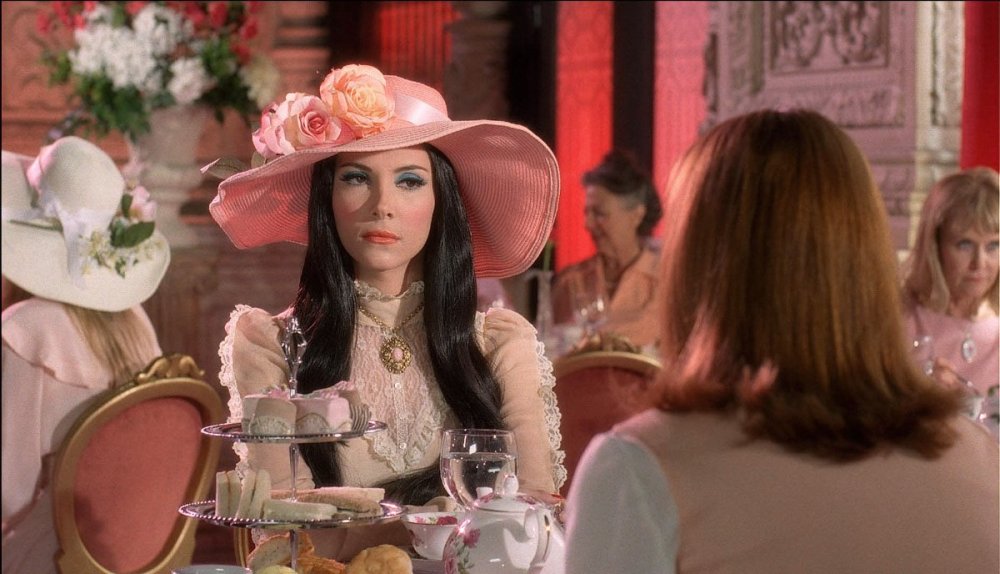
Here is a shot from dailies for "The Love Witch" -- in this case 250D instead of 200T because I couldn't gel the daylight windows. Zeiss Super Speeds (so a bit sharper than the Cookes and Baltars of the 50's and 60's) but with some diffusion on the lens (a light net combined with a 1/8 Classic Soft filter.)