Search the Community
Showing results for tags 'color'.
-
Lots of uses for them. Also includes shades of gray, black and white. Full collection... Colored, White, Gray And Black Page Collection D. D. Teoli Jr. A. C. : D. D. Teoli Jr. A. C. : Free Download, Borrow, and Streaming : Internet Archive <><><><> Daniel D. Teoli Jr. Archival Collection Daniel D. Teoli Jr. Small Gauge Film Archive Daniel D. Teoli Jr. Advertising Archive Daniel D. Teoli Jr. VHS Video Archive Daniel D. Teoli Jr. Popular Culture Archive Daniel D. Teoli Jr. Audio Archive Daniel D. Teoli Jr. Social Documentary Photography
-
Hello all! I am very curious about your opinions and thoughs on lighting in LOTR trilogy. I have made this video-essay, where I am focusing on conceptual lighting techniques and how it tells information, pushing narrative and impact audience. I would like to have a discussion about this, if you are interested! You can watch here: Thank you and looking forward to your thoughts!
-
- lighting
- cinematograhy
- (and 6 more)
-
Hi All. I hope the global reach of this forum could help me out here. I am looking for any articles, blog posts, behind the scenes, etc relating to the Color and Cinematography of the film "RRR". Any interviews with Shiva Kumar, the Colorist or Senthil Kumar, the DP would be appreciated. Thanks very much! -Bob
-
- telugu
- indian cinema
-
(and 3 more)
Tagged with:
-
"When selecting between the Sony Venice and Arri Alexa 35 or Mini LF for their respective projects, what key factors do DPs consider? Furthermore, could you please explain the differences in terms of look, color, and skin tones between these cameras in detail? Thank you."
-
"When selecting between the Sony Venice and Arri Alexa 35 or Mini LF for their respective projects, what key factors do DPs consider? Furthermore, could you please explain the differences in terms of look, color, and skin tones between these cameras in detail? Thank you.
-
Hello everyone! So, when watching some series, I noticed the skin looked yellowish in an unnatural way. Do you think this happened because the makeup artist chose the incorrect undertone for the actors? Or it might be the type of lighting/colour temperature of the lights? I can also tell the makeup is only applied on the face and not on the neck, but that's a discussion for a makeup related forum I guess ? Thanks in advance.
-
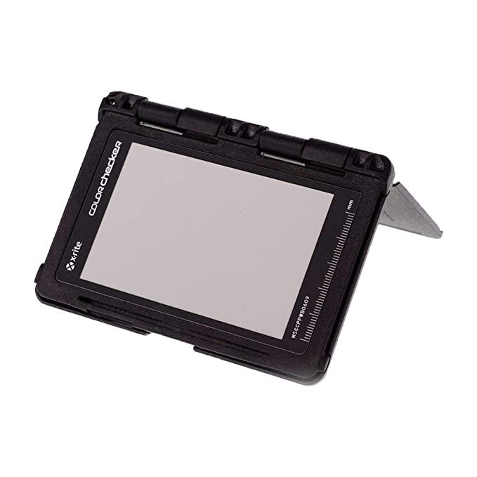
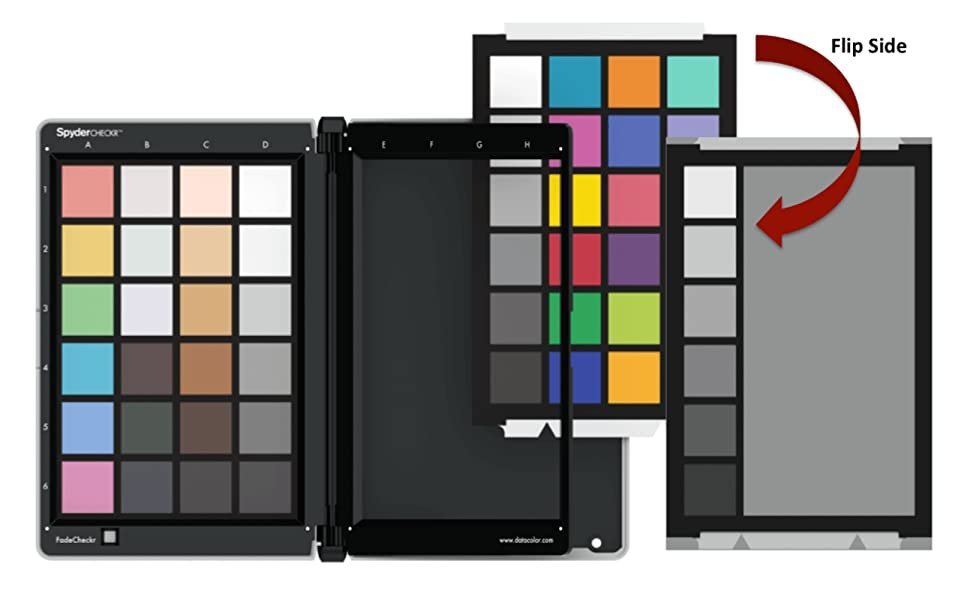
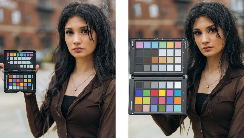
can someone experienced let me know answers to these questions. I have never used a color checker before. 1) How important is color checkers for Digital cameras recording in RAW or similar top quality formats ? 2) Is it a viable option for day to day use in movie production ? 3) Can we differentiate different skin tones using checker ? 4) If shooting outdoor, is it a good choice to use as day light intensity & temperature keeps varying through out the day ? 5) what are industry standard best practices for using color checkers ? 6) what is the best company color checker available in market ?
- 2 replies
-
- colorchecker
- color
-
(and 3 more)
Tagged with:
-
While using the Sony fx9 using slog3 in a low light scene using Iso 4000 I have found a lot of noise and I was also using T2, why is this happening, is there any solution to it?
-
So I’ve been shooting on the BMPCC 4K for the last couple months, my first proper cinema camera that I’ve owned. Each project I’ve shot with Blackmagic’s RAW setting which obviously means massive file sizes. I’m planning on playing with ProRes 422 to test on some shoots but was wondering: how much of a difference is there really between the two? I understand that RAW gives you more ability with things like highlight recovery, changing color temps and ISO in post, etc. But assuming you’re exposing correctly on the day and intentionally shooting with a particular WB, how big of a difference does it really make? ProRes would likely make for an easier post workflow due to file sizes, but I’m curious to hear your thoughts.
-
Whilst one might purchase a roll of 250D and 200T and test this out as I would, as it happens, I have been wrung out of all my money the past three months. So, rather than try to self hypothesize in my head, I may as well put the proverbial nail in the coffin in an attempt to suppress my ADHD and OCD. Which leads me to my questions... A) Color-wise, what can one expect when using a tungsten balanced stock with an 85 or 85B filter, rather than simply daylight stock aside from the two-third stop of light? B) To further elaborate on question A, normally how significant is this color change? C) Lastly, For a pre eighties era film style, do you recommend using daylight balanced stock for all exterior daytime scenes, or go as far as to strictly use tungsten stock with an 85/85B filter for all exterior daytime scenes, a very common practice of a tungsten dominant era? Until of course I actually go out and test this myself I won't really have an answer I can be one hundred percent satisfied with, but rather one I can at least accept for a short while. And yes, I am aware of the 200 kelvin difference of the 85 vs 85B filter and will be putting this to the test as well once I can economically prioritize doing a film test.
-
https://rover.ebay.com/rover/0/0/0?mpre=https%3A%2F%2Fwww.ebay.co.uk%2Fulk%2Fitm%2F303584655787
-
I’m shooting with V3 500T 7219 this weekend and I haven’t been able to find a good source of information regarding using LED fixtures (Lite Mat Plus 1 S2, Hive Wasp-100C, Quasar Q-LED) on film. According to the Kodak via the Vision 3 brochure it states “If the kind of lamp is unknown, a KODAK WRATTEN2 Color Compensating Filter CC30R + CC20Y can be used with an exposure index (EI) of 250. Light Source Exposure Index “ which seems like a safer bet, however I was going to mix in a few Tungsten fixtures for hard light. Has anyone worked with these LED lamps and V3 500T? Or any thoughts on how to rate them? Most of the lamps will be colored to 3200K but a couple will be 5600K. Ideally the LED fixtures would be helpful to make small soft sources. Unfortunately, I don’t have time to test this week before hand, so any advice would be appreciated. Also this will be 24fps only. I’m aware that the CRI is an important factor in this. Also I’m assuming color temp is going to effect my rating. I’m going to reach out to a couple manufactures and see what they recommend as well. Thanks
-
Hey everyone, This might be a question that exposes my ignorance, but recently I was asked if I could grade a 30 minute documentary for someone. I happen to do a lot of color correction for my job as well as just for fun when I want to mess around in Resolve, so I was confident that I could do what the director was asking for (she said she wants it to look true to life, so mostly just primary corrections it sounds like). Then she told me that the footage was V-Log 4K shot on the Panasonic EVA1 and asked if I have a 4K monitor, which I don't. What I do have is an IPS 1920x1200 monitor, specifically a ProArt ASUS PA248Q, and a ColorMunki. I have graded C100, FS5ii, GH4, and even downscaled RED footage on this monitor with good results, but because she specifically asked if my monitor is 4K, I'm beginning to wonder if maybe my monitor wouldn't be accurate enough for her project. As far as I know, the only problems I would have are judging sharpness and noise, but as far as color goes it should be fairly accurate regardless of my monitor's resolution as long as I calibrate properly, right? Or is there something I'm missing here? I'd love to help with her project, but I also don't want to waste her time. What do you guys think?
-
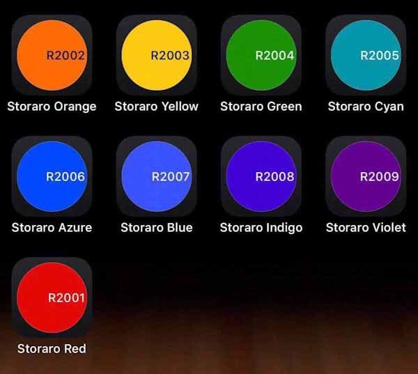
Would limiting myself to using only the 9 or 10 Storaro gels from Rosco be a reasonable creative strategy for maximizing visual impact while streamlining the decision process? (With the exception of CTB, CTO, and CTS, of course). Are his colors versatile enough to tell every kind of story, convey every emotion? Why? I’m exhausted. Between Lee, Rosco, Apollo, and GAM there are thousands of gel colors available. But I’m old as old can be and don’t have time to learn the nuances of so many options before I’m dead. Plus, Vittorio is a much greater genius than most of us...
- 16 replies
-
- vittorio storaro
- color
-
(and 1 more)
Tagged with:
-
Colorist Aidan Stanford has joined Keep Me Posted (KMP), a FotoKem company specializing in creative and technical episodic post-production services. In his role as senior colorist, Stanford builds upon Fotokem’s roster of creative talent that serves episodic and feature projects. With over 25 years of experience, Stanford brings unique expertise including proficiencies on color grading systems. His experience ranges from photochemical color timing to digital color grading and includes DI, broadcast, commercials and shorts. His varied background includes color timing 65mm film for LAWRENCE OF ARABIA (IMAX 2002 restoration/release); the DI, HDR and all video deliverables for the Oscar-winning GET OUT; and multiple seasons of Emmy Award-winning television series. His credits include the features HAPPY DEATH DAY, INSIDIOUS 4 and BENJI and his episodic credits include MODERN FAMILY, DRUNK HISTORY, YOU’RE THE WORST and FRESH OFF THE BOAT. Stanford noted, “No other facility offers the breadth of service for filmmakers that is available within the FotoKem family of companies. There is a dedication to customers and a meticulous approach to the work that is in perfect sync with my own. KMP is a highly respected facility, and I am delighted to join the talented team here.” Mike Brodersen, FotoKem’s Chief Strategy Officer, commented on the addition of Stanford to the creative services team. “Aidan brings a deep knowledge of film, an artistic eye and a keen technical ability to help our creative customers bring their vision to reality. His comprehensive skill set in combination with his expertise in color have made him a trusted collaborator with many filmmakers and show runners. We are delighted to have him on our team.”
-
- fotokem
- keep me posted
-
(and 2 more)
Tagged with:
-
Hello everyone, If this has been covered in a previous post please link, I was unable to find much on a few cursory searches. I am requesting advice or suggestions for a good lab who I can send Super 8 cartridges to for processing, telecine, and most importantly good quality post and colour grading. I am based in the UK (London). Normally I rely on someone local who hand-process the film and does all the post for me. I have always been very happy with his work, but I'm interested to see what kind of results I can get from a 'lab'. I am aware of Andec in Berlin ( andecfilm.de ) and the S8 Reversal Lab in the Netherlands ( super8.nl ). Though I have no experience with their service or even if they provide a Grading/Post service. Anyway, I am requesting suggestions, based on experience, of good labs. I'm happy to ship internationally NY, LA etc. for good results. Ideally it would stay EU though. Keep in mind, I am not seeking cinematic quality, for me the decision to use Super8 has always been a point a shoot, in camera, portable film format, so I am not seeking perfection. My main concern is over levels of noise and uneven exposures which I feel might be remedied with a higher quality transfer and greater attention to detail in the grading process (never mind my lack of attention to these details during the filming). I sincerely appreciate your advice, suggestions and shared knowledge. All the best
-
Hi all, I was wondering how one would go about exposing or even using color effect filters like color gradients, Coral, Antique Suede or Day for Night optical filters while shooting on a digital camera and delivering in color. For example, say that you are using an Antique Suede. Wouldn't depriving the sensor of blue light be very destructive to the raw image? To my understanding the blue channel displays the most noticeable noise the most often. If so, how would you combat this? What are the advantages of doing such an important color decision in camera rather than in post apart from the "stops people from messing with your image" argument? Are there any clear optical or overall quality differences? Thanks in advance!
-
Amateur editor/color grader here. Just got some Alexa footage in that is very very gold and warm, both before and after a Log C to Rec709 LUT. I was at the shoot and everything looked properly balanced on the monitors. In fact we even have photos of the monitors from shoot day and it all looks pretty balanced. Our DP was shooting at 4300K in Tungsten (indoors) which seem quite warm to me, but he claims there's no way the footage should look as warm as it does on my end after sending him screenshots. Wondering if the footage was incorrectly dumped or if it was incorrectly imported into Resolve on my end, or if shooting 4300K in Tungsten is just that warm. Attached is shot with rec709 LUT applied as well as photo of the monitor day-of-shoot.
- 10 replies
-
- whitebalance
- alexa
-
(and 2 more)
Tagged with:
-
Im am curious to gather some opinions. I plan on shooting a short in the near future on 16mm. Naturally my choice of stocks are limited to Kodak, and for production purposes 250D would be my best option. Now, really hate doing color correction and DI. I dont like doing it myself, and I dont want to pay to get a colorist to do it for me. I am wondering, how accurate are the colors of 250D, raw out of the stock? What sort of work would I have to do in post to make them accurate. Are there options for me in filtration to normalize the stock? My thought process is, that I want the stock to have an accurate color baseline for me to modify to fit my story. I am looking for a warm, medium contrast, and slightly diffused look. Something in between George Washington (2000) and The Long Goodbye (1973). For this, my idea of was to shoot with some TLS Rehoused Super Baltars, and apply a Tiffen Warm Black Pro-Mist 1/4. What do you think?
-
Originally posted in FILM STOCKS Im am curious to gather some opinions. I plan on shooting a short in the near future on 16mm. Naturally my choice of stocks are limited to Kodak, and for production purposes 250D would be my best option. Now, really hate doing color correction and DI. I dont like doing it myself, and I dont want to pay to get a colorist to do it for me. I am wondering, how accurate are the colors of 250D, raw out of the stock? What sort of work would I have to do in post to make them accurate. Are there options for me in filtration to normalize the stock? My thought process is, that I want the stock to have an accurate color baseline for me to modify to fit my story. I am looking for a warm, medium contrast, and slightly diffused look. Something in between George Washington (2000) and The Long Goodbye (1973). For this, my idea of was to shoot with some TLS Rehoused Super Baltars, and apply a Tiffen Warm Black Pro-Mist 1/4. What do you think
-
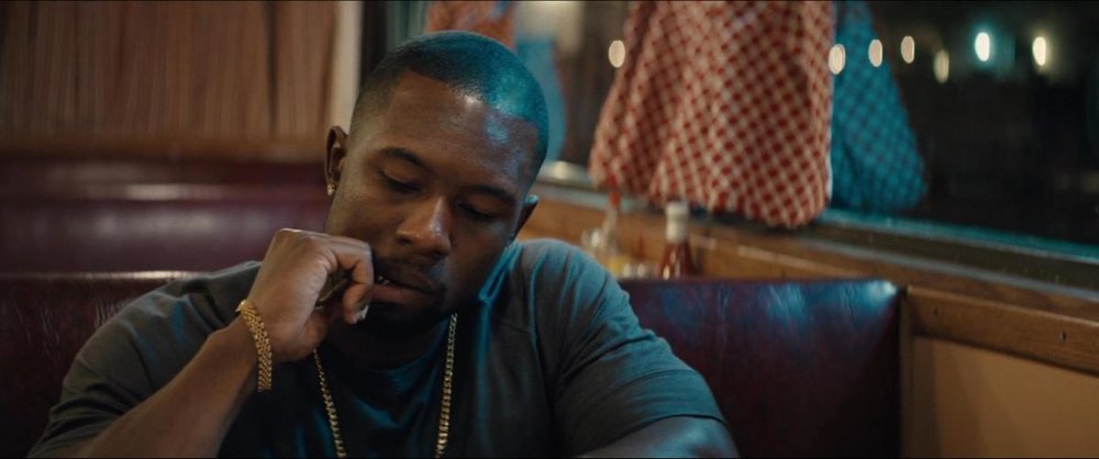
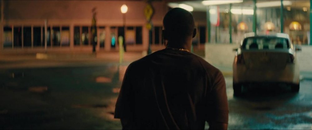
Hey guys! My first post here ;) Currently I'm prepping to shoot my first short-film. I've worked as a DP on commercials and documentaries, but never on narrative film. The script I'll be shooting involves a great amount of tension on the characters almost from beginning to end, so, along with the director (we've worked together a billion time, also as a directing duo) I'm deciding how to bring this tension to the camera. Hard sunlight hitting the subjects face on a low-key enviroment is a great option, but I'm seeking ways to create this tension/contrast through color/color mixing. "Moonlight", shot by James Laxton is a nice reference, so, I was wondering how Laxton accomplished some shots, especially these ones: On an interview, Laxton says he changed the greenish fluorescents from the restaurant to get this blue look (although at the exterior shot they seem quite green to me), the one working as a backlight on the interior shot. I was wondering what kind of lamp is that and at what temperature? I imagine that the inside tungstens are 3200K ~ 2800K, but the outside blue is just to blue to be a regular daylight 5400K. Also, at what white balance was the camera set to be able to capture yellow from the inside and blue from the outside? Thank you guys very much, really happy to be a part of the forum ;)
-
I'm about to start a feature and because of our schedule as well as dropping temperatures, the possibility of shooting day for night is becoming more and more real. My concern is that having red/orange light in the night scenes is extremely important to the director, but that the grade will suck all of that out. The source for the light is a campfire, but one of the characters will also be bloody and wearing a faded red jacket. I've seen the 40's/50's day for night scenes which have a lighter grade and thus more colors, but those seem to have been done because of the sheer expanse of the locations that needed to be seen. Cast Away is the best example of fire/red light I can find for day for night, however I have read that there were some VFX in those shots. While we do have access to a good VFX house, I want to be able to introduce red light practically as a baseline. One detail, we'll be shooting in the woods in California so I'll have limited generator power due to fire concerns. So essentially I am at a loss. Any advice is deeply appreciated.
- 12 replies
-
- day for night
- lighting
-
(and 3 more)
Tagged with:
-
Technicolor 2 Strip technique Do you use this technique, guys? https://www.youtube.com/watch?v=PtnJIFWGJHI
- 1 reply
-
- color
- colorcorrection
-
(and 4 more)
Tagged with:
-
Hi, I've been conducting a little research about gel and I wasn't sure the relationship of transmission and stops. Say, a gel has transmission of 30%. Does that mean that the gel reduces the luminance by 70%? If so, is it in lux or lumen or stop? (I don't have a firm understanding of these units so I might be saying random things) Also, is it helpful to know the transmission vs. wavelength chart? I'd also like to know how the colour temperature of an original source affects the end result through gels. Is there a certain colour temperature that's most appropriate for gels? Or is it totally up to users? If you have your way of working with gels that'd be amazing to know as well. Thanks!



.thumb.jpg.929f516d7b78cdbeb58b06732f446a84.jpg)
.thumb.jpg.9812f5f7a7edc79e69f6d4a1162ed596.jpg)
.thumb.jpg.9a36758113e9971795b4e8891a1d2c10.jpg)
.thumb.jpg.1629b7247b783adc15d4eac19ebd0cc6.jpg)
