


Drew Hoffman
-
Posts
57 -
Joined
-
Last visited
-
home work lighting glass
Drew Hoffman replied to zhangchengdong's topic in Lighting for Film & Video
Here's an article that might help you out. It's a pretty quick read and has a fair amount of useful stuff. Lowel EDU -
A colorimeter or a nice jib would be wonderful.
-
Personally, I'm a member of the school of "you need to know the rules, before you can break them." I think it's important to know the rule of thirds and things about balancing a frame and leading lines and all of that good stuff before you abandon them in a search for "truth." There's nothing wrong with breaking the rules. But knowing them first is the difference between making a deliberate choice that serves and enhances your piece or inadvertently minimizing your image's potential by not understanding the basics. This is all relative of course. After all, there is literally an infinite amount of places you can set your frame. That's part of the fun and the challenge.
-
exterior urban lighting at night
Drew Hoffman replied to Nate Schenker's topic in Lighting for Film & Video
I would definitely consider heavier blue, especially if you're going for a stylized look. Shoot some tests, if you can. Especially on a limited budget, a little extra money up front on testing will help you pick out exactly the look you want and it's better than going through production and realizing it isn't working in post. -
inspirational painters.. Whose yours?
Drew Hoffman replied to Jesse Cairnie's topic in General Discussion
Fair enough. I can appreciate the artistic and cultural significance, I have reservations about many Impressionistic works myself. However, aesthetically it's not really my cup of tea. Setting foot in the contemporary wing of the museum used to drive me up a wall, because half of the work I'd kind of dig. The other half though, I'd have to wonder if it hadn't really been destined for the dumpster out back and made it into the gallery by mistake. Although, I guess that's part of what's so great about art to begin with, it resonates differently with different people. Still, nothing's more inspirational than... -
inspirational painters.. Whose yours?
Drew Hoffman replied to Jesse Cairnie's topic in General Discussion
Jackson Pollock is one of the few "contemporary" artists I appreciate. Looking at his stuff up close, it has great texture and feeling to it. Everything else just goes over my head. Like this bad boy: "Red Plank" by John McCracken It's a shiny red board leaning up against a wall and I think it's work like this that make people believe they don't "get" art. At least I don't get it. Anyone, feel free to enlighten me on it.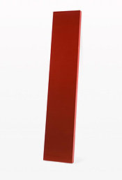
-
inspirational painters.. Whose yours?
Drew Hoffman replied to Jesse Cairnie's topic in General Discussion
My favorite has to be Picasso. Especially his Cubism works. I can't imagine the inner-workings of the mind that can previsualize that kind of idea and actually pull it off so beautifully.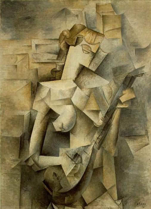
-
It's not that much. I got my copy off Filmtools here. It's a great little program to have, particularly when you have a sunrise/sunset type shot where the sun position needs to be exact and the light is changing very fast. Plus, the company is super cool. I got a brand new copy in the mail from them when they upgraded the program!
-
It doesn't really tension them inward so much, as it prevents them from sliding outward. If it's a mid-level spreader... I don't think I'd try hanging a sandbag from it, unless it's really heavy duty. I've seen a number of spreaders break that way.
-
I have a 500GB drive from LaCie that I bought a couple of years ago to hold footage. So far it's worked fine for me.
-
Favorite set bag / ditty bag?
Drew Hoffman replied to Matt Irwin CSC's topic in Camera Assistant / DIT & Gear
I'm a fan of the tool bags from the hardware store. They may not have the specially designed pockets, but they have a ton of pockets and are a fraction of the price. I use this one for my big bag: CLC Bag Plus, as an accessories bag, one similar to this one: Little Bag I like the way you can zip them up to keep sand and dirt and everything else out. But when it's open, it sits wide open. Especially the little one. That thing has pockets all over and will easily hold filters, matte box, eyebrow, slate, extra BNC, spare on board batteries... and so on and so on. Plus I love that little plastic tray for barrel connectors and all those little things that like to hide in big bags. I look forward to when I can afford to get a CineBags Cinematographer's Bag, but for now I have to keep blowing all of my money on groceries and bills. -
help with two camera units
Drew Hoffman replied to Shane English's topic in Camera Assistant / DIT & Gear
I think that ultimately it's a decision for the editor. They're the one's who spend the most time looking at slates. Like MOS slating... I've known some editors who just like the sticks closed... and some who command that exactly two fingers be placed in between the sticks. I'd follow the chain of command and ask the DP if they can do a quick check for you to find out what the preference is. If you don't have that luxury, then perhaps ask the Scriptee or use your best logic. As long as you can very clearly and concisely figure out which roll came from which camera either right off the can or the slate, I think you should be fine. -
I've been trying to create a custom DoF calculator in my PCAM for the 1/3" chip of the HVX. I figured that this would be a very common desire and relatively easy to track down. However... I started in the middle of Evil Dead II and now that I'm almost finished with Army of Darkness and I still don't have a satisfactory answer, I'm appealing for help. After some extensive digging I was able to track down that for a 4:3 1/3" CCD... the horizontal is 4.8 mm; the vertical is 3.6 mm and the circles of confusion are about 0.015 mm... This doesn't exactly translate to HVX's native 16:9 chip. The best I've been able to track down is that for 16:9... it's either 4.8 mm x 2.7 mm OR 5.2 mm x 2.9 mm... I have a feeling that it's the 4.8x2.7 one, but as a good 2nd AD once told me... "Assumption is the first step to a f*** up." So, does anybody else have their PCAM set up to figure out the HVX or does somebody have the true dimensions of the chip and what the circles of confusion are? Are they also 0.015 or something else? Thanks a ton!
-
If there's a similar thread somewhere else, I'd love to be able to read that. I just have not been able to find anything so far that helps with what I'm trying to figure out. I'm getting ready to shoot a piece that utilizes HD for some scenes and super 16 (w/ 7217). After telecine, it's most likely that it will stay in the digital world and would only be projected in a film festival type situation. My concern is this: I've never mixed formats before and I was wondering how other people had handled this in past situations and how successful that turned out. I'd like to know if there's anything special I need to keep in mind while shooting. Although we're using it to establish different visual looks for the specific scenes... I want to make sure that once it's cut together, it doesn't look super funky or distracting at all. Thanks!
-
I mostly think it's unfortunate that he laughed and walked away. Even if there was a more pressing manner, clearly he thought there was a better explanation and even taking 10 or 15 minutes at lunch would have been enough to cover some basics. Maybe its just me... but if you feel that somebody has the wrong information, they have at least a pseudo responsibility to provide the "right" information. I know I wouldn't know half of what I do if it weren't for the people who were good enough to share some of the knowledge that they've amassed over the years. I'm not saying that the steady cam operator (or whoever) should sit down, explain and breakdown everything that goes into being good with a steady cam. That's a specialty they've spent a lot of time (and probably a lot of money) learning. I'm just saying that films by their very nature are a collaborative process, not being willing to help others along is counter-intuitive and counter-productive... that's just my opinion and I digress quite a bit. There are two types of light meters available. Incident and reflective meters. Incident meters read the amount of light falling on them, reflective meters read the light that is being reflected from the surface the meter is pointed at. Reflective meters can be deceiving, they're not smart and they don't know what they're looking at. All they know is how to expose what they're looking at to look like 18% gray. If you take a reflective reading off of a white wall and expose for what it tells you, that wall is going to look middle gray. A gray card is perfect to use with a reflective meter, especially when you're starting new and don't completely understand how to place your exposure. Hell, I've spent an entire semester classes devoted entirely to the zone system, spot meters and learning how to place your exposure... and there are still many many many things I have left to learn. When you have enough experience and knowledge, you can light the entire scene using your reflective meter. In the mean time, an incident meter is taken at the subject and is a good way to determine where you want to set your exposure. A reflective (or spot meter, which is specialized reflective meter that has a very narrow area of reading, usually 1 degree) is taken from the camera position and is good for reading the tonal range of your scene. You can then make sure that you're going to get detail where you want it and things are going to fall off to empty black or white where you want those. Exposing a gray card and color chart at the beginning of the roll, as stated before, are used by the lab for the purpose of setting the right colors and intensities for your telecine or film print. Shooting them at the beginning of each roll helps establish consistency and helps ensure your colors and exposures will match from shot to shot during post. Coming from a still photography world, I like more density on my negative and will overexpose by at least a half stop to a full stop. Shooting a gray card for the lab makes sure that when the footage comes back that it's been printed correctly and doesn't look too bright. This is also important if you want to change the color of your image specifically for a scene. Shooting a correct color chart at the beginning of the roll establishes what the colors are supposed to look like, then you're free to change them as you see fit. Without it (especially on a student or low budget production) the colorist has to guess what you want the colors to look like and may interpret a scene that's unusually blue as a mistake on your part and color it out... when that's what you were trying to do to begin with. I think I got a little carried away there, I hope everything I said makes sense and is relevant to your question... if not, feel free to chastise me and I'll try to rephrase it. Sorry.