David Mullen ASC
-
Posts
22,408 -
Joined
-
Last visited
Everything posted by David Mullen ASC
-
I used to put two or three small tungsten fresnels with orange gel on Magic Gadget flicker boxes set to different rates in order to make things look more random, or maybe one flickering and the other on a dimmer just being randomly raised and lowered. Then all the lights would go through a light diffusion frame to blend them. I've also used three or four Astera Helios LED tubes on different flicker rates, like in a 2' 4-bank Kino housing, again with diffusion over the doors. Or a Skypanel on a firelight gag.
-

Focal lenses and image distortion in cinema
David Mullen ASC replied to Petr Kvapil's topic in General Discussion
The author of the book is NOT suggesting that you are supposed to counteract the effect of the camera's focal length by changing seating position in the theater. What he is saying is a bit reductive and not completely accurate but there is some rough truth in there. But it's more practical when you are talking about very large theater screens showing a very high resolution image. IMAX is a good example, the screen is larger than normal compared to the center viewing distance in order for the image to expand into your peripheral vision. Cinerama was similar except that the image was only expanded on the horizontal axis. The idea is that with a very large and sharp image, sharp enough to look sharp though enlarged, you were concentrating on the center of the screen and letting some information "tickle" your peripheral vision to make the experience more immersive. IMAX often tends to use very wide-angle lenses because when you sat in the center or slightly forward of center, you were concentrating on a more "normal" focal-length area. Cinerama was similar, the fixed field of view was very wide. With either format, if you sat at the back of the theater or looked at the movie on a TV screen, you were more aware of the wide-angle photography. But in a normal 35mm movie, if a director chose wide-angle lenses, it was for an effect or for the expanded view, it was not because they wanted you to get up out of your seat and move closer to get back to a more normal view because you were concentrating only on the center of the screen. Frame from "How the West Was Won" (3-panel Cinerama), in the Smilevision letterbox format to replicate the look on a curved screen.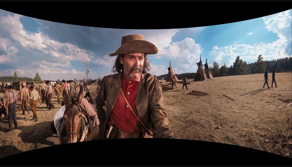
-
Copying a Music Video
David Mullen ASC replied to Ofri Margalit's topic in Lighting for Film & Video
It's all hard lit with multiple tungsten fresnels with cutters, flags to top the light and separate areas. More or less the drummer and pianist are in one key, then the singers when they are forward are in a separate key. Backlights on everyone. No lighting diffusion. -
Focal lenses and image distortion in cinema
David Mullen ASC replied to Petr Kvapil's topic in General Discussion
If the image is distorted in a Terry Gilliam movie, it's on purpose. -
If you want to calculate crop factor using area of film used, then you'd have to calculate the area used to create a 2.39 frame (if that's your final aspect ratio) after a 1.5X de-squeeze. This means that the actual area used has a 1 : 1.59333 (divide 2.39 by 1.5). So if you are comparing to shooting in 4-perf Super35: Full Aperture is 24.89 x 18.67mm, so knowing that is close to 1.33, you figure that for a final 2.39 image after a 1.5X de-squeeze, you're going to have to crop the top & bottom a little because all you need is 1.59333. It works out to be a 24.89 x 15.621mm area. If comparing to shooting in 3-perf 35mm: Full Aperture is 24.8 x 13.87mm, so knowing that is close to 1.78, you figure you're going to crop the sides because all you need is 1.59333. It works out to be 22.099 x 13.87mm. 1.59333 on Super16 (which is 12.35 x 7.42mm full aperture) is 11.823 x 7.42mm. So comparing horizontal view for crop factor, compared to 4-perf Super35, that's a 2.1X crop factor. Compared to 3-perf 35mm, that's a 1.87X crop factor. That would help you calculate focal lengths for each format to get to 2.39 : 1 for a final project. But in terms of using that 70 degree AOV figure, you'd have to know specifically for what format area that number applies to.
-
Achieving contrast through photochemistry
David Mullen ASC replied to Deniz Zagra's topic in General Discussion
The director did not want any graininess and she liked the idea of working at high lights levels like in the 1950s/1960s. "Eyes Wide Shut" pushed 500T by two stops but rated at 1600 ASA instead of 2000 ASA, which is really just a 1/3-stop safety margin rather than consistently going for a denser negative. But I'm sure it helped. Dante Spinotti did something similar for "Red Dragon" (2002) -- I think he pushed 2-stops but rated 500T at 1000 ASA or 1250 ASA, so a bit more density. -
Achieving contrast through photochemistry
David Mullen ASC replied to Deniz Zagra's topic in General Discussion
Intermediate dupe stock is not designed to have its gamma manipulated. You could increase contrast by push-processing the film negative to some extent -- and you could try not underexposing to compensate for the push -- like pushing 200T by one-stop but rating it at 200 ASA (not 400 ASA) and letting it become one-stop denser than normal. It would then be printed down and cause a subtle increase in contrast; it might get you something closer to the look of Vision Premier print rather than a Vision print. 15 years ago, FotoKem had a demo of a very high-contrast look that they got, I think, by using print stock as a dupe element, I don't know if it was in the IP or IN step. The Vision contact prints for my film, "The Love Witch" (2016), were pretty contrasty and saturated because I overexposed 200T stock by over a stop and printed down, like in the low 40s (25 is normal). But that took a lot of light because I was basically working at 100 ASA and then opening up a bit more even after that. So I suggest trying the idea of pushing 200T by one-stop (or even test pushing by 2-stops) but not underexposing to compensate, just end up with a dense negative that has to use high printer light numbers. -
I assume that the 70 degrees FOV is based on the 1.5X horizontal expansion of view due to the anamorphic element. If so, then you just have to figure out the crop factor for the same areas used to create the same aspect ratio in both formats.
-
It's funny but as a DP, where I noticed the lack of post CGI work was little things, like erasing movie lights reflected in eye glasses! The campfire scene with Josh Hartnett is what I'm talking about, you can see a Skypanel on a fire color program reflected in his glasses now and then. Most shows would ask a VFX supervisor to replace the reflection with one of a fire if possible, or shoot without glass in and add reflections. But of course if you're shooting large format, then you're talking about higher resolution scans and you can't do it if your goal is to contact print as often as possible rather than cut in something recorded out to film. I thought the fireball for Trinity was fine.
-
https://www.in70mm.com/news/2023/oppenheimer_cinema/index.htm The website says three theaters in Spain are showing it in 5-perf 70mm film (not 15-perf IMAX film), one in Barcelona.
-
How to achieve night shots using low speed film
David Mullen ASC replied to Deniz Zagra's topic in General Discussion
The night work certainly it wasn't shot on 100 ASA 5254 rated normally at 100 ASA, or overexposed. It was probably rated at 200 ASA (underexposed one-stop) with a one-stop push, on fast lenses. You can't judge the grain on a modern transfer because some noise reduction was probably applied. I would try doing the night scenes at 200 ASA normal for 200T stock and using some lights if you want to keep the grain down. But if you really don't have the budget for lights, use 500T stock. You could always try some minimal noise reduction in post to help match the 200T shots that were overexposed. I shot "The Love Witch" mostly on 200T overexposed one-stop and it took quite a lot of light for interiors and nights, basically that means achieving 100 foot-candles to get a full exposure. -
I would try 1/2 Plus-Green on the 5600K lights and then set your camera to 3200K for an exaggerated Cool White fluorescent tube look. If you really want more green, then Full Plus-Green, why not?
-
Before the 5-perf 70mm screening began at the Howard Hughes Cinemark, they were showing a film trailer, I believe also 70mm but matted to 1.85 and misframed so that the top of 1.85 was the top of the screen, if not slightly past the top of the screen. It was for Alexander Payne's new movie "The Leftovers", which looked like it was shot in film and the trailer had a 70's era title graphic. Then the movie started and I was worried I was going to have to leave and tell the projectionist to frame up properly but when the movie started and a splice flashed at the bottom edge of the 70mm image, the projectionist lowered the frame correctly.
-
What is the color of death??
David Mullen ASC replied to Abdul Rahman Jamous's topic in Lighting for Film & Video
There are cultural associations -- white with death in Asian cultures, black in Western cultures -- but color symbols in movies are more about context and repetition, following the old rule if that if it happens once, it's an accident, twice it's a coincidence, and three times, it's a motif. Cyan is often used in horror movies mainly because it's creepy on skintones and also because it can be used for moonlight effects. -
There is no rule because people in scenes don’t always stand in a “normal” light level depending on their position relative to the source plus depending on the mood of the scene. Plus skin tones are not the same for everyone.
- 1 reply
-
- 2
-

-
Focus-pulling by using a video tap on a film camera is problematic, there isn’t enough resolution. Imagine a tiny security camera pointed at a frosted ground glass screen.
-
I saw this today in 5-perf 70mm film, which I suspect was an optical reduction of the IMAX shots, not a D.I. The print was superb, you forget how much better the blacks are in a non-D.I. film print, even if there is a loss of shadow detail from the contrast -- we've gotten used to the flatter shadow detail of digital movies. Occasionally in day scenes, it gets a bit harsh-looking but always rich, dramatic. You could get a sense of where the IMAX shots come in, despite everything being the same 2.20 : 1 framing -- either there is a drop in depth of field to the point of extreme shallowness, or there is a lot of corner fall-off and the shots feel "big" in background scale, like when Oppenheimer climbs the ladder at Trinity. I thought it was a good movie, exploring all the contradictions of Oppenheimer, and I thought Cillian Murphy did a great job, to me he clearly goes through the emotional wringer even while internalizing his pain. The sound mix was rather oppressive. If it's true that Nolan shot a lot of this movie in 5-perf 65mm -- his usual reason is that he prefers dialogue scenes to not be looped, which IMAX cameras usually cause to happen -- then perhaps the 5-perf 70mm print was the way to go.
-
Kodak 7207 & 7219 - Rich Blacks - Grain
David Mullen ASC replied to Boris Kalaidjiev's topic in Film Stocks & Processing
Certainly some overexposure helps reduce graininess. Black level in a photochemical print would be helped by a denser negative being printed down, but black level in a video transfer is a matter of digitally setting blacks to "0" -- so what overexposure gives you is more shadow detail so that you can set the blacks to "0" without them looking artificially crushed and have them look naturally dark. Most of the reason why a video image has noisy blacks is because they are lifted to show shadow detail or the image is underexposed so that setting the blacks to "0" makes them feel crushed, plugged up. -
Diffusion for photography predates cinema, but it started to appear with movies like "Broken Blossoms" (1919). Hollywood always liked to glamorize movie stars, male and female, but generally more diffusion was used for women under the notion that men needed to look "manly". Some movies were diffused more generally while others saved it for close-ups; most did a mix in the 1930s, lighter diffusion on medium shots, heavier on close-ups. But it wasn't just Hollywood, portraiture in general liked that look in the 1930s. Popular diffusers were Kodak Portrait Diffusion Disks (acid-etched concentric rings on glass, similar to what were sold as Dutos in Europe), Scheibes (sort of a varnish sprayed on glass in a speckled pattern), and various nets, pantyhoses, gauzes. Diffusion Disks were also used in photo enlargers for still photographers. Too many movies to list but you might consider finding what 1930s films have come out on blu-ray recently since those will have enough resolution to judge the filtering. For example: http://www.dvdbeaver.com/film10/blu-ray_review_142/desire_blu-ray.htm
-
Lighting with colour & skin tone
David Mullen ASC replied to James Lahaise's topic in Lighting for Film & Video
Red is probably the worst in both film and digital and green is probably the best for sharpness and grain/noise.- 10 replies
-
- 1
-
-
- lighting tips
- colour
- (and 1 more)
-
Lighting with colour & skin tone
David Mullen ASC replied to James Lahaise's topic in Lighting for Film & Video
Faces shot under red light are not that sharp on film either, it’s just hard to get good detail when only one layer of film or one-quarter of the pixels are receiving information. With film you have grain though which gives some texture in lieu of detail.- 10 replies
-
- 1
-
-
- lighting tips
- colour
- (and 1 more)
-
Generally those Litemats would be used in smaller interiors and not attempting to recreate hard sunlight or achieve high levels of daylight. They might get brought out as the real daylight fades. You could get a large soft window light effect with Litemats but you’d need the big ones like the Litemat 8 (about a 4’x4’ soft light) and more than one, maybe through a bigger diffusion frame. But if you need more stop for a larger space, you’d have to go to diffused / bounced HMIs. Or a bunch of big ARRI Skypanel S360s LEDs…
-
Soft LED panels can be used with film just as Kinoflo fluorescent tubes were used before. As for hard lighting, LED fresnels can work as long as they are modern ones designed for filming, not some older RGB LEDs made for small bars and clubs, those are hard to get a simple 3200K color out of. You could mix tungsten fresnels with LED panels too. It’s hard to get a LED to look like a direct 2K tungsten fresnel or bigger, but for smaller spots then LEDs are fine. Certainly there’s no LED version of a 20K tungsten fresnel!
-
You control the brightness of the background in whatever is the best method. You can also just ND gel the window area that is within the frame.