Satsuki Murashige
-
Posts
4,560 -
Joined
-
Last visited
Everything posted by Satsuki Murashige
-
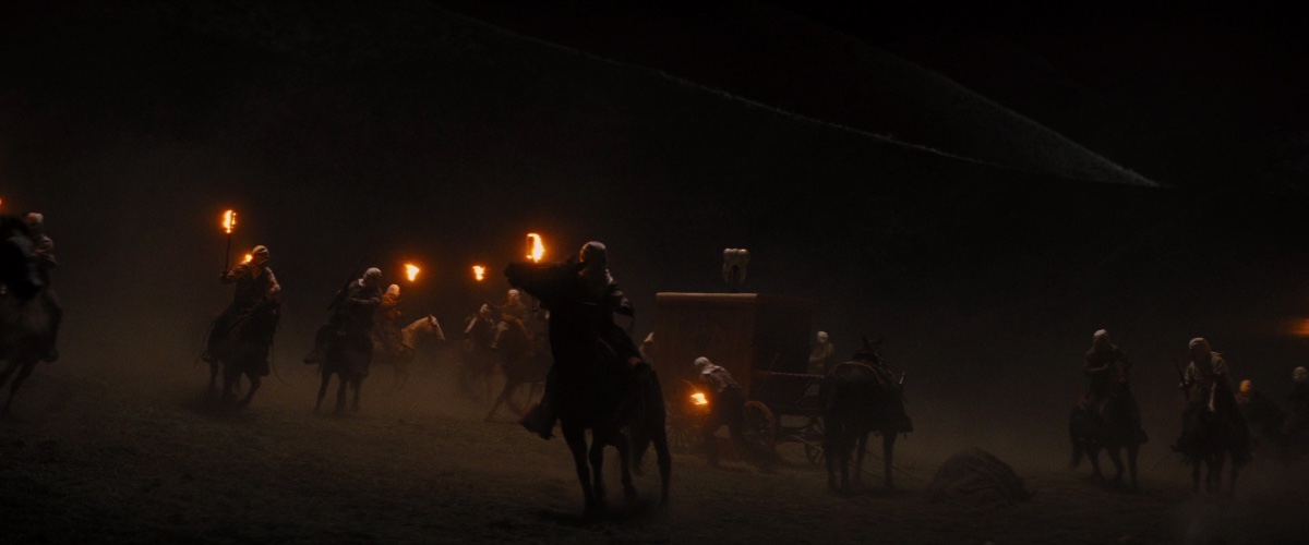
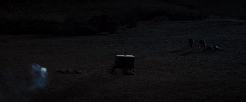
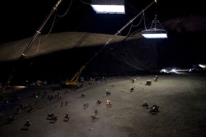
 I think it’s also reasonable to still consider moonlight diffused by cloud cover as a ‘moonlight’ look since it’s still the motivating source. ’Road to Perdition’ (2002) Dir. Sam Mendes DP. Conrad L. Hall, ASC
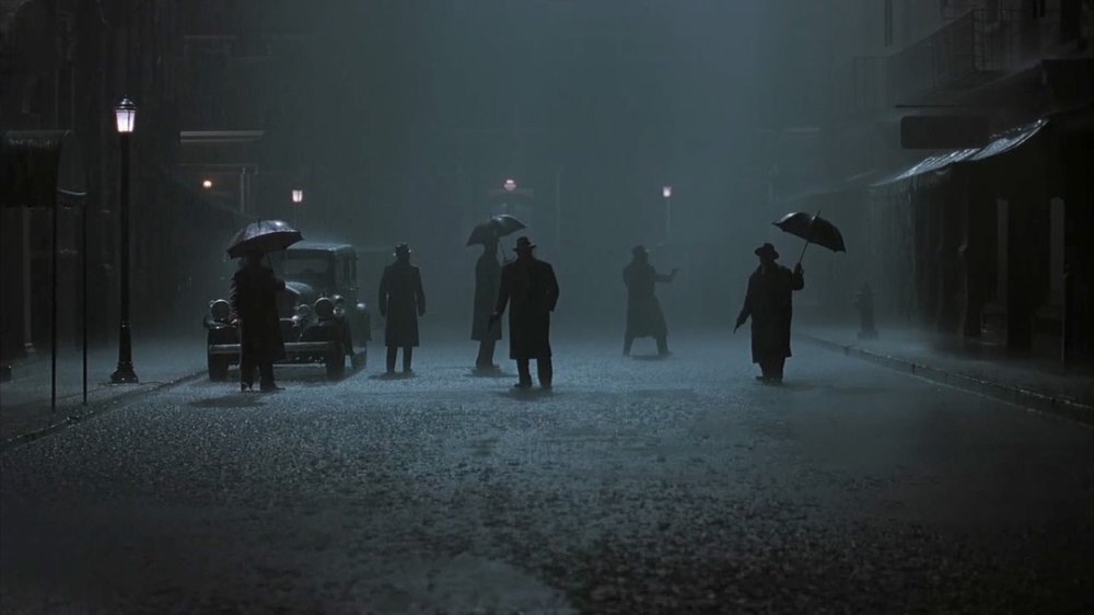
-
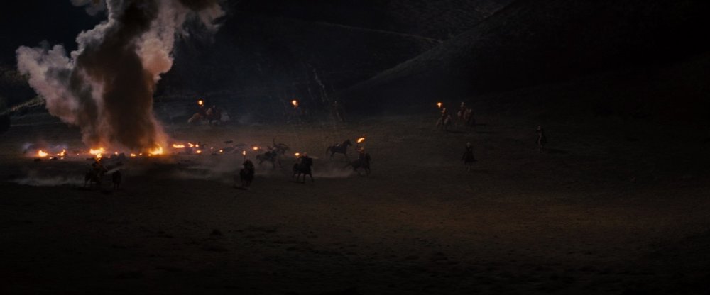
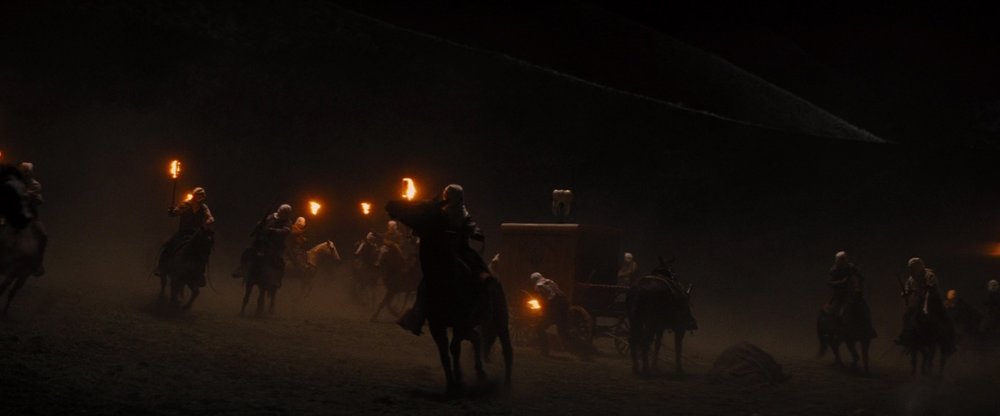
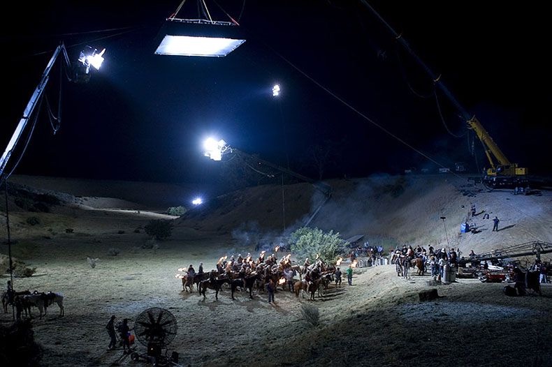
On the other hand, sometimes a soft toppy ‘moonlight’ source or a mix or hard and soft looks good: ‘Django Unchained’ (2012) Dir. Quentin Tarantino DP. Robert Richardson, ASC
-
SEKONIC 858D-U VS SPECTRA CINE IV SENSITIVITY
Satsuki Murashige replied to Iggy Heringa's topic in Lighting for Film & Video
What I was sort of getting at is that a multi-tool will never be as good at a specific job as a dedicated tool. For some jobs, the convenience of having to carry only one tool outweighs having to carry multiple dedicated tools. And sometimes you simply need the precision of exactly the right tool for the job, no matter how cumbersome. In other words - the multi-tool is a design feature, not a bug. It just needs to be recognized for what it is, and what it isn’t. -
Cinematographers that came from G&E
Satsuki Murashige replied to Nelson JJ Flores's topic in General Discussion
Darius Wolski -
SEKONIC 858D-U VS SPECTRA CINE IV SENSITIVITY
Satsuki Murashige replied to Iggy Heringa's topic in Lighting for Film & Video
I think the Sekonic is more of a multi-tool, it has spot/incident/flash/fc/lux/fL/filter comp/shutter comp, etc. Trying to appeal to both stills and film/video markets. Whereas the Spectra is more of a single purpose precision instrument made for cinematographers. I know they also make a spot attachment for the Cine IV, but it seems rather cumbersome and I’ve never seen anyone use it. -
SEKONIC 858D-U VS SPECTRA CINE IV SENSITIVITY
Satsuki Murashige replied to Iggy Heringa's topic in Lighting for Film & Video
Can’t speak to the Sekonic 858D-U, but my L-558 Cine (2 generations older) is less sensitive than my Spectra Cine IV. It also only reads out in increments of 10fc, whereas the Spectra reads out in 1/10 fc increments. I think footcandles/lux readings are more of an afterthought with the Sekonic. -
I think one issue you will have with doing this with a Microforce or similar manual motor controller is that if you keep the motor speed constant, then the zoom will appear to move faster and faster towards the long end of the lens. Maybe that will be ok, but if you want the appearance of a constant zooming speed, then you’ll need to gradually ramp down the rotational speed of the zoom ring during the shot. In that case, I think you’ll need some kind of motion control rig where you can program the motor speed on a curve. Or if you’re willing to risk a sore thumb, you could do it with a Microforce on the lowest setting and perform the ramp manually. Hopefully you won’t have to do too many takes!
-
Deakins cove lighting: possible with LED?
Satsuki Murashige replied to omar robles's topic in Lighting for Film & Video
Roger says in his podcast that he’s a light tweaker, constantly running around and adjusting lights himself. So it’s probably faster for him to get what he wants by working with smaller heads on baby stands, instead of large heads on combos and crank stands. That said, I’m sure he does plenty of both. -
Keep in mind that Roger Deakins only shot the movie that Denis Villeneuve wanted to make. Even if Roger (or someone else) attempted to copy Jordan Cronenweth’s work, ‘BR: 2049’ would still be (in my opinion) thematically disconnected from the original. I think Mr. Villeneuve was probably the wrong choice of director if the producers wanted a sequel that felt ‘the same’ as the original. His films are beautifully cold, distanced, and bleak, with hints of absurdity wrapped in a veneer of realism - he is not a romantic like early era Ridley Scott.
-
Deakins cove lighting: possible with LED?
Satsuki Murashige replied to omar robles's topic in Lighting for Film & Video
Lol! Well as Phil says, it’s very cheap and relatively quick to set up. Probably something Roger started using in his documentary days. If it ain’t broke... -
Also, make sure to add a Polarizer to your filter package. It might help to dial out some unwanted reflections.
-
Can you just perform an auto white balance on the orange mask, using the color grading tools in FCP? If possible, it would be ideal to white balance the digital camera during the scanning process so you don’t introduce extra noise in post.
-
Well, what do you want your commercial to look like? The point of testing to try out different ideas on how to get the look you want. If you want a soft diffused look, try out different old lenses vs filters. If you want a warm golden look, try out in-camera white balance vs gels on lights vs LUTs. If you want a grainy look, try underexposing vs adding film grain in post. So on, and so forth. It’s all related to what you’re trying to achieve, rather than just testing for no reason.
-
Use long lenses and stay further back so your reflection is smaller. Use large solids behind camera. A T-bone may look better than a solid frame if you need to avoid seeing stands. If possible, light from outside the room and with practicals. Since your device is curved like a sphere, a lot of problematic reflections will come from 3/4 back and above/below. So if you still want edge lighting and texture on the object, you may want to consider bouncing large lights onto the walls/floors from a distance to increase natural reflections, rather than lighting the object directly.
-
Deakins cove lighting: possible with LED?
Satsuki Murashige replied to omar robles's topic in Lighting for Film & Video
-
Kinetal 17.5mm + Iscorama pre-36 for S16
Satsuki Murashige replied to M Joel W's topic in Lenses & Lens Accessories
Can’t speak to the rest, but I think this is correct. I always use a 1.4x desqueeze in post with mine, and it looks right. -
Yes, just pointing out that there’s nothing especially fancy going on.
-
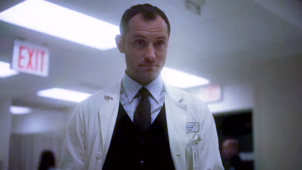
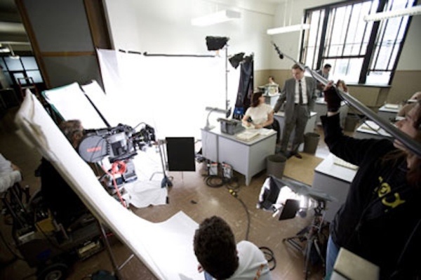
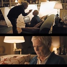
Original: White balanced back to ‘normal’:

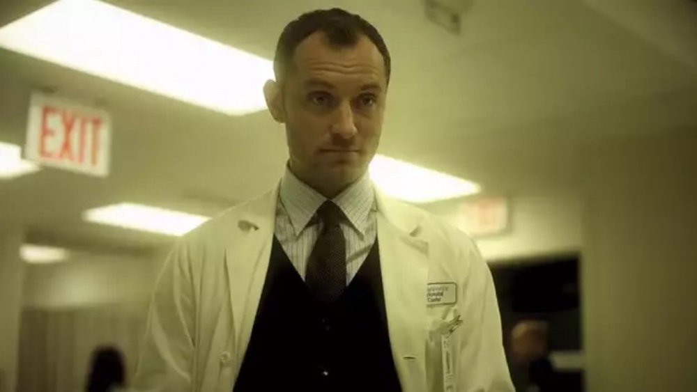
-
Yes, it’s yellow + green. You can do it in camera or just shoot with normal white balance and grade it that way in post. The important thing is that you don’t mix color temperatures while lighting on set. Notice that both the practicals and the key light are the same color in Jude Law’s close up. This allows you to push the color as you like in the grade.
-
What file format is best for grading film scans?
Satsuki Murashige replied to Seth Baldwin's topic in Post Production
You can usually also just ask for Prores4444 video files if DPX is a hassle. I’m not sure DPX has much advantage unless you’re doing VFX or frame-by-frame restoration cleanup work. Cineon log files in Prores4444 grade really well. -
Uh oh. I sense another anti-consumerism rant incoming shortly... ?
-
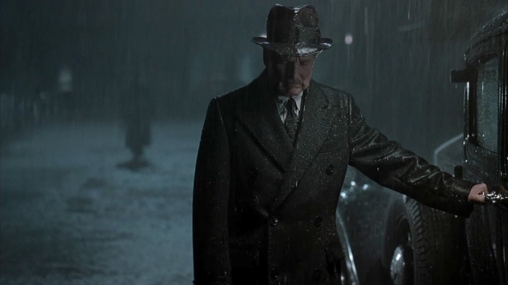
I don’t think there’s any frontal fill, it’s a very wide shot and the foreground is almost black. And I don’t think there’s any toppy fill, as there seems to be a hard ceiling on at least the back half of the set and the only light falling on the chandeliers and ceiling fan is coming from the two opposing windows. There also aren’t any shadows or reflections on the floor that would indicate a large toppy source. There is a fairly strong blue light coming from a window source on camera right, lighting the foreground man and the chairs that might be perceived as fill since it is opposite the window light. And there might be a bit of atmosphere going on as well, which will have a similar effect to adding a small amount of fill light in the mid and deep background.
-
The lighting units are probably large fresnels, judging by the sharp shadows of the grates on the back wall. Mostly likely something like a row of tungsten 10Ks or T12s. The color comes from gels. Re: color I think the green tones that you’re perceiving in the shadows are probably a mix of the colored lighting (yellow sodium vapor and blue moonlight), the color of the walls and floor tiles (beige?), and the color of the chairs.
-
You assign a tape color in prep to each film stock that you’re using on the shoot. The colors can be whatever you want as long as you keep it consistent, but there are certain conventions that are standardized - red for high speed tungsten (i.e. 500T), blue for daylight stock (i.e. 250D).
-
Lol, great story Michael!