


Emiel de Jong
-
Posts
23 -
Joined
-
Last visited
Recent Profile Visitors

-
The last generation of Kinoton projectors used stepper motors for the intermittent sprocket, even for 16mm... https://www.sprocketschool.org/wiki/Kinoton_FP_30_E Their FP 38 ECII Reference model was built for quality checking prints, with better image steadiness than (most...?) mechanical projector movements could provide. So I guess it is theoretically possible to build a camera with this system. Practically possible is another thing I guess.
-
Haha, congratulations! And your procrastination habits are about the healthiest I've seen... ?
-
Postproduction guidance - beginner
Emiel de Jong replied to Patricia Dauder's topic in Post Production
Apart from that 4000 page manual (you need lots of courage for that as a starter...) there are also some much more friendly training books on https://www.blackmagicdesign.com/products/davinciresolve/training . Download is free and you get all media material with it to start working with Resolve immediately. The books are a beginner's guide, and then more detailed guides for editing, audio, color correction and visual effects. I think they are pure fun! -
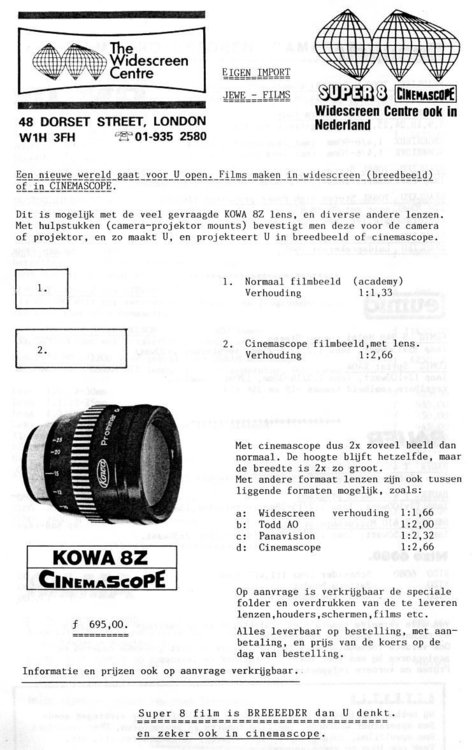
The 8Z adapter for my super-8 camera... something I had to have when a Dutch dealer in the early 1990's made it available. It was fun, but results were always a bit soft in my experience. Later, when I got into film projection professionally, I always felt that this was just the 16H 16mm projection anamorphic with a different name on it to sell it to the super8 filmmaker. On YT there are a few videos that compare the 8Z and the 16H, differences in sharpness are found, but I still guess this has to do with the calibration of the individual lenses instead of being the result of a different design. They simply look too exactly the same ? A YT video shows they come with either blueish or yellowish coating, and that makes a difference for sure in lens flare color. I once encountered the same lens also as part of a cheaper 35mm film projection combination: a quick google shows this must have been the "Sankor Anamo-Prime". I think too the professional anamorphic taking lenses from Kowa must have been completely different things...
-
-
-
Ektachrome 100 is BACK!!
Emiel de Jong replied to Nick Collingwood's topic in Film Stocks & Processing
About direct prints from Vision 3 50D: 2 years ago I shot some tests with it and we had it printed, it became clear that the effect I wanted, outspoken colors and rich blacks, was simply not possible. (And I wasn't going for the Kodachrome type of outspoken colors, just the effect I got automatically with negative / positive some ten years earlier.) Somebody from the lab here in the Netherlands explained to me: Vision 3 is designed for digital intermediate, has therefore soft colors, and print film to compensate for that surely existed (if I remember correctly he mentioned some Fuji stock), but is not made anymore. This was 35mm but I guess print film stock availability is the same for 35 and 16. -
Labs in Europe - Recommendations?
Emiel de Jong replied to Alexander Boyd's topic in Post Production
I was very happy with the services of Dejonghe and also with those of the not yet mentioned lab in Amsterdam: http://www.haghefilm-digitaal.nl -
Ektachrome 100 is BACK!!
Emiel de Jong replied to Nick Collingwood's topic in Film Stocks & Processing
This article mentions "feature films shot with..." and "35mm": http://nofilmschool.com/2017/01/kodak-ektachrome-35mm I am wondering too: will it be available in 35mm, and with negative or positive perforation? -
Lowel Quartz D safety question
Emiel de Jong replied to Emiel de Jong's topic in Lighting for Film & Video
Thanks Don. I will get those screens... -
I got some nice Lowel Quartz D sets ( the yellow ones). They don't have protective screens: were those only introduced with the later DP model, or are they just missing? And should it be possible to use the DP ones on the D model? Thanks...
-
Increase contrast photochemically (contact printing)
Emiel de Jong replied to Ben Brahem Ziryab's topic in Post Production
Thanks Kenny, that's excellent; if it's up to me that's exactly what we will do next time. I will check out his other articles too... -
Increase contrast photochemically (contact printing)
Emiel de Jong replied to Ben Brahem Ziryab's topic in Post Production
Thanks David, that is all very valuable information. If we do another project all-analog there will be some heavy testing before, and then I want to bring in people anyway who are more skilled in this field than I am myself. I love the idea of working with film and film only, but if if the qualities I associate with that cannot be produced anymore with the materials available right now it would be mad to refuse digital finishing. (So, we "were" in the same festival in Amsterdam ! I couldn't be there the day "The Love Witch" played, so unfortunately I have not seen it yet.) -
Increase contrast photochemically (contact printing)
Emiel de Jong replied to Ben Brahem Ziryab's topic in Post Production
"Unless the timer took you into his hazeltine room for a pass before the 1st answer print, which is unusual." - Yes, this was exactly what happened, except it was a Colormaster. Second session was with the answer print, looking at it directly through a magnifying glass and through different color filters. -
Increase contrast photochemically (contact printing)
Emiel de Jong replied to Ben Brahem Ziryab's topic in Post Production
Kenny, I don't know... (as you will guess I am not a DOP and this is not something I do every day, I hope you all appreciate that I try to learn about it though...). I remember a conversation I had with the grader when I asked about the negative, he considered it fairly normal. What I did at the first session was asking for a less bright image till I sort of liked what was on the monitor screen, this produced a print which was in parts somewhat too dark, without giving in return the extra saturation and deep blacks I was expecting to get.
